Thoughts on High-Frequency Trading Strategies (2)
 0
0
 1071
1071
Thoughts on High-Frequency Trading Strategies (2)
Accumulated Trading Amount Modeling
In the previous article, we derived an expression for the probability of a single trade amount being greater than a certain value.

We are also interested in the distribution of trading amount over a period of time, which intuitively should be related to the individual trade amount and order frequency. Below, we process the data in fixed intervals and plot its distribution, similar to what was done in the previous section.
In [1]:
from datetime import date,datetime
import time
import pandas as pd
import numpy as np
import matplotlib.pyplot as plt
%matplotlib inline
In [2]:
trades = pd.read_csv('HOOKUSDT-aggTrades-2023-01-27.csv')
trades['date'] = pd.to_datetime(trades['transact_time'], unit='ms')
trades.index = trades['date']
buy_trades = trades[trades['is_buyer_maker']==False].copy()
buy_trades = buy_trades.groupby('transact_time').agg({
    'agg_trade_id': 'last',
    'price': 'last',
    'quantity': 'sum',
    'first_trade_id': 'first',
    'last_trade_id': 'last',
    'is_buyer_maker': 'last',
    'date': 'last',
    'transact_time':'last'
})
buy_trades['interval']=buy_trades['transact_time'] - buy_trades['transact_time'].shift()
buy_trades.index = buy_trades['date']
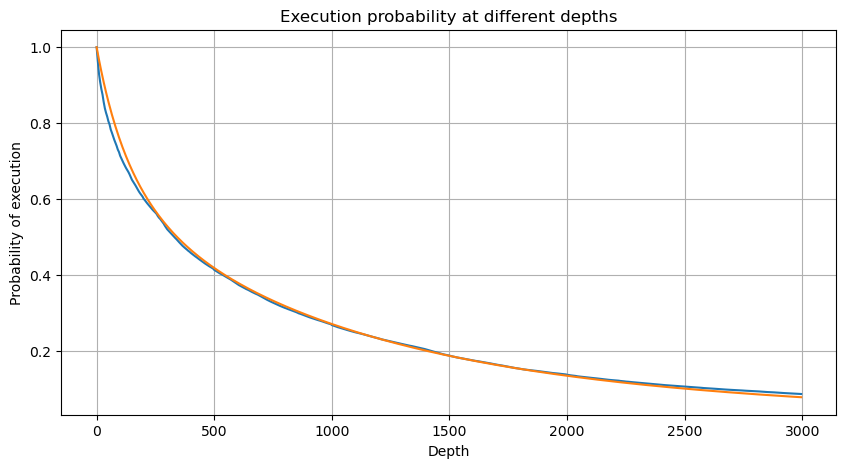
We combine the individual trade amounts at intervals of 1 second to obtain the aggregated trading amount, excluding periods with no trading activity. We then fit this aggregated amount using the distribution derived from the single trade amount analysis mentioned earlier. The results show a good fit when considering each trade within the 1-second interval as a single trade, effectively solving the problem. However, when the time interval is extended relative to the trading frequency, we observe an increase in errors. Further research reveals that this error is caused by the correction term introduced by the Pareto distribution. This suggests that as the time interval lengthens and includes more individual trades, the aggregation of multiple trades approaches the Pareto distribution more closely, necessitating the removal of the correction term.
In [3]:
df_resampled = buy_trades['quantity'].resample('1S').sum()
df_resampled = df_resampled.to_frame(name='quantity')
df_resampled = df_resampled[df_resampled['quantity']>0]
In [4]:
# Cumulative distribution in 1s
depths = np.array(range(0, 3000, 5))
probabilities = np.array([np.mean(df_resampled['quantity'] > depth) for depth in depths])
mean = df_resampled['quantity'].mean()
alpha = np.log(np.mean(df_resampled['quantity'] > mean))/np.log(2.05)
probabilities_s = np.array([((1+20**(-depth/mean))*depth/mean+1)**(alpha) for depth in depths])

plt.figure(figsize=(10, 5))
plt.plot(depths, probabilities)
plt.plot(depths, probabilities_s)
plt.xlabel('Depth')
plt.ylabel('Probability of execution')
plt.title('Execution probability at different depths')
plt.grid(True)
Out[4]:
In [5]:
df_resampled = buy_trades['quantity'].resample('30S').sum()
df_resampled = df_resampled.to_frame(name='quantity')
df_resampled = df_resampled[df_resampled['quantity']>0]
depths = np.array(range(0, 12000, 20))
probabilities = np.array([np.mean(df_resampled['quantity'] > depth) for depth in depths])
mean = df_resampled['quantity'].mean()
alpha = np.log(np.mean(df_resampled['quantity'] > mean))/np.log(2.05)
probabilities_s = np.array([((1+20**(-depth/mean))*depth/mean+1)**(alpha) for depth in depths])
alpha = np.log(np.mean(df_resampled['quantity'] > mean))/np.log(2)
probabilities_s_2 = np.array([(depth/mean+1)**alpha for depth in depths]) # No amendment

plt.figure(figsize=(10, 5))
plt.plot(depths, probabilities,label='Probabilities (True)')
plt.plot(depths, probabilities_s, label='Probabilities (Simulation 1)')
plt.plot(depths, probabilities_s_2, label='Probabilities (Simulation 2)')
plt.xlabel('Depth')
plt.ylabel('Probability of execution')
plt.title('Execution probability at different depths')
plt.legend()
plt.grid(True)
Out[5]:
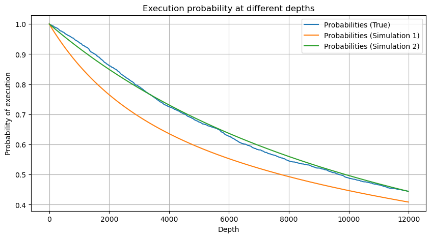
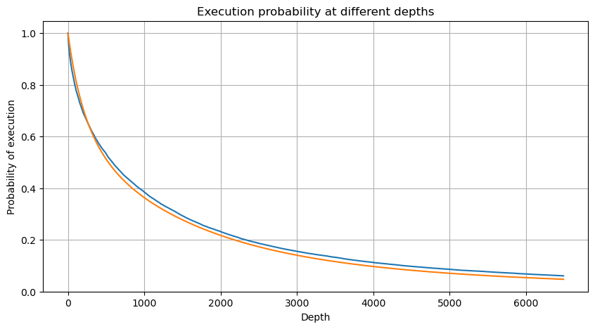
Now summarize a general formula for the distribution of accumulated trading amount for different time periods, using the distribution of single transaction amount to fit, instead of separately calculating each time. Here is the formula:

Here, avg_interval represents the average interval of single transactions, and avg_interval_T represents the average interval of the interval that needs to be estimated. It may sound a bit confusing. If we want to estimate the trading amount for 1 second, we need to calculate the average interval between events containing transactions within 1 second. If the arrival probability of orders follows a Poisson distribution, it should be directly estimable. However, in reality, there is a significant deviation, but I won’t elaborate on it here.
Note that the probability of trading amount exceeding a specific value within a certain interval of time and the actual probability of trading at that position in the depth should be quite different. As the waiting time increases, the possibility of changes in the order book increases, and trading also leads to changes in the depth. Therefore, the probability of trading at the same depth position changes in real-time as the data updates.
In [6]:
df_resampled = buy_trades['quantity'].resample('2S').sum()
df_resampled = df_resampled.to_frame(name='quantity')
df_resampled = df_resampled[df_resampled['quantity']>0]
depths = np.array(range(0, 6500, 10))
probabilities = np.array([np.mean(df_resampled['quantity'] > depth) for depth in depths])
mean = buy_trades['quantity'].mean()
adjust = buy_trades['interval'].mean() / 2620
alpha = np.log(np.mean(buy_trades['quantity'] > mean))/0.7178397931503168
probabilities_s = np.array([((1+20**(-depth*adjust/mean))*depth*adjust/mean+1)**(alpha) for depth in depths])

plt.figure(figsize=(10, 5))
plt.plot(depths, probabilities)
plt.plot(depths, probabilities_s)
plt.xlabel('Depth')
plt.ylabel('Probability of execution')
plt.title('Execution probability at different depths')
plt.grid(True)
Out[6]:
Single Trade Price Impact
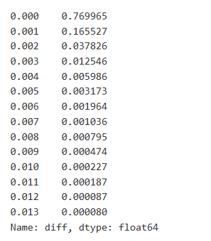
Trade data is valuable, and there is still a lot of data that can be mined. We should pay close attention to the impact of orders on prices, as this affects the positioning of strategies. Similarly, aggregating data based on transact_time, we calculate the difference between the last price and the first price. If there is only one order, the price difference is 0. Interestingly, there are a few data results that are negative, which may be due to the ordering of the data, but we won’t delve into it here.
The results show that the proportion of trades that did not cause any impact is as high as 77%, while the proportion of trades causing a price movement of 1 tick is 16.5%, 2 ticks is 3.7%, 3 ticks is 1.2%, and more than 4 ticks is less than 1%. This basically follows the characteristics of an exponential function, but the fitting is not precise.
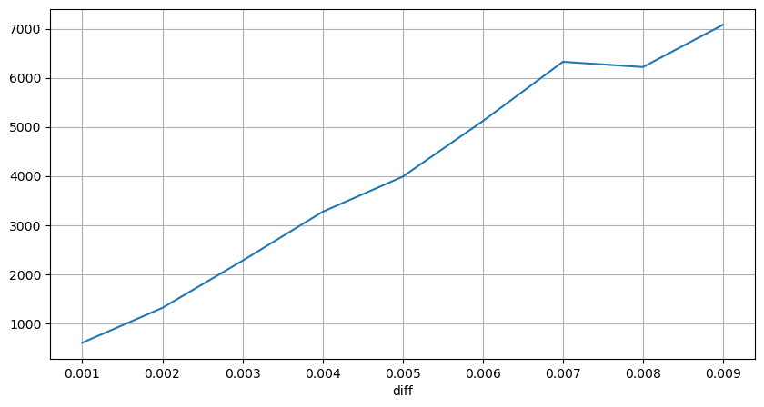
The trade amount causing the corresponding price difference was also analyzed, excluding distortions caused by excessive impact. It shows a linear relationship, with approximately 1 tick of price fluctuation caused by every 1000 units of amount. This can also be understood as an average of around 1000 units of orders placed near each price level in the order book.
In [7]:
diff_df = trades[trades['is_buyer_maker']==False].groupby('transact_time')['price'].agg(lambda x: abs(round(x.iloc[-1] - x.iloc[0],3)) if len(x) > 1 else 0)
buy_trades['diff'] = buy_trades['transact_time'].map(diff_df)
In [8]:
diff_counts = buy_trades['diff'].value_counts()
diff_counts[diff_counts>10]/diff_counts.sum()
Out[8]:
In [9]:
diff_group = buy_trades.groupby('diff').agg({
    'quantity': 'mean',
    'diff': 'last',
})
In [10]:
diff_group['quantity'][diff_group['diff']>0][diff_group['diff']<0.01].plot(figsize=(10,5),grid=True);
Out[10]:
Fixed Interval Price Impact
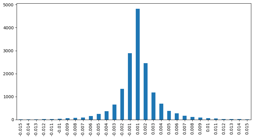
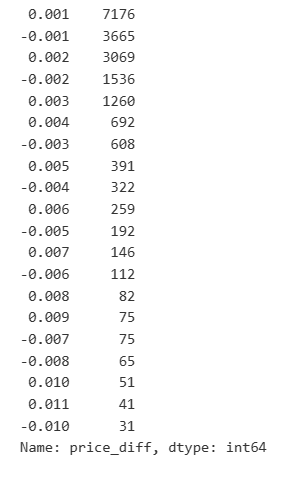
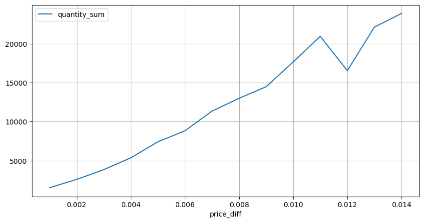
Let’s analyze the price impact within a 2-second interval. The difference here is that there may be negative values. However, since we are only considering buy orders, the impact on the symmetrical position would be one tick higher. Continuing to observe the relationship between trade amount and impact, we only consider results greater than 0. The conclusion is similar to that of a single order, showing an approximate linear relationship, with approximately 2000 units of amount needed for each tick.
In [11]:
df_resampled = buy_trades.resample('2S').agg({
    'price': ['first', 'last', 'count'],
    'quantity': 'sum'
})
df_resampled['price_diff'] = round(df_resampled[('price', 'last')] - df_resampled[('price', 'first')],3)
df_resampled['price_diff'] = df_resampled['price_diff'].fillna(0)
result_df_raw = pd.DataFrame({
    'price_diff': df_resampled['price_diff'],
    'quantity_sum': df_resampled[('quantity', 'sum')],
    'data_count': df_resampled[('price', 'count')]
})
result_df = result_df_raw[result_df_raw['price_diff'] != 0]
In [12]:
result_df['price_diff'][abs(result_df['price_diff'])<0.016].value_counts().sort_index().plot.bar(figsize=(10,5));
Out[12]:
In [23]:
result_df['price_diff'].value_counts()[result_df['price_diff'].value_counts()>30]
Out[23]:
In [14]:
diff_group = result_df.groupby('price_diff').agg({ 'quantity_sum': 'mean'})
In [15]:
diff_group[(diff_group.index>0) & (diff_group.index<0.015)].plot(figsize=(10,5),grid=True);
Out[15]:
Trade Amount’s Price Impact
Previously, we determined the trade amount required for a tick change, but it was not precise as it was based on the assumption that the impact had already occurred. Now, let’s reverse the perspective and examine the price impact caused by trade amount.
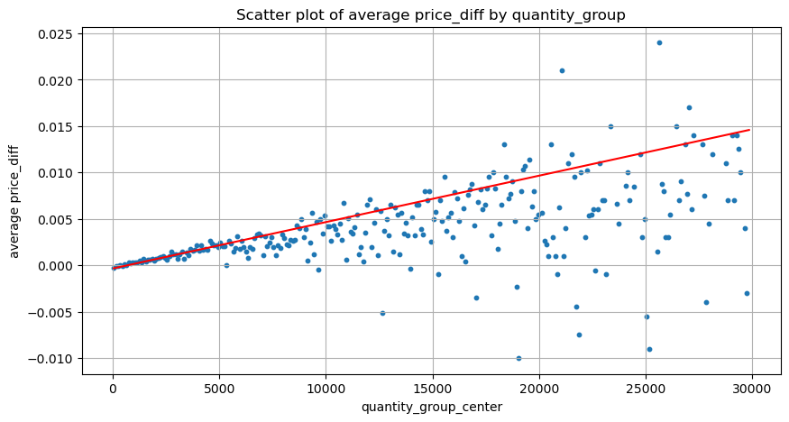
In this analysis, the data is sampled every 1 second, with each step representing 100 units of amount. We then calculated the price changes within this amount range. Here are some valuable conclusions:
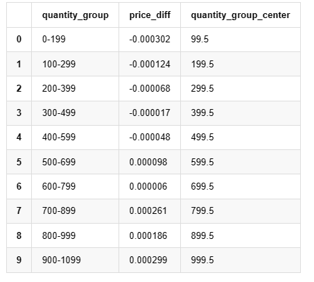
- When the buy order amount is below 500, the expected price change is a decrease, which is as expected since there are also sell orders impacting the price.
- At lower trade amounts, there is a linear relationship, meaning that the larger the trade amount, the greater the price increase.
- As the buy order amount increases, the price change becomes more significant. This often indicates a price breakthrough, which may later regress. Additionally, the fixed interval sampling adds to the data instability.
- It is important to pay attention to the upper part of the scatter plot, which corresponds to the increase in price with trade amount.
- For this specific trading pair, we provide a rough version of the relationship between trade amount and price change.

Where “C” represents the change in price and “Q” represents the amount of buy orders.
In [16]:
df_resampled = buy_trades.resample('1S').agg({
    'price': ['first', 'last', 'count'],
    'quantity': 'sum'
})
df_resampled['price_diff'] = round(df_resampled[('price', 'last')] - df_resampled[('price', 'first')],3)
df_resampled['price_diff'] = df_resampled['price_diff'].fillna(0)
result_df_raw = pd.DataFrame({
    'price_diff': df_resampled['price_diff'],
    'quantity_sum': df_resampled[('quantity', 'sum')],
    'data_count': df_resampled[('price', 'count')]
})
result_df = result_df_raw[result_df_raw['price_diff'] != 0]
In [24]:
df = result_df.copy()
bins = np.arange(0, 30000, 100)  #
labels = [f'{i}-{i+100-1}' for i in bins[:-1]]
df.loc[:, 'quantity_group'] = pd.cut(df['quantity_sum'], bins=bins, labels=labels)
grouped = df.groupby('quantity_group')['price_diff'].mean()
In [25]:
grouped_df = pd.DataFrame(grouped).reset_index()
grouped_df['quantity_group_center'] = grouped_df['quantity_group'].apply(lambda x: (float(x.split('-')[0]) + float(x.split('-')[1])) / 2)

plt.figure(figsize=(10,5))
plt.scatter(grouped_df['quantity_group_center'], grouped_df['price_diff'],s=10)
plt.plot(grouped_df['quantity_group_center'], np.array(grouped_df['quantity_group_center'].values)/2e6-0.000352,color='red')
plt.xlabel('quantity_group_center')
plt.ylabel('average price_diff')
plt.title('Scatter plot of average price_diff by quantity_group')
plt.grid(True)
Out[25]:
In [19]:
grouped_df.head(10)
Out[19]: , , , , , , , , , , , , , , , , , , , , , , , , , , , , , , , , , , , , , , , , , , , , , , , , , , , , , , , , , , , , , , , , , , , , , , , , ,
Preliminary Optimal Order Placement
With the modeling of trade amount and the rough model of price impact corresponding to trade amount, it seems possible to calculate the optimal order placement. Let’s make some assumptions and provide an irresponsible optimal price position.
- Assume that the price regresses to its original value after the impact (which is highly unlikely and would require further analysis of the price change after the impact).
- Assume that the distribution of trade amount and order frequency during this period follows a preset pattern (which is also inaccurate, as we are estimating based on one day’s data and trading exhibits clear clustering phenomena).
- Assume that only one sell order occurs during the simulated time and then is closed.
- Assume that after the order is executed, there are other buy orders that continue to push up the price, especially when the amount is very low. This effect is ignored here, and it is simply assumed that the price will regress.
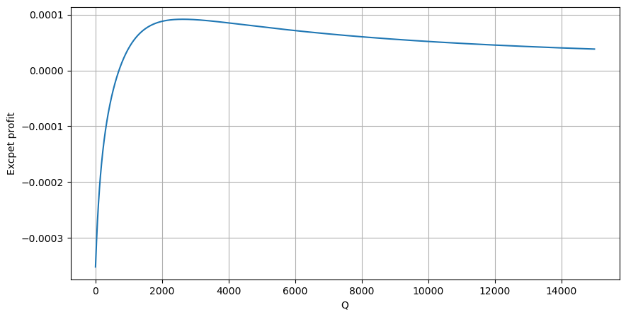
Let’s start by writing a simple expected return, which is the probability of cumulative buy orders exceeding Q within 1 second, multiplied by the expected return rate (i.e., the price impact).

Based on the graph, the maximum expected return is approximately 2500, which is about 2.5 times the average trade amount. This suggests that the sell order should be placed at a price position of 2500. It is important to emphasize that the horizontal axis represents trade amount within 1 second and should not be equated with depth position. Additionally, this analysis is based on trades data and lacks important depth data.
Summary
We have discovered that trade amount distribution at different time intervals is a simple scaling of the distribution of individual trade amounts. We have also developed a simple expected return model based on price impact and trade probability. The results of this model align with our expectations, showing that if the sell order amount is low, it indicates a price decrease, and a certain amount is needed for profit potential. The probability decreases as the trade amount increases, with an optimal size in between, which represents the optimal order placement strategy. However, this model is still too simplistic. In the next article, I will delve deeper into this topic.
In [20]:
# Cumulative distribution in 1s
df_resampled = buy_trades['quantity'].resample('1S').sum()
df_resampled = df_resampled.to_frame(name='quantity')
df_resampled = df_resampled[df_resampled['quantity']>0]

depths = np.array(range(0, 15000, 10))
mean = df_resampled['quantity'].mean()
alpha = np.log(np.mean(df_resampled['quantity'] > mean))/np.log(2.05)
probabilities_s = np.array([((1+20**(-depth/mean))*depth/mean+1)**(alpha) for depth in depths])
profit_s = np.array([depth/2e6-0.000352 for depth in depths])
plt.figure(figsize=(10, 5))
plt.plot(depths, probabilities_s*profit_s)
plt.xlabel('Q')
plt.ylabel('Excpet profit')
plt.grid(True)
Out[20]:
- FMZ Mobile APP Trading Terminal, empowering your quantitative trading experience
- FMZ手机APP交易终端,赋能你的量化交易体验
- Analysis and instructions for use about built-in function _Cross
- 用微笑曲线对比特币期权进行Delta对冲
- Thoughts on High-Frequency Trading Strategies (5)
- Thoughts on High-Frequency Trading Strategies (4)
- 高频交易策略的思考(5)
- 高频交易策略的思考(4)
- Thoughts on High-Frequency Trading Strategies (3)
- 高频交易策略的思考(3)
- 高频交易策略的思考(2)
- Thoughts on High-Frequency Trading Strategies (1)
- 高频交易策略的思考(1)
- Futu Securities Configuration Description Document
- FMZ Quant Uniswap V3 Exchange Pool Liquidity Related Operations Guide (Part 1)
- FMZ量化Uniswap V3兑换池流动性相关操作指南(一)
- Constructing Interactive Button Functions in the Strategy Status Bar
- Strategy Interface Parameter Settings
- FMZ Cryptocurrency Quantitative Platform WebSocket Usage Guide (Detailed Explanation of the Upgraded Dial Function)
- Crash Course in Python in X Minutes