8
Follow
1381
Followers
اس حکمت عملی کے چارٹ میں لکیریں کھینچنے کی منطق کو آسان بنا دیا گیا ہے، اب براہ راست پہلے سے تیار کردہ فنکشنز کو استعمال کیا جا سکتا ہے۔
- ایک سے زیادہ لکیریں کھینچنے کی حمایت
- کینڈل سٹک چارٹ کی حمایت
- فلیگ چھوٹے آئیکنز کی حمایت
- آپ مزید گرافکس کی حمایت بھی شامل کر سکتے ہیں
یہ فعالیت جے ایس ورژن کے برابر ہے۔
جے ایس ورژن سے لائین ڈرائنگ لائبریری کا پورٹ کیا گیا ہے۔
اگر کوئی مسئلہ ہو تو براہ کرم 小小梦 (Xiao Xiao Meng) سے 359706687 پر رابطہ کریں۔
Source
Python
# Python 2/3 兼容版本
import time
chart = None
series = []
labelIdx = {}
preBarTime = 0
preFlagTime = 0
preDotTime = {}

cfg = {
    "tooltip" : {
        "xDateFormat" : "%Y-%m-%d %H:%M:%S, %A"
    },
    "legend" : {
        "enabled" : True
    },
    "plotOptions" : {
        "candlestick" : {
            "color" : "#d75442",
            "upColor" : "#6ba583"
        }
    },
    "rangeSelector" : {
        "buttons" : [{
            "type" : "hour",
            "count" : 1,
            "text" : "1h",
        }, {
            "type" : 'hour',
            "count" : 3,
            "text" : "3h"
        }, {
            "type" : "hour",
            "count" : 8,
            "text" : "8h"
        }, {
            "type" : "all",
            "text" : "All"
        }],
        "selected" : 2,
        "inputEnabled" : True
    },
    "series" : series,
}

def GetCfg():
    global cfg
    return cfg

# 画水平线
def PlotHLine(value = None, label = None, color = None, style = None):
    global cfg, chart
    if ("yAxis" in cfg) == False :
        cfg.setdefault("yAxis", {"plotLines" : []})
    elif ("plotLines" in cfg["yAxis"]) == False :
        cfg["yAxis"].setdefault("plotLines", [])

    obj = {
        "value" : value,
        "color" : color or "red",
        "width" : 2,
        "dashStyle" : style or "Solid",
        "label" : {
            "text" : label or "",
            "align" : "center"
        }
    }
    found = False
    for i in range(len(cfg["yAxis"]["plotLines"])) :
        if cfg["yAxis"]["plotLines"][i]["label"]["text"] == label :
            cfg["yAxis"]["plotLines"][i] = obj
            found = True
    if not found :
        cfg["yAxis"]["plotLines"].append(obj)
    if not chart :
        chart = Chart(cfg)
        chart.update(cfg)    # 更新图表
    else :
        chart.update(cfg)

# 画K线
def PlotRecords(records, title = None):
    global labelIdx, series, preBarTime, chart
    if not chart :
        chart = Chart(cfg)
        chart.reset()
    if ("candlestick" in labelIdx) == False :
        cfg["__isStock"] = True
        seriesIdx = len(series)
        series.append({
            "type" : "candlestick",
            "name" : "" if title == None else title,
            "id" : "primary",
            "data" : []
            })
        chart.update(cfg)
        labelIdx.setdefault("candlestick", seriesIdx)
    else :
        seriesIdx = labelIdx["candlestick"]
    if isinstance(records, dict) and ("Time" in records) == True :
        Bar = records
        if Bar["Time"] == preBarTime :
            chart.add(seriesIdx, [Bar["Time"], Bar["Open"], Bar["High"], Bar["Low"], Bar["Close"]], -1)
        elif Bar["Time"] > preBarTime :
            preBarTime = Bar.Time
            chart.add(seriesIdx, [Bar["Time"], Bar["Open"], Bar["High"], Bar["Low"], Bar["Close"]])
    else :
        for i in range(len(records)) :
            if records[i]["Time"] == preBarTime :
                chart.add(seriesIdx, [records[i]["Time"], records[i]["Open"], records[i]["High"], records[i]["Low"], records[i]["Close"]], -1)
            elif records[i]["Time"] > preBarTime :
                preBarTime = records[i]["Time"]
                chart.add(seriesIdx, [records[i]["Time"], records[i]["Open"], records[i]["High"], records[i]["Low"], records[i]["Close"]])
    return chart

# 画指标线
def PlotLine(label, dot, Ntime = None):
    global labelIdx, chart, series, preDotTime
    if not chart :
        cfg.setdefault("xAxis", {
            "type" : "datetime"
            })
        chart = Chart(cfg)
        chart.reset()
    if (label in labelIdx) == False :
        seriesIdx = len(series)
        preDotTime.setdefault(str(seriesIdx), 0)
        labelIdx[label] = seriesIdx
        series.append({
            "type" : "line",
            "yAxis" : 0,
            "showInLegend" : True,
            "name" : label,
            "data" : [],
            "tooltip" : {"valueDecimals" : 5}
            })
        chart.update(cfg)
    else :
        seriesIdx = labelIdx[label]
    if Ntime == None :
        Ntime = _N(time.time() * 1000, 0)
    if preDotTime[str(seriesIdx)] != Ntime :
        preDotTime[str(seriesIdx)] = Ntime
        chart.add(seriesIdx, [Ntime, dot])
    else :
        chart.add(seriesIdx, [Ntime, dot], -1)
    return chart

# 画标记
def PlotFlag(time, text, title, shape = "", color = ""):
    global chart, cfg, labelIdx, preFlagTime
    if not chart :
        chart = Chart(cfg)
        chart.reset()
    label = "flag"
    if (label in labelIdx) == False :
        seriesIdx = len(series)
        labelIdx[label] = seriesIdx
        series.append({
            "type" : "flags",
            "onSeries" : "primary",
            "data" : []
            })
        chart.update(cfg)
    else :
        seriesIdx = labelIdx[label]
    obj = {
        "x" : time,
        "color" : color,
        "shape" : shape,
        "title" : title,
        "text" : text
    }
    if preFlagTime != time :
        preFlagTime = time
        chart.add(seriesIdx, obj)
    else :
        chart.add(seriesIdx, obj, -1)
    return chart

# 设置图表标题
def PlotTitle(title, chartTitle = None):
    global cfg
    if ("subtitle" in cfg) == True :
        cfg["subtitle"] = {"text" : title}
    else :
        cfg.setdefault("subtitle", {"text" : title})
    if chartTitle != None :
        if (title in cfg) == True :
            cfg["title"] = {"text" : chartTitle}
        else :
            cfg.setdefault("title", {"text" : chartTitle})
    if chart :
        chart.update(cfg)

# 导出函数
ext.GetCfg = GetCfg
ext.PlotHLine = PlotHLine
ext.PlotRecords = PlotRecords
ext.PlotLine = PlotLine
ext.PlotFlag = PlotFlag
ext.PlotTitle = PlotTitle

# 测试代码
def main():
    isFirst = True
    while True:
        records = exchange.GetRecords()
        if records and len(records) > 0 :
            ext.PlotRecords(records, "BTC")
            if isFirst :
                ext.PlotFlag(records[-1]["Time"], "Start", "S")
                isFirst = False
                ext.PlotHLine(records[-1]["Close"], "Close")
        ticker = exchange.GetTicker()
        if ticker :
            ext.PlotLine("Last", ticker.Last)
            ext.PlotLine("buy", ticker.Buy + 10)
            ext.PlotTitle("Last" + str(ticker.Last))
        Sleep(60000)
Related strategies
Comment
All comments (14)


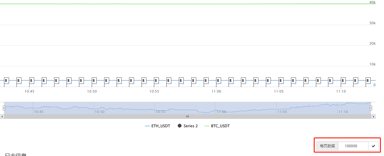
上图您标记的这个只是FMZ页面上,每个分页显示的数据数量,一个图表如果有10万条数据,你这里设置每个分页显示10000条,这10万条数据就会分开10页显示。这个设置和你的代码设计无关。只是 FMZ页面显示的控制而已。
4 years ago


可以找你定制一个走势图吗?把几条k线集合到一个图标上;例如:btc价格线+ltc价格线+eth价格线+多币种综合价格线等,就几条线都在一个图上,就跟k线图上的几条均价线一样,都显示在同一个图上
8 years ago

- 1