
1
Follow
1781
Followers
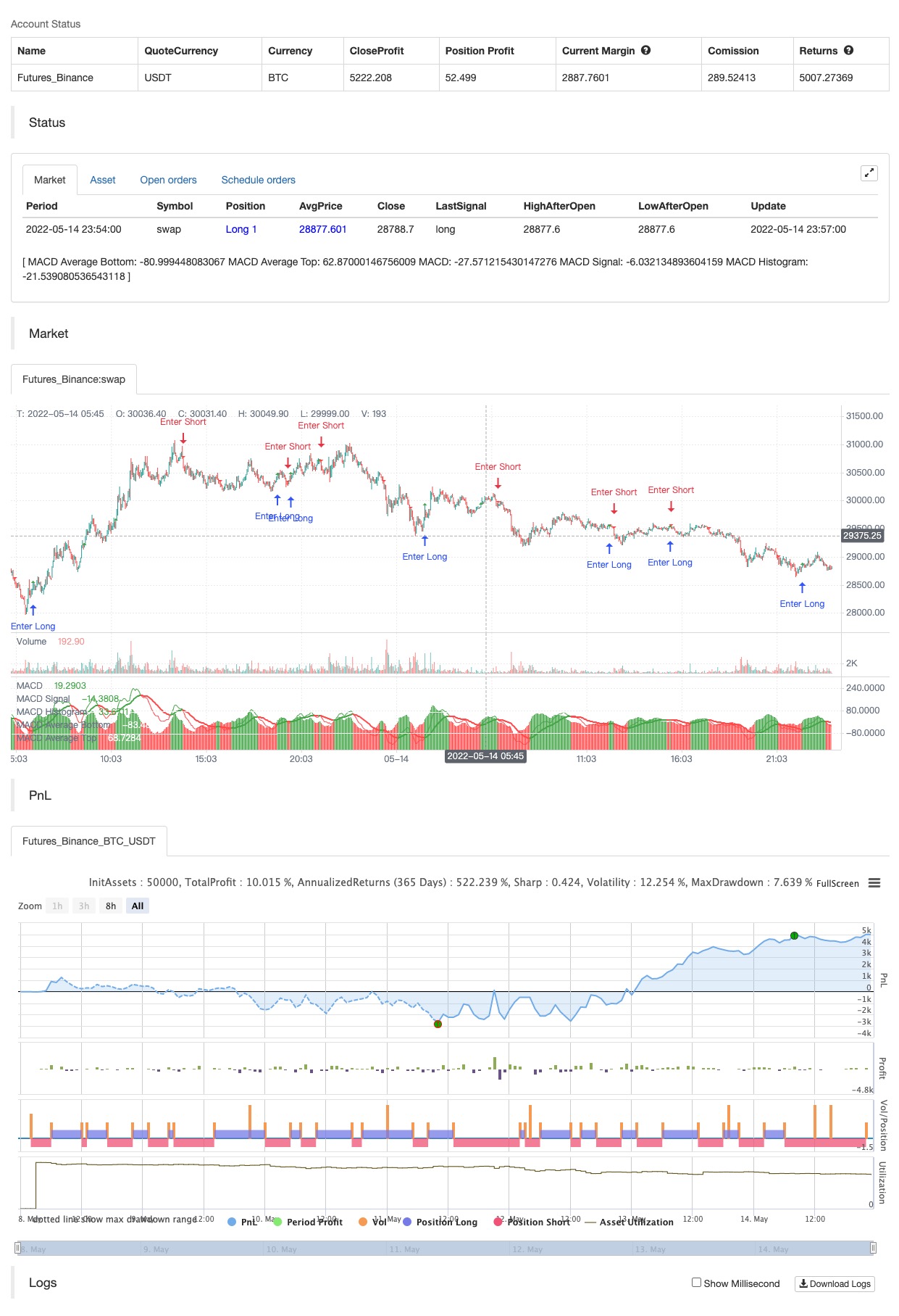
A classic MACD with average peak and dip lines. The lighter green and red horizontal lines are the average peak and dip of the entire span, respectively. The second, bolder of the two lines are the averages of the peaks and dips above and below the overall peak and dip averages. The filled in color is to help visualize these averages and possible trade setups. Rework of the MACD + Averages script.
backtest
Source
Pine
/*backtest
start: 2022-05-08 00:00:00
end: 2022-05-14 23:59:00
period: 3m
basePeriod: 1m
exchanges: [{"eid":"Futures_Binance","currency":"BTC_USDT"}]
*/

//@version=4
//@author=Cryptonaut
//@ Cryptonaut
study("Smarter MACD", max_bars_back=500, max_labels_count=500, overlay=false, shorttitle="Smarter MACD")Strategy parameters
Related strategies
Comment
All comments (0)
No data
- 1