Quantity price distribution chart: Watch the distribution of the chips to get an insight into average costs
Author: Little white cabbage, Created: 2022-06-21 18:20:24, Updated:A stock exchange's chip spread chart, also known as a digital currency's quantity spread chart or turnover spread chart, is a high-level chart study that shows trading activity at a specified price level over a specified period of time. Essentially, a turnover spread chart captures the total volume of transactions at a specific price level over a specified period of time and divides the total volume into buy or sell volumes, which allows traders to easily see the information.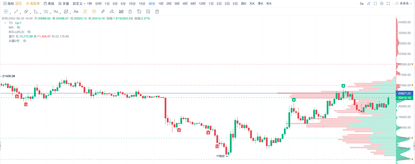
Calculation method Divide the price range across all visible K-line columns on the current page evenly into several small price ranges, stating the number of transactions within each small price range, the longer the column. The larger the volume. Generally, red is the volume of transactions sold, green is the volume of transactions bought. Application rules 1. Transaction volumes plotted on the price chart, showing how much trading activity occurred at each price level during the trading period, pointing to prices favored by the market and prices ignored by the market, which gives some clues as to where future prices may be heading.
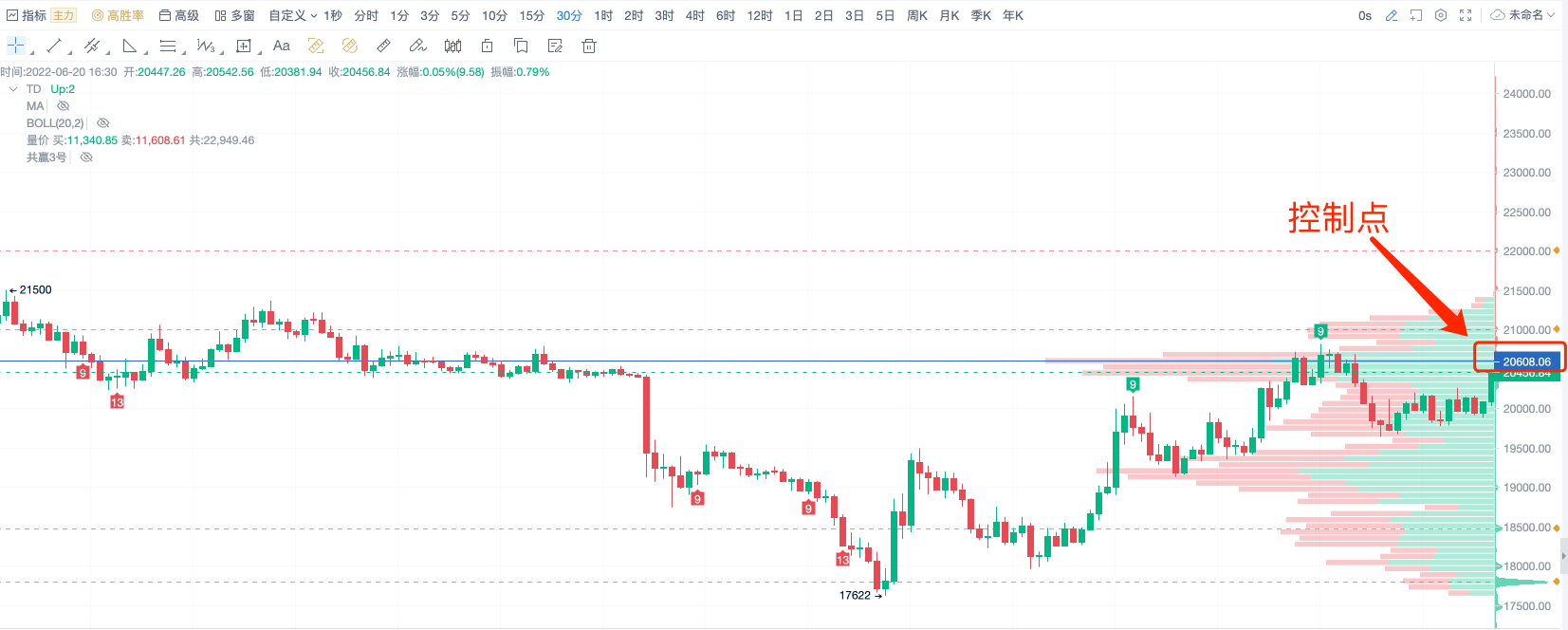
2.控制点(默认为蓝色价格标签线)和价格区间的形成可以指出价格未来的走势如果当前价格在控制点下,做多;如果价格在控制点之上,做空。
 3.由于成交量分布的动态特性,它可以成为寻找潜在的出入场节点的工具。低交易量节点可以提供较好的入场点,因为他们代表过去被忽略的价格:而高交易量节点可以提供出场点的大概率位置,因为市场预期已经发现前期较有吸引力的价格,这代表卖的好机会。
- MACD, the king of the indicators, is the one who has the biggest household denomination indicator.
- How to order through FMZ
- The new version of the TV reset icon is not convenient.
- MyLanguage Doc
- The most advanced way to trade: master the order wall!
- What is the unit of volume?
- Which of the following is the most recent year-over-year increase in the overhead and reverse overhead rates?
- Problems with tradingview: Always delay 1 to 2 seconds between signal to FMZ
- How to operate multiple accounts on one disk
- WeChat can't receive a policy alert?
- Problems with disk error reporting
- Why can't small currencies be recalculated?
- The grid strategy
- Return to the latest strategy of cash multi-currency hedging
- There is a bear market, there is no strategy to run
- Interest on capital charges
- Today's laughing incident (transliterated)
- The telegraph cluster suddenly stopped going in.
- Civilian gamers, is there a balancing strategy written by God?
- What interface can be used to get the market value of the currencies?
ScienceThat's good.
Little white cabbageI'm not being polite, I'm overreacting!
ChaoZhangVery helpful. Thank you.
Black and white.I'm going to read it, and then what?
xaifer48The exchange does not support transaction charting on the price chart. What platform or software class are you on? Can you explain?
Little white cabbageThis indicator can be used.