8
Follow
1381
Followers
Đã đơn giản hóa logic vẽ đường trên biểu đồ chiến lược, có thể gọi trực tiếp các hàm đã được đóng gói
- Hỗ trợ vẽ nhiều đường
- Hỗ trợ biểu đồ nến
- Hỗ trợ biểu tượng cờ nhỏ
- Bạn cũng có thể thêm hỗ trợ cho nhiều đồ thị hơn
Chức năng tương đương phiên bản JS
Được chuyển từ thư viện vẽ đường phiên bản JS
Nếu có thắc mắc, vui lòng liên hệ Tiểu Tiểu Mộng 359706687
Source
Python
# Python 2/3 兼容版本
import time
chart = None
series = []
labelIdx = {}
preBarTime = 0
preFlagTime = 0
preDotTime = {}

cfg = {
    "tooltip" : {
        "xDateFormat" : "%Y-%m-%d %H:%M:%S, %A"
    },
    "legend" : {
        "enabled" : True
    },
    "plotOptions" : {
        "candlestick" : {
            "color" : "#d75442",
            "upColor" : "#6ba583"
        }
    },
    "rangeSelector" : {
        "buttons" : [{
            "type" : "hour",
            "count" : 1,
            "text" : "1h",
        }, {
            "type" : 'hour',
            "count" : 3,
            "text" : "3h"
        }, {
            "type" : "hour",
            "count" : 8,
            "text" : "8h"
        }, {
            "type" : "all",
            "text" : "All"
        }],
        "selected" : 2,
        "inputEnabled" : True
    },
    "series" : series,
}

def GetCfg():
    global cfg
    return cfg

# 画水平线
def PlotHLine(value = None, label = None, color = None, style = None):
    global cfg, chart
    if ("yAxis" in cfg) == False :
        cfg.setdefault("yAxis", {"plotLines" : []})
    elif ("plotLines" in cfg["yAxis"]) == False :
        cfg["yAxis"].setdefault("plotLines", [])

    obj = {
        "value" : value,
        "color" : color or "red",
        "width" : 2,
        "dashStyle" : style or "Solid",
        "label" : {
            "text" : label or "",
            "align" : "center"
        }
    }
    found = False
    for i in range(len(cfg["yAxis"]["plotLines"])) :
        if cfg["yAxis"]["plotLines"][i]["label"]["text"] == label :
            cfg["yAxis"]["plotLines"][i] = obj
            found = True
    if not found :
        cfg["yAxis"]["plotLines"].append(obj)
    if not chart :
        chart = Chart(cfg)
        chart.update(cfg)    # 更新图表
    else :
        chart.update(cfg)

# 画K线
def PlotRecords(records, title = None):
    global labelIdx, series, preBarTime, chart
    if not chart :
        chart = Chart(cfg)
        chart.reset()
    if ("candlestick" in labelIdx) == False :
        cfg["__isStock"] = True
        seriesIdx = len(series)
        series.append({
            "type" : "candlestick",
            "name" : "" if title == None else title,
            "id" : "primary",
            "data" : []
            })
        chart.update(cfg)
        labelIdx.setdefault("candlestick", seriesIdx)
    else :
        seriesIdx = labelIdx["candlestick"]
    if isinstance(records, dict) and ("Time" in records) == True :
        Bar = records
        if Bar["Time"] == preBarTime :
            chart.add(seriesIdx, [Bar["Time"], Bar["Open"], Bar["High"], Bar["Low"], Bar["Close"]], -1)
        elif Bar["Time"] > preBarTime :
            preBarTime = Bar.Time
            chart.add(seriesIdx, [Bar["Time"], Bar["Open"], Bar["High"], Bar["Low"], Bar["Close"]])
    else :
        for i in range(len(records)) :
            if records[i]["Time"] == preBarTime :
                chart.add(seriesIdx, [records[i]["Time"], records[i]["Open"], records[i]["High"], records[i]["Low"], records[i]["Close"]], -1)
            elif records[i]["Time"] > preBarTime :
                preBarTime = records[i]["Time"]
                chart.add(seriesIdx, [records[i]["Time"], records[i]["Open"], records[i]["High"], records[i]["Low"], records[i]["Close"]])
    return chart

# 画指标线
def PlotLine(label, dot, Ntime = None):
    global labelIdx, chart, series, preDotTime
    if not chart :
        cfg.setdefault("xAxis", {
            "type" : "datetime"
            })
        chart = Chart(cfg)
        chart.reset()
    if (label in labelIdx) == False :
        seriesIdx = len(series)
        preDotTime.setdefault(str(seriesIdx), 0)
        labelIdx[label] = seriesIdx
        series.append({
            "type" : "line",
            "yAxis" : 0,
            "showInLegend" : True,
            "name" : label,
            "data" : [],
            "tooltip" : {"valueDecimals" : 5}
            })
        chart.update(cfg)
    else :
        seriesIdx = labelIdx[label]
    if Ntime == None :
        Ntime = _N(time.time() * 1000, 0)
    if preDotTime[str(seriesIdx)] != Ntime :
        preDotTime[str(seriesIdx)] = Ntime
        chart.add(seriesIdx, [Ntime, dot])
    else :
        chart.add(seriesIdx, [Ntime, dot], -1)
    return chart

# 画标记
def PlotFlag(time, text, title, shape = "", color = ""):
    global chart, cfg, labelIdx, preFlagTime
    if not chart :
        chart = Chart(cfg)
        chart.reset()
    label = "flag"
    if (label in labelIdx) == False :
        seriesIdx = len(series)
        labelIdx[label] = seriesIdx
        series.append({
            "type" : "flags",
            "onSeries" : "primary",
            "data" : []
            })
        chart.update(cfg)
    else :
        seriesIdx = labelIdx[label]
    obj = {
        "x" : time,
        "color" : color,
        "shape" : shape,
        "title" : title,
        "text" : text
    }
    if preFlagTime != time :
        preFlagTime = time
        chart.add(seriesIdx, obj)
    else :
        chart.add(seriesIdx, obj, -1)
    return chart

# 设置图表标题
def PlotTitle(title, chartTitle = None):
    global cfg
    if ("subtitle" in cfg) == True :
        cfg["subtitle"] = {"text" : title}
    else :
        cfg.setdefault("subtitle", {"text" : title})
    if chartTitle != None :
        if (title in cfg) == True :
            cfg["title"] = {"text" : chartTitle}
        else :
            cfg.setdefault("title", {"text" : chartTitle})
    if chart :
        chart.update(cfg)

# 导出函数
ext.GetCfg = GetCfg
ext.PlotHLine = PlotHLine
ext.PlotRecords = PlotRecords
ext.PlotLine = PlotLine
ext.PlotFlag = PlotFlag
ext.PlotTitle = PlotTitle

# 测试代码
def main():
    isFirst = True
    while True:
        records = exchange.GetRecords()
        if records and len(records) > 0 :
            ext.PlotRecords(records, "BTC")
            if isFirst :
                ext.PlotFlag(records[-1]["Time"], "Start", "S")
                isFirst = False
                ext.PlotHLine(records[-1]["Close"], "Close")
        ticker = exchange.GetTicker()
        if ticker :
            ext.PlotLine("Last", ticker.Last)
            ext.PlotLine("buy", ticker.Buy + 10)
            ext.PlotTitle("Last" + str(ticker.Last))
        Sleep(60000)
Related strategies
Comment
All comments (14)


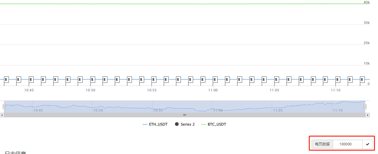
上图您标记的这个只是FMZ页面上,每个分页显示的数据数量,一个图表如果有10万条数据,你这里设置每个分页显示10000条,这10万条数据就会分开10页显示。这个设置和你的代码设计无关。只是 FMZ页面显示的控制而已。
4 years ago


可以找你定制一个走势图吗?把几条k线集合到一个图标上;例如:btc价格线+ltc价格线+eth价格线+多币种综合价格线等,就几条线都在一个图上,就跟k线图上的几条均价线一样,都显示在同一个图上
8 years ago

- 1