 ["abc", "def", {"type": "button", "cmd": "coverAll", "name": "close position"}]
      ]
  })"_json;

  auto ticker = exchange.GetTicker();
  json jsonTicker = R"({"Buy": 0, "Sell": 0, "High": 0, "Low": 0, "Volume": 0, "Last": 0, "Time": 0})"_json;
  jsonTicker["Buy"] = ticker.Buy;
  jsonTicker["Sell"] = ticker.Sell;
  jsonTicker["Last"] = ticker.Last;
  jsonTicker["Volume"] = ticker.Volume;
  jsonTicker["Time"] = ticker.Time;
  jsonTicker["High"] = ticker.High;
  jsonTicker["Low"] = ticker.Low;

  json arr = R"([{"body": {}, "colspan": 2}, "abc"])"_json;
  arr[0]["body"] = jsonTicker;
  table["rows"].push_back(arr);
  LogStatus("`" + table.dump() + "`");
}
)
- Vertical merger
```js
function main() {
var table = {
type: 'table',
title: 'Table demo',
cols: ['ColumnA', 'ColumnB', 'ColumnC'],
rows: [
['A1', 'B1', {'type':'button', 'cmd': 'coverAll', 'name': 'C1'}]
]
}
var ticker = exchange.GetTicker()
var name = exchange.GetName()
table.rows.push([{body : "A2 + B2:" + JSON.stringify(ticker), colspan : 2}, "C2"])
table.rows.push([{body : "A3 + A4 + A5:" + name, rowspan : 3}, "B3", "C3"])
// A3 is merged by the first cell in the previous row
table.rows.push(["B4", "C4"])
// A2 is merged by the first cell in the previous row
table.rows.push(["B5", "C5"])
table.rows.push(["A6", "B6", "C6"])
LogStatus('`' + JSON.stringify(table) + '`')
}
import json
def main():
    table = {
        "type" : "table",
        "title" : "Table demo",
        "cols" : ["ColumnA", "ColumnB", "ColumnC"],
        "rows" : [
            ["A1", "B1", {"type": "button", "cmd": "coverAll", "name": "C1"}]
        ]
    }

    ticker = exchange.GetTicker()
    name = exchange.GetName()

    table["rows"].append([{"body": "A2 + B2:" + json.dumps(ticker), "colspan": 2}, "C2"])
    table["rows"].append([{"body": "A3 + A4 + A5:" + name, "rowspan": 3}, "B3", "C3"])
    table["rows"].append(["B4", "C4"])
    table["rows"].append(["B5", "C5"])
    table["rows"].append(["A6", "B6", "C6"])
    LogStatus("`" + json.dumps(table) + "`")
void main() {
    json table = R"({
        "type" : "table",
        "title" : "Table demo",
        "cols" : ["ColumnA", "ColumnB", "ColumnC"],
        "rows" : [
            ["A1", "B1", {"type": "button", "cmd": "coverAll", "name": "C1"}]
        ]
    })"_json;
    // In order to test, the code is short and easy to read, and the constructed data is used here
    json jsonTicker = R"({"High": 0, "Low": 0, "Buy": 0, "Sell": 0, "Last": 0, "Time": 0, "Volume": 0})"_json;
    auto name = exchange.GetName();
    json arr1 = R"([{"body": "", "colspan": 2}, "C2"])"_json;
    arr1[0]["body"] = "A2 + B2:" + jsonTicker.dump();
    json arr2 = R"([{"body": "", "rowspan": 3}, "B3", "C3"])"_json;
    arr2[0]["body"] = "A3 + A4 + A5:" + name;
    table["rows"].push_back(arr1);
    table["rows"].push_back(arr2);
    table["rows"].push_back(R"(["B4", "C4"])"_json);
    table["rows"].push_back(R"(["B5", "C5"])"_json);
    table["rows"].push_back(R"(["A6", "B6", "C6"])"_json);
    LogStatus("`" + table.dump() + "`");
}
)
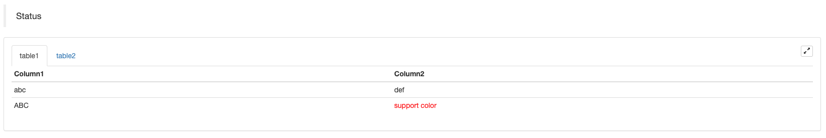
অবস্থা বারের টেবিল পেইজিং প্রদর্শনঃ
function main() {
    var table1 = {type: 'table', title: 'table1', cols: ['Column1', 'Column2'], rows: [ ['abc', 'def'], ['ABC', 'support color #ff0000']]}
    var table2 = {type: 'table', title: 'table2', cols: ['Column1', 'Column2'], rows: [ ['abc', 'def'], ['ABC', 'support color #ff0000']]}
    LogStatus('`' + JSON.stringify([table1, table2]) + '`')
}
import json
def main():
    table1 = {"type": "table", "title": "table1", "cols": ["Column1", "Column2"], "rows": [ ["abc", "def"], ["ABC", "support color #ff0000"]]}
    table2 = {"type": "table", "title": "table2", "cols": ["Column1", "Column2"], "rows": [ ["abc", "def"], ["ABC", "support color #ff0000"]]}
    LogStatus("`" + json.dumps([table1, table2]) + "`")
void main() {
    json table1 = R"({"type": "table", "title": "table1", "cols": ["Column1", "Column2"], "rows": [ ["abc", "def"], ["ABC", "support color #ff0000"]]})"_json;
    json table2 = R"({"type": "table", "title": "table2", "cols": ["Column1", "Column2"], "rows": [ ["abc", "def"], ["ABC", "support color #ff0000"]]})"_json;
    json arr = R"([])"_json;
    arr.push_back(table1);
    arr.push_back(table2);
    LogStatus("`" + arr.dump() + "`");
}
পাতা পাতা করার পাশাপাশি, একাধিক টেবিল উপরে থেকে নীচে সাজানো যেতে পারে।
function main(){
    var tab1 = {
        type : "table",
        title : "table1",
        cols : ["1", "2"],
        rows : []
    }
    var tab2 = {
        type : "table",
        title : "table2",
        cols : ["1", "2", "3"],
        rows : []
    }
    var tab3 = {
        type : "table",
        title : "table3",
        cols : ["A", "B", "C"],
        rows : []
    }

    tab1.rows.push(["jack", "lucy"])
    tab2.rows.push(["A", "B", "C"])
    tab3.rows.push(["A", "B", "C"])

    LogStatus('`' + JSON.stringify(tab1) + '`\n' +
        '`' + JSON.stringify(tab2) + '`\n' +
        '`' + JSON.stringify(tab3) + '`')

    Log("exit")
}
import json
def main():
    tab1 = {
        "type": "table",
        "title": "table1",
        "cols": ["1", "2"],
        "rows": []
    }
    tab2 = {
        "type": "table",
        "title": "table2",
        "cols": ["1", "2", "3"],
        "rows": []
    }
    tab3 = {
        "type": "table",
        "title": "table3",
        "cols": ["A", "B", "C"],
        "rows": []
    }

    tab1["rows"].append(["jack", "lucy"])
    tab2["rows"].append(["A", "B", "C"])
    tab3["rows"].append(["A", "B", "C"])
    LogStatus("`" + json.dumps(tab1) + "`\n" +
        "`" + json.dumps(tab2) + "`\n" +
        "`" + json.dumps(tab3) + "`")
void main() {
    json tab1 = R"({
        "type": "table",
        "title": "table1",
        "cols": ["1", "2"],
        "rows": []
    })"_json;
    json tab2 = R"({
        "type": "table",
        "title": "table2",
        "cols": ["1", "2", "3"],
        "rows": []
    })"_json;
    json tab3 = R"({
        "type": "table",
        "title": "table3",
        "cols": ["A", "B", "C"],
        "rows": []
    })"_json;
    tab1["rows"].push_back(R"(["jack", "lucy"])"_json);
    tab2["rows"].push_back(R"(["A", "B", "C"])"_json);
    tab3["rows"].push_back(R"(["A", "B", "C"])"_json);
    LogStatus("`" + tab1.dump() + "`\n" +
        "`" + tab2.dump() + "`\n" +
        "`" + tab3.dump() + "`");
}
অপারেশন ফলাফলঃ)
নোটঃ
যখন কৌশল বটটি বট পৃষ্ঠায় চলছে, আপনি যদি ইতিহাস রেকর্ডগুলির মধ্য দিয়ে স্ক্রোল করেন, তবে স্ট্যাটাস বারটি একটি নিষ্ক্রিয় অবস্থায় প্রবেশ করবে এবং আপডেট করা বন্ধ করবে। স্ট্যাটাস বার ডেটা শুধুমাত্র যখন লগটি প্রথম পৃষ্ঠায় থাকে তখনই রিফ্রেশ হবে।
স্ট্যাটাস বারে কোডেড ছবি আউটপুট সমর্থন করেbase64, এবং এছাড়াও কোডেড ইমেজ আউটপুট সমর্থনbase64প্রদর্শিত ট্যাবলেটগুলিতে। যেহেতু কোডযুক্ত চিত্রের স্ট্রিংয়ের দৈর্ঘ্য সাধারণত খুব দীর্ঘ, তাই কোনও নমুনা কোড সরবরাহ করা হয় না।
EnableLog ((()
EnableLog(IsEnable)অর্ডার তথ্যের জন্য লগ রেকর্ডিং চালু বা বন্ধ করে দেয়। প্যারামিটার মানঃisEnableহল বুল টাইপ. যদিIsEnableসেট করা আছেfalse, অর্ডার লগটি মুদ্রণ করা হবে না এবং এটি বট ডাটাবেসে লেখা হবে না।
চার্ট ((...)
Chart(...), চার্ট অঙ্কন কাস্টমাইজ করার ফাংশন।
Chart({…})প্যারামিটার হলHighCharts.StockChartপ্যারামিটারহাইস্টকসযে সিরিয়ালাইজ করা যাবেJSON, একটি যোগ করে_isStockযদি আপনি নির্দিষ্ট_isStock:false, এটি একটি সাধারণ চার্ট হিসাবে প্রদর্শিত হবে।
নোটঃ
আপনি যদি এর বৈশিষ্ট্যটি সেট করেন_isStockথেকেfalse, ব্যবহৃত চার্ট হল:হাইচার্ট, যেমনটা চার্ট থেকে দেখা যাচ্ছে:
)
যদি আমরা এর বৈশিষ্ট্যটি সেট করি_isStockথেকেtrue, ব্যবহৃত চার্ট হল:হাইস্টক(ডিফল্ট)_isStockযেমনটি চার্টে দেখানো হয়েছেঃ
)
বস্তুর কাছে ফিরে আসার জন্য, আপনি কল করতে পারেনadd(n, data) (n(যেমন ০) হ'লseries, এবংdataএই সূচকে তথ্য যোগ করার জন্য) ।series; কলreset()চার্ট ডেটা সাফ করার জন্য, এবংresetএকটি সংখ্যাসূচক পরামিতি নিতে পারে এবং সংরক্ষিত আইটেম সংখ্যা নির্দিষ্ট করতে পারে।
আপনি কল করতে পারেনadd(n, data, i) (iএই তথ্যের সূচকseries) সংশ্লিষ্ট তথ্য পরিবর্তন করতেseries.
এটি নেতিবাচক হতে পারে,
chart.add(0, [1574993606000, 13.5], -1), এর শেষ বিন্দুর তথ্য পরিবর্তন করুনseries[0].data.
এটি একাধিক চার্ট প্রদর্শন করতে সমর্থন করে, আপনি শুধুমাত্র কনফিগারেশনের সময় অ্যারে পরামিতি পাস করতে হবে, যেমনঃvar chart = Chart([{…}, {…}, {…}])উদাহরণস্বরূপ, চার্ট ১-এ দুটিseries, চার্ট ২ এর একটি আছেseries, এবং চার্ট 3 এক আছেseries. তারপর, সিরিজ আইডি 0 এবং 1 উল্লেখ যখন যোগ করা হয় আপডেট করার জন্য প্রতিনিধিত্ব করে দুই অর্ডার চার্ট 1 কলাম; সিরিজ আইডি 2 উল্লেখ যখন যোগ করা হয় প্রথম বোঝায়seriesচার্ট ২ এর তথ্য; সিরিজ ID3 উল্লেখ করে প্রথমseriesচার্ট ৩-এর
HighStocks: http://api.highcharts.com/highstock
মাল্টি-চার্ট প্রদর্শনের সাথে সম্পর্কিত অ্যাট্রিবিউট সেটিংসঃউদাহরণ
উদাহরণস্বরূপ, চার্ট কনফিগারেশন বস্তুঃ
var cfgA = {
    extension: {
        // It does not participate in grouping, displayed separately, and its default is 'group'
        layout: 'single',
        // This is the specified height, which can be set to string "300px" (set "300", and "300px" will be displayed instead automatically)
        height: 300,
        // It is the unit value of the specified width, with a total value of 12
        col: 8
    },
    title: {
        text: 'Market Chart'
    },
    xAxis: {
        type: 'datetime'
    },
    series: [{
        name: 'Buy 1',
        data: []
    }, {
        name: 'Sell 1',
        data: []
    }]
}

var cfgB = {
    title: {
        text: 'Spread chart'
    },
    xAxis: {
        type: 'datetime'
    },
    series: [{
        name: 'Spread',
        type: 'column',
        data: []
    }]
}

var cfgC = {
    _isStock: false,
    title: {
        text: 'Pie Chart'
    },
    series: [{
        type: 'pie',
        name: 'one',
        // After specifying the initial data, you don't need to update it with the "add" function; Changing the chart configuration directly will update the series
        data: [
            ["A", 25],
            ["B", 25],
            ["C", 25],
            ["D", 25]
        ]
    }]
}

var cfgD = {
    extension: {
        layout: 'single',
        // The unit value of the specified width, with a total value of 12
        col: 8,
        height: '300px'
    },
    title: {
        text: 'Market Chart'
    },
    xAxis: {
        type: 'datetime'
    },
    series: [{
        name: 'Buy 1',
        data: []
    }, {
        name: 'Sell 1',
        data: []
    }]
}

var cfgE = {
    __isStock: false,
    extension: {
        layout: 'single',
        col: 4,
        height: '300px'
    },
    title: {
        text: 'Pie Chart2'
    },
    series: [{
        type: 'pie',
        name: 'one',
        data: [
            ["A", 25],
            ["B", 25],
            ["C", 25],
            ["D", 25]
        ]
    }]
}
cfgA = {
    "extension" : {
        "layout" : "single",
        "height" : 300,
        "col" : 8
    },
    "title" : {
        "text" : "Market Chart"
    },
    "xAxis" : {
        "type" : "datetime"
    },
    "series" : [{
        "name" : "Buy 1",
        "data" : []
    }, {
        "name" : "Sell 1",
        "data" : []
    }]
}

cfgB = {
    "title" : {
        "text" : "Spread chart"
    },
    "xAxis" : {
        "type" : "datetime"
    },
    "series" : [{
        "name" : "Spread",
        "type" : "column",
        "data" : []
    }]
}

cfgC = {
    "__isStock" : False,
    "title" : {
        "text" : "Pie Chart"
    },
    "series" : [{
        "type" : "pie",
        "name" : "one",
        "data" : [
            ["A", 25],
            ["B", 25],
            ["C", 25],
            ["D", 25]
        ]
    }]
}

cfgD = {
    "extension" : {
        "layout" : "single",
        "col" : 8,
        "height" : "300px"
    },
    "title" : {
        "text" : "Market Chart"
    },
    "series" : [{
        "name" : "Buy 1",
        "data" : []
    }, {
        "name" : "Sell 1",
        "data" : []
    }]
}

cfgE = {
    "__isStock" : False,
    "extension" : {
        "layout" : "single",
        "col" : 4,
        "height" : "300px"
    },
    "title" : {
        "text" : "Pie Chart2"
    },
    "series" : [{
        "type" : "pie",
        "name" : "one",
        "data" : [
            ["A", 25],
            ["B", 25],
            ["C", 25],
            ["D", 25]
        ]
    }]
}
json cfgA = R"({
    "extension" : {
        "layout" : "single",
        "height" : 300,
        "col" : 8
    },
    "title" : {
        "text" : "Market Chart"
    },
    "xAxis" : {
        "type" : "datetime"
    },
    "series" : [{
        "name" : "Buy 1",
        "data" : []
    }, {
        "name" : "Sell 1",
        "data" : []
    }]
})"_json;

json cfgB = R"({
    "title" : {
        "text" : "Spread chart"
    },
    "xAxis" : {
        "type" : "datetime"
    },
    "series" : [{
        "name" : "Spread",
        "type" : "column",
        "data" : []
    }]
})"_json;

json cfgC = R"({
    "__isStock" : false,
    "title" : {
        "text" : "Pie Chart"
    },
    "series" : [{
        "type" : "pie",
        "name" : "one",
        "data" : [
            ["A", 25],
            ["B", 25],
            ["C", 25],
            ["D", 25]
        ]
    }]
})"_json;

json cfgD = R"({
    "extension" : {
        "layout" : "single",
        "col" : 8,
        "height" : "300px"
    },
    "title" : {
        "text" : "Market Chart"
    },
    "series" : [{
        "name" : "Buy 1",
        "data" : []
    }, {
        "name" : "Sell 1",
        "data" : []
    }]
})"_json;

json cfgE = R"({
    "__isStock" : false,
    "extension" : {
        "layout" : "single",
        "col" : 4,
        "height" : "300px"
    },
    "title" : {
        "text" : "Pie Chart2"
    },
    "series" : [{
        "type" : "pie",
        "name" : "one",
        "data" : [
            ["A", 25],
            ["B", 25],
            ["C", 25],
            ["D", 25]
        ]
    }]
})"_json;
-
cfgA.extension.layoutবৈশিষ্ট্যযদি এই বৈশিষ্ট্যটি সেট করা থাকে এবং মানটি
single হয়, তাহলে চার্টটি ওভারল্যাপ করা হবে না (এটি ট্যাবযুক্ত লেবেল হিসাবে প্রদর্শিত হবে না) এবং পৃথকভাবে প্রদর্শিত হবে (টাইলযুক্ত প্রদর্শন) । -
cfgA.extension.heightবৈশিষ্ট্যএই বৈশিষ্ট্যটি চার্টের উচ্চতা সেট করতে ব্যবহৃত হয়। মানটি একটি সংখ্যাসূচক প্রকার হতে পারে, অথবা
300px মোডে সেট করা যেতে পারে। -
cfgA.extension.colবৈশিষ্ট্যএই বৈশিষ্ট্যটি চার্টের প্রস্থ সেট করতে ব্যবহৃত হয়। পৃষ্ঠার প্রস্থ মোট 12 ইউনিটে বিভক্ত, এবং
8 সেটিং মানে চার্টটি 8 ইউনিট প্রস্থ দখল করে। সম্পূর্ণ উদাহরণ কৌশল চালানঃ
উপরের উদাহরণগুলিতে চার্ট কনফিগারেশন বস্তুর প্রভাব প্রদর্শনঃ
)
)
-
চার্ট কনফিগারেশন অবজেক্টের ডেটার জন্য, সরাসরি চার্ট কনফিগারেশন পরিবর্তন করুন, এবং তারপর ডেটা আপডেট বাস্তবায়ন করতে চার্ট আপডেট করুনঃ
উদাহরণস্বরূপ
JavaScriptউদাহরণের কোড অংশ (সম্পূর্ণ উদাহরণ):cfgC.series[0].data[0][1] = Math.random() * 100 cfgE.series[0].data[0][1] = Math.random() * 100 // "Update" is actually equivalent to resetting the configuration of the chart chart.update([cfgA, cfgB, cfgC, cfgD, cfgE])তথ্য আপডেট করুন
addপদ্ধতি, যেমন পাই চার্টে একটি আইটেম যোগ করা, এবং এখানে অনুসরণ করেJavaScriptউদাহরণের কোড অংশ (সম্পূর্ণ উদাহরণ):// Add a data point to the pie chart; "add" can only update the data points added by the "add" method, the built-in data points cannot be updated later chart.add(3, { name: "ZZ", y: Math.random() * 100 }) -
এর সংযুক্ত ব্যবহারের উদাহরণ
Chartফাংশনসহজ অঙ্কন উদাহরণঃ
// This chart is an object in JavaScript language. Before using the "Chart" function, we need to declare an object variable of a chart configuration
var chart = {
    // It is marked as a general chart; if you are interested, you can change it to false and run it
    __isStock: true,
    // Zoom tool
    tooltip: {xDateFormat: '%Y-%m-%d %H:%M:%S, %A'},
    // Title
    title : { text : 'Spread analysis chart'},
    // Choose a range
    rangeSelector: {
        buttons:  [{type: 'hour',count: 1, text: '1h'}, {type: 'hour',count: 3, text: '3h'}, {type: 'hour', count: 8, text: '8h'}, {type: 'all',text: 'All'}],
        selected: 0,
        inputEnabled: false
    },
    // The horizontal axis of the coordinate axis is: x axis, and the currently set "Types of" is: time
    xAxis: { type: 'datetime'},
    // The vertical axis of the coordinate axis is: y axis, and the default value is adjusted with the data size
    yAxis : {
        // Title
        title: {text: 'Spread'},
        // Whether to enable the right vertical axis
        opposite: false
    },
    // Data system column; this attribute holds each data system column (line, K-line diagram, label, etc.)
    series : [
        // The index is 0, and the data in the data column is stored in the data array.
        {name : "line1", id : "line 1,buy1Price", data : []},
        // The index is 1, and set dashStyle: 'shortdash', namely: set the dashed line
        {name : "line2", id : "line 2,lastPrice", dashStyle : 'shortdash', data : []}
    ]
}
function main(){
    // Call the "Chart" function to initialize the chart
    var ObjChart = Chart(chart)
    // Empty
    ObjChart.reset()
    while(true){
        // Get the timestamp of this polling, that is, a millisecond timestamp, used to determine the position of the X axis written to the chart
        var nowTime = new Date().getTime()
        // Get market data
        var ticker = _C(exchange.GetTicker)
        // Get "Buy 1" price from the return value of market data
        var buy1Price = ticker.Buy
        // To obtain the last executed price, in order to avoid the overlap of the 2 lines, we add 1
        var lastPrice = ticker.Last + 1
        // Use timestamp as X value and "Buy 1" price as Y value, and pass them into the data sequence of index 0
        ObjChart.add(0, [nowTime, buy1Price])
        // Same as above
        ObjChart.add(1, [nowTime, lastPrice])
        Sleep(2000)
    }
}
import time chart = { "__isStock" : True, "tooltip" : {"xDateFormat" : "%Y-%m-%d %H:%M:%S, %A"}, "title" : {"text" : "Spread analysis chart"}, "rangeSelector" : { "buttons" : [{"type": "count", "count": 1, "text": "1h"}, {"type": "hour", "count": 3, "text": "3h"}, {"type": "hour", "count": 8, "text": "8h"}, {"type": "all", "text": "All"}], "selected": 0, "inputEnabled": False }, "xAxis": {"type": "datetime"}, "yAxis": { "title": {"text": "Spread"}, "opposite": False }, "series": [{ "name": "line1", "id": "line 1,buy1Price", "data": [] }, { "name": "line2", "id": "line 2,lastPrice", "dashStyle": "shortdash", "data": [] }] } def main(): ObjChart = Chart(chart) ObjChart.reset() while True: nowTime = time.time() * 1000 ticker = exchange.GetTicker() buy1Price = ticker["Buy"] lastPrice = ticker["Last"] + 1 ObjChart.add(0, [nowTime, buy1Price]) ObjChart.add(1, [nowTime, lastPrice]) Sleep(2000)void main() { // When write strategies in C++, try not to declare global variables that are not basic types, so the declaration of the chart configuration objects is in the "main" function json chart = R"({ "__isStock" : true, "tooltip" : {"xDateFormat" : "%Y-%m-%d %H:%M:%S, %A"}, "title" : {"text" : "Spread analysis chart"}, "rangeSelector" : { "buttons" : [{"type": "count", "count": 1, "text": "1h"}, {"type": "hour", "count": 3, "text": "3h"}, {"type": "hour", "count": 8, "text": "8h"}, {"type": "all", "text": "All"}], "selected": 0, "inputEnabled": false }, "xAxis": {"type": "datetime"}, "yAxis": { "title": {"text": "Spread"}, "opposite": false }, "series": [{ "name": "line1", "id": "line 1,buy1Price", "data": [] }, { "name": "line2", "id": "line 2,lastPrice", "dashStyle": "shortdash", "data": [] }] })"_json; auto ObjChart = Chart(chart); ObjChart.reset(); while(true) { auto nowTime = Unix() * 1000; auto ticker = exchange.GetTicker(); auto buy1Price = ticker.Buy; auto lastPrice = ticker.Last + 1.0; ObjChart.add(0, {nowTime, buy1Price}); ObjChart.add(1, {nowTime, lastPrice}); Sleep(2000); } }ত্রিভুজীয় বক্ররেখা অঙ্কনের উদাহরণঃ
// The object used to initialize the chart
var chart = {
    // Chart title
    title: {text: "line value triggers plotLines value"},
    // The related settings of Y axis
    yAxis: {
        // The horizontal line perpendicular to y axis, used as a trigger line, is an array of structures where multiple trigger lines can be set
        plotLines: [{
            // Trigger line value; set a number, and this line will be displayed in the corresponding numerical position
            value: 0,
            // Set the color of the trigger line
            color: 'red',
            // Width
            width: 2,
            // Labels displayed
            label: {
                // Label text
                text: 'Trigger value',
                // Center label position
                align: 'center'
            }
        }]
    },
    // The related settings of X axis, and here the setting type is the time axis
    xAxis: {type: "datetime"},
    series: [
        {name: "sin", type: "spline", data: []},
        // This is a more important data system column; you can set multiple data system column, according to the array index control
        {name: "cos", type: "spline", data: []}
    ]
}
function main(){
    // Pi
    var pi = 3.1415926535897
    // Variable for recording timestamp
    var time = 0
    // Angle
    var angle = 0
    // Coordinate y value, used to receive sine and cosine values
    var y = 0
    // Call the API to initialize charts with "chart" objects
    var objChart = Chart(chart)
    // When initializing, clear the chart
    objChart.reset()
    // Set the value of the trigger line to 1
    chart.yAxis.plotLines[0].value = 1
    // Loop
    while(true){
        // Get the timestamp of the current moment
        time = new Date().getTime()
        // The angle is increased by 5 degrees every 500ms, and the sine value is calculated
        y = Math.sin(angle * 2 * pi / 360)
        // Write the calculated y value to the data of the corresponding index of the chart; the first parameter of the "add" function is the specified index
        objChart.add(0, [time, y])
        // Calculate the cosine value
        y = Math.cos(angle * 2 * pi / 360)
        objChart.add(1, [time, y])
        // Increase by 5 degrees
        angle += 5
        // Pause for 5 seconds, to avoid drawing too frequently and the data growing too fast
        Sleep(5000)
    }
}
import math import time chart = { "title": {"text": "line value triggers plotLines value"}, "yAxis": { "plotLines": [{ "value": 0, "color": "red", "width": 2, "label": { "text": "Trigger value", "align": "center" } }] }, "xAxis": {"type": "datetime"}, "series": [{"name": "sin", "type": "spline", "data": []}, {"name": "cos", "type": "spline", "data": []}] } def main(): pi = 3.1415926535897 ts = 0 angle = 0 y = 0 objChart = Chart(chart) objChart.reset() chart["yAxis"]["plotLines"][0]["value"] = 1 while True: ts = time.time() * 1000 y = math.sin(angle * 2 * pi / 360) objChart.add(0, [ts, y]) y = math.cos(angle * 2 * pi / 360) objChart.add(1, [ts, y]) angle += 5 Sleep(5000)void main() { json chart = R"({ "title": {"text": "line value triggers plotLines value"}, "yAxis": { "plotLines": [{ "value": 0, "color": "red", "width": 2, "label": { "text": "Trigger value", "align": "center" } }] }, "xAxis": {"type": "datetime"}, "series": [{"name": "sin", "type": "spline", "data": []}, {"name": "cos", "type": "spline", "data": []}] })"_json; auto pi = 3.1415926535897; auto ts = 0; auto angle = 0.0; auto y = 0.0; auto objChart = Chart(chart); objChart.reset(); chart["yAxis"]["plotLines"][0]["value"] = 1; while(true) { ts = Unix() * 1000; y = sin(angle * 2 * pi / 360); objChart.add(0, {ts, y}); y = cos(angle * 2 * pi / 360); objChart.add(1, {ts, y}); angle += 5; Sleep(5000); } }এ বিষয়ে
cppকৌশল,Chartফাংশনটি চার্টটি কনফিগার করার জন্য একটি কোডেড স্ট্রিং ব্যবহার করতে পারেঃvoid main () { Chart c = Chart(R"EOF({"chart":{"type":"line"},"title":{"text":"Simple chart"},"xAxis":{"title":{"text":"Date"}},"yAxis":{"title":{"text":"Number"}},"series":[{"name":"number","data":[]}]})EOF"); c.reset(); for (size_t i = 0; i < 10; i++) { // For example, int64 of "sprintf" function has different parameters in 32-bit and 64-bit, so it is best to use "toString" to transfer the platform-related types into strings and then pass c.add(0, format("[%s, %d]", toString(Unix() + i).c_str(), rand() % 100)); } })
-
মিশ্র চার্টের একটি জটিল উদাহরণজাভাস্ক্রিপ্ট কৌশল ঠিকানা
/*backtest
start: 2020-03-11 00:00:00
end: 2020-04-09 23:59:00
period: 1d
exchanges: [{"eid":"Bitfinex","currency":"BTC_USD"}]
*/

var chartCfg = {
    subtitle: {
        text: "subtitle",
    },
    yAxis: [{
        height: "40%",
        lineWidth: 2,
        title: {
            text: 'PnL',
        },
        tickPixelInterval: 20,
        minorGridLineWidth: 1,
        minorTickWidth: 0,
        opposite: true,
        labels: {
            align: "right",
            x: -3,
        }
    }, {
        title: {
            text: 'Profit',
        },
        top: "42%",
        height: "18%",
        offset: 0,
        lineWidth: 2
    }, {
        title: {
            text: 'Vol',
        },
        top: '62%',
        height: '18%',
        offset: 0,
        lineWidth: 2
    }, {
        title: {
            text: 'Asset',
        },
        top: '82%',
        height: '18%',
        offset: 0,
        lineWidth: 2
    }],
    series: [{
        name: 'PnL',
        data: [],
        id: 'primary',
        tooltip: {
            xDateFormat: '%Y-%m-%d %H:%M:%S'
        },
        yAxis: 0
    }, {
        type: 'column',
        lineWidth: 2,
        name: 'Profit',
        data: [],
        yAxis: 1,
    }, {
        type: 'column',
        name: 'Trade',
        data: [],
        yAxis: 2
    }, {
        type: 'area',
        step: true,
        lineWidth: 0,
        name: 'Long',
        data: [],
        yAxis: 2
    }, {
        type: 'area',
        step: true,
        lineWidth: 0,
        name: 'Short',
        data: [],
        yAxis: 2
    }, {
        type: 'line',
        step: true,
        color: '#5b4b00',
        name: 'Asset',
        data: [],
        yAxis: 3
    }, {
        type: 'pie',
        innerSize: '70%',
        name: 'Random',
        data: [],
        center: ['3%', '6%'],
        size: '15%',
        dataLabels: {
            enabled: false
        },
        startAngle: -90,
        endAngle: 90,
    }],
};

function main() {
    let c = Chart(chartCfg);
    let preTicker = null;
    while (true) {
        let t = exchange.GetTicker();

        c.add(0, [t.Time, t.Last]); // PnL
        c.add(1, [t.Time, preTicker ? t.Last - preTicker.Last : 0]); // profit
        let r = Math.random();
        var pos = parseInt(t.Time/86400);
        c.add(2, [t.Time, pos/2]); // Vol
        c.add(3, [t.Time, r > 0.8 ? pos : null]); // Long
        c.add(4, [t.Time, r < 0.8 ? -pos : null]); // Short
        c.add(5, [t.Time, Math.random() * 100]); // Asset
        // update pie
        chartCfg.series[chartCfg.series.length-1].data = [
            ["A", Math.random()*100],
            ["B", Math.random()*100],
         ];
        c.update(chartCfg)
        preTicker = t;
    }
}
'''backtest
start: 2020-03-11 00:00:00
end: 2020-04-09 23:59:00
period: 1d
exchanges: [{"eid":"Bitfinex","currency":"BTC_USD"}]
'''

import random

chartCfg = {
    "subtitle": {
        "text": "subtitle"
    },
    "yAxis": [{
        "height": "40%",
        "lineWidth": 2,
        "title": {
            "text": 'PnL'
        },
        "tickPixelInterval": 20,
        "minorGridLineWidth": 1,
        "minorTickWidth": 0,
        "opposite": True,
        "labels": {
            "align": "right",
            "x": -3
        }
    }, {
        "title": {
            "text": 'Profit'
        },
        "top": "42%",
        "height": "18%",
        "offset": 0,
        "lineWidth": 2
    }, {
        "title": {
            "text": 'Vol'
        },
        "top": '62%',
        "height": '18%',
        "offset": 0,
        "lineWidth": 2
    }, {
        "title": {
            "text": 'Asset'
        },
        "top": '82%',
        "height": '18%',
        "offset": 0,
        "lineWidth": 2
    }],
    "series": [{
        "name": 'PnL',
        "data": [],
        "id": 'primary',
        "tooltip": {
            "xDateFormat": '%Y-%m-%d %H:%M:%S'
        },
        "yAxis": 0
    }, {
        "type": 'column',
        "lineWidth": 2,
        "name": 'Profit',
        "data": [],
        "yAxis": 1
    }, {
        "type": 'column',
        "name": 'Trade',
        "data": [],
        "yAxis": 2
    }, {
        "type": 'area',
        "step": True,
        "lineWidth": 0,
        "name": 'Long',
        "data": [],
        "yAxis": 2
    }, {
        "type": 'area',
        "step": True,
        "lineWidth": 0,
        "name": 'Short',
        "data": [],
        "yAxis": 2
    }, {
        "type": 'line',
        "step": True,
        "color": '#5b4b00',
        "name": 'Asset',
        "data": [],
        "yAxis": 3
    }, {
        "type": 'pie',
        "innerSize": '70%',
        "name": 'Random',
        "data": [],
        "center": ['3%', '6%'],
        "size": '15%',
        "dataLabels": {
            "enabled": False
        },
        "startAngle": -90,
        "endAngle": 90
    }]
}

def main():
    c = Chart(chartCfg)
    preTicker = None
    while True:
        t = exchange.GetTicker()
        c.add(0, [t["Time"], t["Last"]])
        profit = t["Last"] - preTicker["Last"] if preTicker else 0
        c.add(1, [t["Time"], profit])
        r = random.random()
        pos = t["Time"] / 86400
        c.add(2, [t["Time"], pos / 2])
        long = pos if r > 0.8 else None
        c.add(3, [t["Time"], long])
        short = -pos if r < 0.8 else None
        c.add(4, [t["Time"], short])
        c.add(5, [t["Time"], random.random() * 100])

        # update pie
        chartCfg["series"][len(chartCfg["series"]) - 1]["data"] = [
            ["A", random.random() * 100],
            ["B", random.random() * 100]
        ]
        c.update(chartCfg)
        preTicker = t
/*backtest
start: 2020-03-11 00:00:00
end: 2020-04-09 23:59:00
period: 1d
exchanges: [{"eid":"Bitfinex","currency":"BTC_USD"}]
*/

void main() {
    json chartCfg = R"({
        "subtitle": {
            "text": "subtitle"
        },
        "yAxis": [{
            "height": "40%",
            "lineWidth": 2,
            "title": {
                "text": "PnL"
            },
            "tickPixelInterval": 20,
            "minorGridLineWidth": 1,
            "minorTickWidth": 0,
            "opposite": true,
            "labels": {
                "align": "right",
                "x": -3
            }
        }, {
            "title": {
                "text": "Profit"
            },
            "top": "42%",
            "height": "18%",
            "offset": 0,
            "lineWidth": 2
        }, {
            "title": {
                "text": "Vol"
            },
            "top": "62%",
            "height": "18%",
            "offset": 0,
            "lineWidth": 2
        }, {
            "title": {
                "text": "Asset"
            },
            "top": "82%",
            "height": "18%",
            "offset": 0,
            "lineWidth": 2
        }],
        "series": [{
            "name": "PnL",
            "data": [],
            "id": "primary",
            "tooltip": {
                "xDateFormat": "%Y-%m-%d %H:%M:%S"
            },
            "yAxis": 0
        }, {
            "type": "column",
            "lineWidth": 2,
            "name": "Profit",
            "data": [],
            "yAxis": 1
        }, {
            "type": "column",
            "name": "Trade",
            "data": [],
            "yAxis": 2
        }, {
            "type": "area",
            "step": true,
            "lineWidth": 0,
            "name": "Long",
            "data": [],
            "yAxis": 2
        }, {
            "type": "area",
            "step": true,
            "lineWidth": 0,
            "name": "Short",
            "data": [],
            "yAxis": 2
        }, {
            "type": "line",
            "step": true,
            "color": "#5b4b00",
            "name": "Asset",
            "data": [],
            "yAxis": 3
        }, {
            "type": "pie",
            "innerSize": "70%",
            "name": "Random",
            "data": [],
            "center": ["3%", "6%"],
            "size": "15%",
            "dataLabels": {
                "enabled": false
            },
            "startAngle": -90,
            "endAngle": 90
        }]
    })"_json;

    Chart c = Chart(chartCfg);
    Ticker preTicker;
    while(true) {
        auto t = exchange.GetTicker();
        c.add(0, {t.Time, t.Last});
        auto profit = preTicker.Valid ? t.Last - preTicker.Last : 0;
        c.add(1, {t.Time, profit});
        auto r = rand() % 100;
        auto pos = t.Time / 86400.0;
        c.add(2, {t.Time, pos / 2.0});
        auto longPos = r > 0.8 ? pos : NULL;
        c.add(3, {t.Time, longPos});
        auto shortPos = r < 0.8 ? -pos : NULL;
        c.add(4, {t.Time, shortPos});
        c.add(5, {t.Time, rand() % 100});

        // update pie
        json pie = R"([["A", 0], ["B", 0]])"_json;
        pie[0][1] = rand() % 100;
        pie[1][1] = rand() % 100;
        chartCfg["series"][chartCfg["series"].size() - 1]["data"] = pie;

        c.update(chartCfg);
        preTicker = t;
    }
}
চার্টগুলির মধ্যে,pieচার্ট একটি সময় অক্ষ ছাড়া চার্ট, এবং চার্ট কনফিগারেশন তথ্য আপডেট করার সময় সরাসরি আপডেট করা প্রয়োজন। উদাহরণস্বরূপ উপরের উদাহরণে কোড, তথ্য আপডেট করার পরে, ব্যবহারc.update(chartCfg)চার্টটি নিম্নরূপ আপডেট করতে হবেঃ
    // update pie
    chartCfg.series[chartCfg.series.length-1].data = [
        ["A", Math.random()*100],
        ["B", Math.random()*100],
    ];
    c.update(chartCfg)
    # update pie
    chartCfg["series"][len(chartCfg["series"]) - 1]["data"] = [
        ["A", random.random() * 100],
        ["B", random.random() * 100]
    ]
    c.update(chartCfg)
    // update pie
    json pie = R"([["A", 0], ["B", 0]])"_json;
    pie[0][1] = rand() % 100;
    pie[1][1] = rand() % 100;
    chartCfg["series"][chartCfg["series"].size() - 1]["data"] = pie;
    c.update(chartCfg);
অপারেশন ফলাফলঃ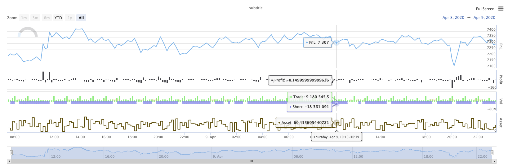
KLineChart ((...)
KLineChart(chartCfg), এই ফাংশনটি কৌশলটি চালানোর সময় কাস্টম অঙ্কনের জন্য পাইন ভাষার অনুরূপ একটি অঙ্কন পদ্ধতি ব্যবহার করতে ব্যবহৃত হয়। কৌশল কাস্টম অঙ্কন শুধুমাত্রKLineChart()পদ্ধতি বাChart() methods.
রেফারেন্স কোডঃ
function main() {
    // Call the KLineChart function to create a chart control object c
    let c = KLineChart({
        overlay: true
    })

    // Use the spot exchange object test to obtain K-line data. If you use the futures exchange object test, you need to set up the contract first.
    let bars = exchange.GetRecords()
    if (!bars) {
        return
    }

    bars.forEach(function(bar, index) {
        c.begin(bar)
        c.barcolor(bar.Close > bar.Open ? 'rgba(255, 0, 0, 0.2)' : 'rgba(0, 0, 0, 0.2)')
        if (bar.Close > bar.Open) {
            c.bgcolor('rgba(0, 255, 0, 0.5)')
        }
        let h = c.plot(bar.High, 'high')
        let l = c.plot(bar.Low, 'low')

        c.fill(h, l, {
            color: bar.Close > bar.Open ? 'rgba(255, 0, 0, 0.2)' : 'rgba(255, 0, 0, 0.2)'
        })
        c.hline(bar.High)
        c.plotarrow(bar.Close - bar.Open)
        c.plotshape(bar.Low, {
            style: 'diamond'
        })
        c.plotchar(bar.Close, {
            char: 'X'
        })
        c.plotcandle(bar.Open*0.9, bar.High*0.9, bar.Low*0.9, bar.Close*0.9)
        if (bar.Close > bar.Open) {
            // long/short/closelong/closeshort
            c.signal("long", bar.High, 1.5)
        } else if (bar.Close < bar.Open) {
            c.signal("closelong", bar.Low, 1.5)
        }
        c.close()
    })
}
def main():
    # Call the KLineChart function to create a chart control object c
    c = KLineChart({
        "overlay": True
    })

    # Use the spot exchange object test to obtain K-line data. If you use the futures exchange object test, you need to set up the contract first.
    bars = exchange.GetRecords()
    if not bars:
        return

    for bar in bars:
        c.begin(bar)
        c.barcolor('rgba(255, 0, 0, 0.2)' if bar.Close > bar.Open else 'rgba(0, 0, 0, 0.2)')
        if bar.Close > bar.Open:
            c.bgcolor('rgba(0, 255, 0, 0.5)')

        h = c.plot(bar.High, 'high')
        l = c.plot(bar.Low, 'low')

        c.fill(h, l, 'rgba(255, 0, 0, 0.2)' if bar.Close > bar.Open else 'rgba(255, 0, 0, 0.2)')
        c.hline(bar.High)
        c.plotarrow(bar.Close - bar.Open)
        c.plotshape(bar.Low, style = 'diamond')
        c.plotchar(bar.Close, char = 'X')
        c.plotcandle(bar.Open*0.9, bar.High*0.9, bar.Low*0.9, bar.Close*0.9)
        if bar.Close > bar.Open:
            # long/short/closelong/closeshort
            c.signal("long", bar.High, 1.5)
        elif bar.Close < bar.Open:
            c.signal("closelong", bar.Low, 1.5)

        c.close()
// Not supported currently
যদি কৌশল কাস্টম অঙ্কন এলাকায় অঙ্কন করার জন্য একটি চার্ট কন্ট্রোল অবজেক্ট থাকতে হবে, ফাংশন ব্যবহারKLineChartএই বস্তুর তৈরি করতে. পরামিতিKLineChartফাংশন একটি চার্ট কনফিগারেশন কাঠামো, রেফারেন্স কোডে ব্যবহৃত চার্ট কাঠামো খুব সহজ{overlay: true}). এই চার্ট কনফিগারেশন কাঠামো শুধুমাত্র প্রধান চার্টে আউটপুট আঁকা বিষয়বস্তু সেট করে.overlayসেট করা আছেfalse, চার্টের বিষয়বস্তু উপ-চার্টে আউটপুট হয়. আপনি প্রধান চার্টে আঁকা একটি অঙ্কন ফাংশন নির্দিষ্ট করতে হবে, তাহলে আপনি প্যারামিটার উল্লেখ করতে পারেনoverlayযেমনtrueনির্দিষ্ট ফাংশন কল.
অঙ্কন অপারেশনটি K-লাইন ডেটা অতিক্রম করে সম্পাদিত হয়। অঙ্কন অপারেশনটি একটিc.begin(bar)ফাংশন কল এবং একটি সঙ্গে শেষc.close()অঙ্কন অপারেশনে সমর্থিত পাইন ভাষার অঙ্কন ইন্টারফেস ফাংশনগুলি হলঃ
-
বারকলারঃ কে-লাইন রঙ সেট করুন
barcolor ((রঙ, অফসেট, সম্পাদনাযোগ্য, show_last, শিরোনাম, প্রদর্শন)
c.barcolor(bar.Close > bar.Open ? 'rgba(255, 0, 0, 0.2)' : 'rgba(0, 0, 0, 0.2)') // Use the example illustrated in the reference code in this example, without giving unnecessary detailsc.barcolor('rgba(255, 0, 0, 0.2)' if bar.Close > bar.Open else 'rgba(0, 0, 0, 0.2)')displayঐচ্ছিক পরামিতিঃnone , all
-
bgcolor: নির্দিষ্ট রঙের সাথে K-লাইন এর পটভূমি পূরণ করুন
bgcolor ((color, offset, editable, show_last, title, display, overlay)
c.bgcolor('rgba(0, 255, 0, 0.5)')c.bgcolor('rgba(0, 255, 0, 0.5)')displayঅপশনাল প্যারামিটারঃnone , all
-
গ্রাফঃ চার্টে তথ্যের একটি সিরিজ গ্রাফ করুন
plot ((সিরিজ, শিরোনাম, রঙ, লাইনউইথ, স্টাইল, ট্র্যাকপ্রিস, হিস্টবেস, অফসেট, যোগদান, সম্পাদনাযোগ্য, শো_লস্ট, প্রদর্শন)
c.plot(bar.High, 'high')h = c.plot(bar.High, 'high')styleঐচ্ছিক পরামিতিঃstepline_diamond , stepline , cross , areabr , area , circles , columns , histogram , linebr , line displayঐচ্ছিক পরামিতিঃnone , all
-
fill: প্রদত্ত রঙের সাথে দুটি অঙ্কন বা লাইনগুলির মধ্যে পটভূমি পূরণ করুন
fill ((line1, hline2, রঙ, শিরোনাম, সম্পাদনাযোগ্য, fillgaps, প্রদর্শন)
let h = c.plot(bar.High, 'high')
let l = c.plot(bar.Low, 'low')

c.fill(h, l, {color: bar.Close > bar.Open ? 'rgba(255, 0, 0, 0.2)' : 'rgba(255, 0, 0, 0.2)'})
h = c.plot(bar.High, 'high') l = c.plot(bar.Low, 'low') c.fill(h, l, {"color": 'rgba(255, 0, 0, 0.2)' if bar.Close > bar.Open else 'rgba(255, 0, 0, 0.2)'})displayঐচ্ছিক পরামিতিঃnone , all
যেহেতু
JavaScriptভাষা ফাংশন আনুষ্ঠানিক পরামিতি নাম অনুযায়ী ইনকামিং পরামিতি নির্দিষ্ট করতে পারবেন না, এই সমস্যা সমাধানের জন্য, একটি{key: value}কাঠামো একটি নির্দিষ্ট আনুষ্ঠানিক প্যারামিটার নাম পাস প্যারামিটার নির্দিষ্ট করতে ব্যবহার করা যেতে পারে, উদাহরণস্বরূপ রেফারেন্স কোড, ব্যবহার{color: bar.Close > bar.Open ? 'rgba(255, 0, 0, 0.2)' : 'rgba(255, 0, 0, 0.2)'}নির্দিষ্ট করতেcolorপ্যারামিটারfillফাংশন. যদি আপনি পরপর একাধিক পরামিতি নাম সঙ্গে পরামিতি নির্দিষ্ট করতে হবে, আপনি ব্যবহার করতে পারেন{key1: value1, key2: value2, key3: value3}. উদাহরণস্বরূপ, এই উদাহরণে, একটি নির্দিষ্ট একটি পরামিতি যোগtitle:{color: bar.Close > bar.Open ? 'rgba(255, 0, 0, 0.2)' : 'rgba(255, 0, 0, 0.2)', title: 'fill'}.রঙ মান জন্য, আপনি ব্যবহার করতে পারেন
'rgba(255, 0, 0, 0.2)'পদ্ধতি সেট, বা ব্যবহার'#FF0000'সেট করার পদ্ধতি। -
hline: একটি নির্দিষ্ট স্থির মূল্য স্তরে একটি অনুভূমিক রেখা প্রদর্শন করে
hline ((মূল্য, শিরোনাম, রঙ, লাইন স্টাইল, লাইন প্রস্থ, সম্পাদনাযোগ্য, প্রদর্শন)
c.hline(bar.High)c.hline(bar.High)linestyleঐচ্ছিক পরামিতিঃড্যাশড , ডটড , সলিড displayঐচ্ছিক পরামিতিঃnone , all
-
প্লোটারোঃ চার্টে উপরে এবং নীচে তীরগুলি আঁকুন
প্লোটারো ((সারি, শিরোনাম, রঙ, রঙ, অফসেট, মিনহাইট, ম্যাক্সহাইট, সম্পাদনাযোগ্য, শো_ লাস্ট, প্রদর্শন)
c.plotarrow(bar.Close - bar.Open)c.plotarrow(bar.Close - bar.Open)displayঐচ্ছিক পরামিতিঃnone , all
-
Plotshape: চার্টে ভিজ্যুয়াল আকার আঁকুন
plotshape ((সিরিজ, শিরোনাম, স্টাইল, অবস্থান, রঙ, অফসেট, টেক্সট, টেক্সট রঙ, সম্পাদনাযোগ্য, আকার, show_last, প্রদর্শন)
c.plotshape(bar.Low, {style: 'diamond'})c.plotshape(bar.Low, style = 'diamond')-
styleঅপশনাল প্যারামিটারঃডায়মন্ড , স্কয়ার , লেবেল_ডাউন , লেবেল_আপ , অ্যারো_ডাউন , অ্যারো_আপ , সার্কেল , ফ্লেগ , ট্রায়াঙ্গল_ডাউন , ট্রায়াঙ্গল_আপ , ক্রস , এক্সক্রস -
locationঐচ্ছিক পরামিতিঃউপরের বার , নিচের বার , উপরে , নিচে , নিঃসন্দেহে -
sizeঐচ্ছিক পরামিতিঃ10px , 14px , 20px , 40px , 80px size.tiny,size.small,size.normal,size.large,size.hugeপাইন ভাষায়size.autoহয়size.small. -
displayঐচ্ছিক পরামিতিঃnone , all
-
-
plotchar: যেকোনো ইউনিকোড অক্ষর ব্যবহার করে চার্টে দৃশ্যমান আকার আঁকুন
plotchar ((সিরিজ, শিরোনাম, char, অবস্থান, রঙ, অফসেট, টেক্সট, টেক্সট রঙ, সম্পাদনাযোগ্য, আকার, show_last, প্রদর্শন)
c.plotchar(bar.Close, {char: 'X'})c.plotchar(bar.Close, char = 'X')-
locationঐচ্ছিক পরামিতিঃউপরের বার , নিচের বার , উপরে , নিচে , নিঃসন্দেহে -
sizeঐচ্ছিক পরামিতিঃ10px , 14px , 20px , 40px , 80px size.tiny,size.small,size.normal,size.large,size.hugeপাইন ভাষায়size.autoহয়size.small. -
displayঐচ্ছিক পরামিতিঃnone , all
-
-
plotcandle: চার্টে একটি কে-লাইন চার্ট আঁকুন
plotcandle ((খোলা, উচ্চ, নিম্ন, বন্ধ, শিরোনাম, রঙ, wickcolor, সম্পাদনাযোগ্য, show_last, bordercolor, display)
c.plotcandle(bar.Open*0.9, bar.High*0.9, bar.Low*0.9, bar.Close*0.9)c.plotcandle(bar.Open*0.9, bar.High*0.9, bar.Low*0.9, bar.Close*0.9)displayঅপশনাল প্যারামিটারঃnone , all
-
সংকেতঃ পাইন ভাষায় উপলব্ধ না হওয়া ফাংশনগুলি এখানে কেনা এবং বিক্রয় সংকেত আঁকতে ব্যবহৃত হয়
সিগন্যাল ((দিক, মূল্য, qty, id)
c.signal("long", bar.High, 1.5)c.signal("long", bar.High, 1.5)ইনপুট প্যারামিটার
"long"লেনদেনের দিক নির্দেশ করে, ঐচ্ছিক"long","closelong","short","closeshort"ইনকামিং প্যারামিটারbar.Highমার্কার সিগন্যালের Y- অক্ষ অবস্থান। ইনপুট পরামিতি1.5সিগন্যালের ট্রেডের সংখ্যা প্রতিনিধিত্ব করে। চতুর্থ প্যারামিটারটি ডিফল্টরূপে আঁকা পাঠ্য সামগ্রী প্রতিস্থাপনের জন্য পাস করা যেতে পারে। আঁকা সংকেত চিহ্নিতকারীর ডিফল্ট পাঠ্য হল ট্রেডিং দিক, উদাহরণস্বরূপঃ"closelong".
উপরের ফাংশন কলগুলিতে ব্যবহৃত কিছু রঙ, শৈলী এবং অন্যান্য সেটিংস জন্য, দয়া করে পড়ুনKLineChart ফাংশন দিয়ে অঙ্কন সম্পর্কে বিশেষ নিবন্ধ
লগ রিসেট ((()
LogReset()লগগুলি পরিষ্কার করতে ব্যবহৃত হয়। আপনি সংরক্ষণ করতে সাম্প্রতিক লগগুলির সংখ্যা নির্দিষ্ট করতে এবং বাকি লগগুলি সাফ করতে একটি পূর্ণসংখ্যা প্যারামিটার পাস করতে পারেন। স্টার্টআপ লগটি শুরু হওয়ার প্রতিটি সময় গণনা করা হয়, সুতরাং যদি কোনও প্যারামিটার পাস না করা হয় এবং কৌশলটির শুরুতে কোনও লগ আউটপুট না থাকে তবে লগটি প্রদর্শিত হবে না, ডকার লগটি ফিরে আসার জন্য অপেক্ষা করুন (অস্বাভাবিক পরিস্থিতি নয়) । ফাংশনের কোনও রিটার্ন মান নেই।
function main() {
    // Mainta