 ["abc", "def", {"type": "button", "cmd": "coverAll", "name": "close position"}]
      ]
  })"_json;

  auto ticker = exchange.GetTicker();
  json jsonTicker = R"({"Buy": 0, "Sell": 0, "High": 0, "Low": 0, "Volume": 0, "Last": 0, "Time": 0})"_json;
  jsonTicker["Buy"] = ticker.Buy;
  jsonTicker["Sell"] = ticker.Sell;
  jsonTicker["Last"] = ticker.Last;
  jsonTicker["Volume"] = ticker.Volume;
  jsonTicker["Time"] = ticker.Time;
  jsonTicker["High"] = ticker.High;
  jsonTicker["Low"] = ticker.Low;

  json arr = R"([{"body": {}, "colspan": 2}, "abc"])"_json;
  arr[0]["body"] = jsonTicker;
  table["rows"].push_back(arr);
  LogStatus("`" + table.dump() + "`");
}
)
- Vertical merger
```js
function main() {
var table = {
type: 'table',
title: 'Table demo',
cols: ['ColumnA', 'ColumnB', 'ColumnC'],
rows: [
['A1', 'B1', {'type':'button', 'cmd': 'coverAll', 'name': 'C1'}]
]
}
var ticker = exchange.GetTicker()
var name = exchange.GetName()
table.rows.push([{body : "A2 + B2:" + JSON.stringify(ticker), colspan : 2}, "C2"])
table.rows.push([{body : "A3 + A4 + A5:" + name, rowspan : 3}, "B3", "C3"])
// A3 is merged by the first cell in the previous row
table.rows.push(["B4", "C4"])
// A2 is merged by the first cell in the previous row
table.rows.push(["B5", "C5"])
table.rows.push(["A6", "B6", "C6"])
LogStatus('`' + JSON.stringify(table) + '`')
}
import json
def main():
    table = {
        "type" : "table",
        "title" : "Table demo",
        "cols" : ["ColumnA", "ColumnB", "ColumnC"],
        "rows" : [
            ["A1", "B1", {"type": "button", "cmd": "coverAll", "name": "C1"}]
        ]
    }

    ticker = exchange.GetTicker()
    name = exchange.GetName()

    table["rows"].append([{"body": "A2 + B2:" + json.dumps(ticker), "colspan": 2}, "C2"])
    table["rows"].append([{"body": "A3 + A4 + A5:" + name, "rowspan": 3}, "B3", "C3"])
    table["rows"].append(["B4", "C4"])
    table["rows"].append(["B5", "C5"])
    table["rows"].append(["A6", "B6", "C6"])
    LogStatus("`" + json.dumps(table) + "`")
void main() {
    json table = R"({
        "type" : "table",
        "title" : "Table demo",
        "cols" : ["ColumnA", "ColumnB", "ColumnC"],
        "rows" : [
            ["A1", "B1", {"type": "button", "cmd": "coverAll", "name": "C1"}]
        ]
    })"_json;
    // In order to test, the code is short and easy to read, and the constructed data is used here
    json jsonTicker = R"({"High": 0, "Low": 0, "Buy": 0, "Sell": 0, "Last": 0, "Time": 0, "Volume": 0})"_json;
    auto name = exchange.GetName();
    json arr1 = R"([{"body": "", "colspan": 2}, "C2"])"_json;
    arr1[0]["body"] = "A2 + B2:" + jsonTicker.dump();
    json arr2 = R"([{"body": "", "rowspan": 3}, "B3", "C3"])"_json;
    arr2[0]["body"] = "A3 + A4 + A5:" + name;
    table["rows"].push_back(arr1);
    table["rows"].push_back(arr2);
    table["rows"].push_back(R"(["B4", "C4"])"_json);
    table["rows"].push_back(R"(["B5", "C5"])"_json);
    table["rows"].push_back(R"(["A6", "B6", "C6"])"_json);
    LogStatus("`" + table.dump() + "`");
}
)
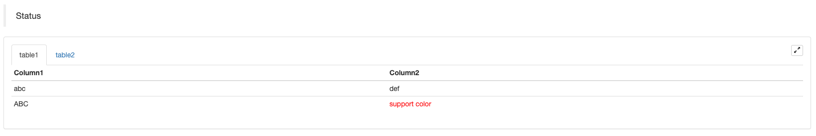
Affichage de la barre d'état de la pagination de table:
function main() {
    var table1 = {type: 'table', title: 'table1', cols: ['Column1', 'Column2'], rows: [ ['abc', 'def'], ['ABC', 'support color #ff0000']]}
    var table2 = {type: 'table', title: 'table2', cols: ['Column1', 'Column2'], rows: [ ['abc', 'def'], ['ABC', 'support color #ff0000']]}
    LogStatus('`' + JSON.stringify([table1, table2]) + '`')
}
import json
def main():
    table1 = {"type": "table", "title": "table1", "cols": ["Column1", "Column2"], "rows": [ ["abc", "def"], ["ABC", "support color #ff0000"]]}
    table2 = {"type": "table", "title": "table2", "cols": ["Column1", "Column2"], "rows": [ ["abc", "def"], ["ABC", "support color #ff0000"]]}
    LogStatus("`" + json.dumps([table1, table2]) + "`")
void main() {
    json table1 = R"({"type": "table", "title": "table1", "cols": ["Column1", "Column2"], "rows": [ ["abc", "def"], ["ABC", "support color #ff0000"]]})"_json;
    json table2 = R"({"type": "table", "title": "table2", "cols": ["Column1", "Column2"], "rows": [ ["abc", "def"], ["ABC", "support color #ff0000"]]})"_json;
    json arr = R"([])"_json;
    arr.push_back(table1);
    arr.push_back(table2);
    LogStatus("`" + arr.dump() + "`");
}
En plus de la pagination des tableaux, plusieurs tableaux peuvent être disposés de haut en bas.
function main(){
    var tab1 = {
        type : "table",
        title : "table1",
        cols : ["1", "2"],
        rows : []
    }
    var tab2 = {
        type : "table",
        title : "table2",
        cols : ["1", "2", "3"],
        rows : []
    }
    var tab3 = {
        type : "table",
        title : "table3",
        cols : ["A", "B", "C"],
        rows : []
    }

    tab1.rows.push(["jack", "lucy"])
    tab2.rows.push(["A", "B", "C"])
    tab3.rows.push(["A", "B", "C"])

    LogStatus('`' + JSON.stringify(tab1) + '`\n' +
        '`' + JSON.stringify(tab2) + '`\n' +
        '`' + JSON.stringify(tab3) + '`')

    Log("exit")
}
import json
def main():
    tab1 = {
        "type": "table",
        "title": "table1",
        "cols": ["1", "2"],
        "rows": []
    }
    tab2 = {
        "type": "table",
        "title": "table2",
        "cols": ["1", "2", "3"],
        "rows": []
    }
    tab3 = {
        "type": "table",
        "title": "table3",
        "cols": ["A", "B", "C"],
        "rows": []
    }

    tab1["rows"].append(["jack", "lucy"])
    tab2["rows"].append(["A", "B", "C"])
    tab3["rows"].append(["A", "B", "C"])
    LogStatus("`" + json.dumps(tab1) + "`\n" +
        "`" + json.dumps(tab2) + "`\n" +
        "`" + json.dumps(tab3) + "`")
void main() {
    json tab1 = R"({
        "type": "table",
        "title": "table1",
        "cols": ["1", "2"],
        "rows": []
    })"_json;
    json tab2 = R"({
        "type": "table",
        "title": "table2",
        "cols": ["1", "2", "3"],
        "rows": []
    })"_json;
    json tab3 = R"({
        "type": "table",
        "title": "table3",
        "cols": ["A", "B", "C"],
        "rows": []
    })"_json;
    tab1["rows"].push_back(R"(["jack", "lucy"])"_json);
    tab2["rows"].push_back(R"(["A", "B", "C"])"_json);
    tab3["rows"].push_back(R"(["A", "B", "C"])"_json);
    LogStatus("`" + tab1.dump() + "`\n" +
        "`" + tab2.dump() + "`\n" +
        "`" + tab3.dump() + "`");
}
Résultat de l'opération)
Nom de l'organisme:
Lorsque le bot de stratégie est en cours d'exécution sur la page de bot, si vous faites défiler les enregistrements d'historique, la barre d'état entrera dans un état inactif et cessera de mettre à jour. Les données de la barre d'état ne seront rafraîchies que lorsque le journal est sur la première page.
La barre d'état prend en charge la sortie d'images codées enbase64, et supporte également la sortie des images codées enbase64Comme la longueur de la chaîne de l'image codée est normalement très longue, aucun code échantillon n'est fourni.
Activation du journal
EnableLog(IsEnable)activer ou désactiver l'enregistrement du journal pour les informations relatives aux commandes.isEnableest de type bool.IsEnableest réglée surfalse, le journal des commandes ne sera pas imprimé et il ne sera pas écrit dans la base de données des robots.
Tableau de référence
Chart(...), fonction de personnalisation de dessins graphiques.
Chart({…}); le paramètre est leHighCharts.StockChartparamètres deLes stocks élevésqui peut être sérialisé enJSON, en ajoutant un_isStockattribuer au paramètre natif._isStock:false, il sera affiché comme un graphique normal.
Note: le numéro de série
Si vous définissez l'attribut de_isStockàfalse, le graphique utilisé est:Tableaux de bord, comme indiqué dans le tableau:
)
Si nous définissons l'attribut de_isStockàtrue, le graphique utilisé est:Les stocks élevés(par défaut)_isStockcomme vrai), comme indiqué dans le tableau:
)
Pour revenir à l'objet, vous pouvez appeleradd(n, data) (n(par exemple 0) est l'indice deseries, etdataest les données écrites dans le graphique) pour ajouter des données à l'indice spécifiéseries; appelreset()pour effacer les données du graphique, etresetpeut prendre un paramètre numérique et spécifier le nombre d'éléments réservés.
Vous pouvez appeleradd(n, data, i) (iest l'indice de ces données dans leseries) pour modifier les données dans leseries.
Il peut être négatif,
chart.add(0, [1574993606000, 13.5], -1), modifier les données du dernier point deseries[0].data.
Pour qu'il supporte l'affichage de plusieurs graphiques, vous n'avez qu'à passer des paramètres de tableau pendant la configuration, tels que:var chart = Chart([{…}, {…}, {…}])Par exemple, le graphique 1 comporte deuxseries, le graphique 2 en a unseries, et le graphique 3 en a unseries. Ensuite, spécifier la série ID 0 et 1 lors de l'addition représente pour mettre à jour les données de deux ordres Colonnes du graphique 1; spécifier la série ID 2 lors de l'addition se réfère à la premièreseriesLa série ID3 se réfère aux données de la premièreseriesdu graphique 3.
HighStocks: http://api.highcharts.com/highstock
Paramètres d'attributs liés à l'affichage de plusieurs graphiques:exemple
Par exemple, les objets de configuration du graphique:
var cfgA = {
    extension: {
        // It does not participate in grouping, displayed separately, and its default is 'group'
        layout: 'single',
        // This is the specified height, which can be set to string "300px" (set "300", and "300px" will be displayed instead automatically)
        height: 300,
        // It is the unit value of the specified width, with a total value of 12
        col: 8
    },
    title: {
        text: 'Market Chart'
    },
    xAxis: {
        type: 'datetime'
    },
    series: [{
        name: 'Buy 1',
        data: []
    }, {
        name: 'Sell 1',
        data: []
    }]
}

var cfgB = {
    title: {
        text: 'Spread chart'
    },
    xAxis: {
        type: 'datetime'
    },
    series: [{
        name: 'Spread',
        type: 'column',
        data: []
    }]
}

var cfgC = {
    _isStock: false,
    title: {
        text: 'Pie Chart'
    },
    series: [{
        type: 'pie',
        name: 'one',
        // After specifying the initial data, you don't need to update it with the "add" function; Changing the chart configuration directly will update the series
        data: [
            ["A", 25],
            ["B", 25],
            ["C", 25],
            ["D", 25]
        ]
    }]
}

var cfgD = {
    extension: {
        layout: 'single',
        // The unit value of the specified width, with a total value of 12
        col: 8,
        height: '300px'
    },
    title: {
        text: 'Market Chart'
    },
    xAxis: {
        type: 'datetime'
    },
    series: [{
        name: 'Buy 1',
        data: []
    }, {
        name: 'Sell 1',
        data: []
    }]
}

var cfgE = {
    __isStock: false,
    extension: {
        layout: 'single',
        col: 4,
        height: '300px'
    },
    title: {
        text: 'Pie Chart2'
    },
    series: [{
        type: 'pie',
        name: 'one',
        data: [
            ["A", 25],
            ["B", 25],
            ["C", 25],
            ["D", 25]
        ]
    }]
}
cfgA = {
    "extension" : {
        "layout" : "single",
        "height" : 300,
        "col" : 8
    },
    "title" : {
        "text" : "Market Chart"
    },
    "xAxis" : {
        "type" : "datetime"
    },
    "series" : [{
        "name" : "Buy 1",
        "data" : []
    }, {
        "name" : "Sell 1",
        "data" : []
    }]
}

cfgB = {
    "title" : {
        "text" : "Spread chart"
    },
    "xAxis" : {
        "type" : "datetime"
    },
    "series" : [{
        "name" : "Spread",
        "type" : "column",
        "data" : []
    }]
}

cfgC = {
    "__isStock" : False,
    "title" : {
        "text" : "Pie Chart"
    },
    "series" : [{
        "type" : "pie",
        "name" : "one",
        "data" : [
            ["A", 25],
            ["B", 25],
            ["C", 25],
            ["D", 25]
        ]
    }]
}

cfgD = {
    "extension" : {
        "layout" : "single",
        "col" : 8,
        "height" : "300px"
    },
    "title" : {
        "text" : "Market Chart"
    },
    "series" : [{
        "name" : "Buy 1",
        "data" : []
    }, {
        "name" : "Sell 1",
        "data" : []
    }]
}

cfgE = {
    "__isStock" : False,
    "extension" : {
        "layout" : "single",
        "col" : 4,
        "height" : "300px"
    },
    "title" : {
        "text" : "Pie Chart2"
    },
    "series" : [{
        "type" : "pie",
        "name" : "one",
        "data" : [
            ["A", 25],
            ["B", 25],
            ["C", 25],
            ["D", 25]
        ]
    }]
}
json cfgA = R"({
    "extension" : {
        "layout" : "single",
        "height" : 300,
        "col" : 8
    },
    "title" : {
        "text" : "Market Chart"
    },
    "xAxis" : {
        "type" : "datetime"
    },
    "series" : [{
        "name" : "Buy 1",
        "data" : []
    }, {
        "name" : "Sell 1",
        "data" : []
    }]
})"_json;

json cfgB = R"({
    "title" : {
        "text" : "Spread chart"
    },
    "xAxis" : {
        "type" : "datetime"
    },
    "series" : [{
        "name" : "Spread",
        "type" : "column",
        "data" : []
    }]
})"_json;

json cfgC = R"({
    "__isStock" : false,
    "title" : {
        "text" : "Pie Chart"
    },
    "series" : [{
        "type" : "pie",
        "name" : "one",
        "data" : [
            ["A", 25],
            ["B", 25],
            ["C", 25],
            ["D", 25]
        ]
    }]
})"_json;

json cfgD = R"({
    "extension" : {
        "layout" : "single",
        "col" : 8,
        "height" : "300px"
    },
    "title" : {
        "text" : "Market Chart"
    },
    "series" : [{
        "name" : "Buy 1",
        "data" : []
    }, {
        "name" : "Sell 1",
        "data" : []
    }]
})"_json;

json cfgE = R"({
    "__isStock" : false,
    "extension" : {
        "layout" : "single",
        "col" : 4,
        "height" : "300px"
    },
    "title" : {
        "text" : "Pie Chart2"
    },
    "series" : [{
        "type" : "pie",
        "name" : "one",
        "data" : [
            ["A", 25],
            ["B", 25],
            ["C", 25],
            ["D", 25]
        ]
    }]
})"_json;
-
cfgA.extension.layoutattributSi cet attribut est réglé et que la valeur est
single , le graphique ne sera pas superposé (il ne sera pas affiché sous forme d'étiquette à onglets) et sera affiché séparément (affichage en tuiles). -
cfgA.extension.heightattributCet attribut est utilisé pour définir la hauteur du graphique.
-
cfgA.extension.colattributCet attribut est utilisé pour définir la largeur du graphique. La largeur de la page est divisée en 12 unités au total, et le paramètre
8 signifie que le graphique occupe 8 unités de largeur. Exécutez l'exemple complet de stratégie:
L'affichage des effets des objets de configuration du graphique dans les exemples ci-dessus:
)
)
-
Pour les données sur les objets de configuration du graphique, modifiez la configuration du graphique directement, puis mettez à jour le graphique pour réaliser la mise à jour des données:
Par exemple, dans le
JavaScriptpartie du code de l'exemple (Un exemple parfait):cfgC.series[0].data[0][1] = Math.random() * 100 cfgE.series[0].data[0][1] = Math.random() * 100 // "Update" is actually equivalent to resetting the configuration of the chart chart.update([cfgA, cfgB, cfgC, cfgD, cfgE])Mettre à jour les données par
addIl s'agit d'une méthode de calcul, comme l'ajout d'un élément au graphique circulaire.JavaScriptpartie du code de l'exemple (Un exemple parfait):// Add a data point to the pie chart; "add" can only update the data points added by the "add" method, the built-in data points cannot be updated later chart.add(3, { name: "ZZ", y: Math.random() * 100 }) -
Exemples d'utilisation de
ChartfonctionExemple de dessin simple:
// This chart is an object in JavaScript language. Before using the "Chart" function, we need to declare an object variable of a chart configuration
var chart = {
    // It is marked as a general chart; if you are interested, you can change it to false and run it
    __isStock: true,
    // Zoom tool
    tooltip: {xDateFormat: '%Y-%m-%d %H:%M:%S, %A'},
    // Title
    title : { text : 'Spread analysis chart'},
    // Choose a range
    rangeSelector: {
        buttons:  [{type: 'hour',count: 1, text: '1h'}, {type: 'hour',count: 3, text: '3h'}, {type: 'hour', count: 8, text: '8h'}, {type: 'all',text: 'All'}],
        selected: 0,
        inputEnabled: false
    },
    // The horizontal axis of the coordinate axis is: x axis, and the currently set "Types of" is: time
    xAxis: { type: 'datetime'},
    // The vertical axis of the coordinate axis is: y axis, and the default value is adjusted with the data size
    yAxis : {
        // Title
        title: {text: 'Spread'},
        // Whether to enable the right vertical axis
        opposite: false
    },
    // Data system column; this attribute holds each data system column (line, K-line diagram, label, etc.)
    series : [
        // The index is 0, and the data in the data column is stored in the data array.
        {name : "line1", id : "line 1,buy1Price", data : []},
        // The index is 1, and set dashStyle: 'shortdash', namely: set the dashed line
        {name : "line2", id : "line 2,lastPrice", dashStyle : 'shortdash', data : []}
    ]
}
function main(){
    // Call the "Chart" function to initialize the chart
    var ObjChart = Chart(chart)
    // Empty
    ObjChart.reset()
    while(true){
        // Get the timestamp of this polling, that is, a millisecond timestamp, used to determine the position of the X axis written to the chart
        var nowTime = new Date().getTime()
        // Get market data
        var ticker = _C(exchange.GetTicker)
        // Get "Buy 1" price from the return value of market data
        var buy1Price = ticker.Buy
        // To obtain the last executed price, in order to avoid the overlap of the 2 lines, we add 1
        var lastPrice = ticker.Last + 1
        // Use timestamp as X value and "Buy 1" price as Y value, and pass them into the data sequence of index 0
        ObjChart.add(0, [nowTime, buy1Price])
        // Same as above
        ObjChart.add(1, [nowTime, lastPrice])
        Sleep(2000)
    }
}
import time chart = { "__isStock" : True, "tooltip" : {"xDateFormat" : "%Y-%m-%d %H:%M:%S, %A"}, "title" : {"text" : "Spread analysis chart"}, "rangeSelector" : { "buttons" : [{"type": "count", "count": 1, "text": "1h"}, {"type": "hour", "count": 3, "text": "3h"}, {"type": "hour", "count": 8, "text": "8h"}, {"type": "all", "text": "All"}], "selected": 0, "inputEnabled": False }, "xAxis": {"type": "datetime"}, "yAxis": { "title": {"text": "Spread"}, "opposite": False }, "series": [{ "name": "line1", "id": "line 1,buy1Price", "data": [] }, { "name": "line2", "id": "line 2,lastPrice", "dashStyle": "shortdash", "data": [] }] } def main(): ObjChart = Chart(chart) ObjChart.reset() while True: nowTime = time.time() * 1000 ticker = exchange.GetTicker() buy1Price = ticker["Buy"] lastPrice = ticker["Last"] + 1 ObjChart.add(0, [nowTime, buy1Price]) ObjChart.add(1, [nowTime, lastPrice]) Sleep(2000)void main() { // When write strategies in C++, try not to declare global variables that are not basic types, so the declaration of the chart configuration objects is in the "main" function json chart = R"({ "__isStock" : true, "tooltip" : {"xDateFormat" : "%Y-%m-%d %H:%M:%S, %A"}, "title" : {"text" : "Spread analysis chart"}, "rangeSelector" : { "buttons" : [{"type": "count", "count": 1, "text": "1h"}, {"type": "hour", "count": 3, "text": "3h"}, {"type": "hour", "count": 8, "text": "8h"}, {"type": "all", "text": "All"}], "selected": 0, "inputEnabled": false }, "xAxis": {"type": "datetime"}, "yAxis": { "title": {"text": "Spread"}, "opposite": false }, "series": [{ "name": "line1", "id": "line 1,buy1Price", "data": [] }, { "name": "line2", "id": "line 2,lastPrice", "dashStyle": "shortdash", "data": [] }] })"_json; auto ObjChart = Chart(chart); ObjChart.reset(); while(true) { auto nowTime = Unix() * 1000; auto ticker = exchange.GetTicker(); auto buy1Price = ticker.Buy; auto lastPrice = ticker.Last + 1.0; ObjChart.add(0, {nowTime, buy1Price}); ObjChart.add(1, {nowTime, lastPrice}); Sleep(2000); } }L'exemple du dessin de la courbe trigonométrique:
// The object used to initialize the chart
var chart = {
    // Chart title
    title: {text: "line value triggers plotLines value"},
    // The related settings of Y axis
    yAxis: {
        // The horizontal line perpendicular to y axis, used as a trigger line, is an array of structures where multiple trigger lines can be set
        plotLines: [{
            // Trigger line value; set a number, and this line will be displayed in the corresponding numerical position
            value: 0,
            // Set the color of the trigger line
            color: 'red',
            // Width
            width: 2,
            // Labels displayed
            label: {
                // Label text
                text: 'Trigger value',
                // Center label position
                align: 'center'
            }
        }]
    },
    // The related settings of X axis, and here the setting type is the time axis
    xAxis: {type: "datetime"},
    series: [
        {name: "sin", type: "spline", data: []},
        // This is a more important data system column; you can set multiple data system column, according to the array index control
        {name: "cos", type: "spline", data: []}
    ]
}
function main(){
    // Pi
    var pi = 3.1415926535897
    // Variable for recording timestamp
    var time = 0
    // Angle
    var angle = 0
    // Coordinate y value, used to receive sine and cosine values
    var y = 0
    // Call the API to initialize charts with "chart" objects
    var objChart = Chart(chart)
    // When initializing, clear the chart
    objChart.reset()
    // Set the value of the trigger line to 1
    chart.yAxis.plotLines[0].value = 1
    // Loop
    while(true){
        // Get the timestamp of the current moment
        time = new Date().getTime()
        // The angle is increased by 5 degrees every 500ms, and the sine value is calculated
        y = Math.sin(angle * 2 * pi / 360)
        // Write the calculated y value to the data of the corresponding index of the chart; the first parameter of the "add" function is the specified index
        objChart.add(0, [time, y])
        // Calculate the cosine value
        y = Math.cos(angle * 2 * pi / 360)
        objChart.add(1, [time, y])
        // Increase by 5 degrees
        angle += 5
        // Pause for 5 seconds, to avoid drawing too frequently and the data growing too fast
        Sleep(5000)
    }
}
import math import time chart = { "title": {"text": "line value triggers plotLines value"}, "yAxis": { "plotLines": [{ "value": 0, "color": "red", "width": 2, "label": { "text": "Trigger value", "align": "center" } }] }, "xAxis": {"type": "datetime"}, "series": [{"name": "sin", "type": "spline", "data": []}, {"name": "cos", "type": "spline", "data": []}] } def main(): pi = 3.1415926535897 ts = 0 angle = 0 y = 0 objChart = Chart(chart) objChart.reset() chart["yAxis"]["plotLines"][0]["value"] = 1 while True: ts = time.time() * 1000 y = math.sin(angle * 2 * pi / 360) objChart.add(0, [ts, y]) y = math.cos(angle * 2 * pi / 360) objChart.add(1, [ts, y]) angle += 5 Sleep(5000)void main() { json chart = R"({ "title": {"text": "line value triggers plotLines value"}, "yAxis": { "plotLines": [{ "value": 0, "color": "red", "width": 2, "label": { "text": "Trigger value", "align": "center" } }] }, "xAxis": {"type": "datetime"}, "series": [{"name": "sin", "type": "spline", "data": []}, {"name": "cos", "type": "spline", "data": []}] })"_json; auto pi = 3.1415926535897; auto ts = 0; auto angle = 0.0; auto y = 0.0; auto objChart = Chart(chart); objChart.reset(); chart["yAxis"]["plotLines"][0]["value"] = 1; while(true) { ts = Unix() * 1000; y = sin(angle * 2 * pi / 360); objChart.add(0, {ts, y}); y = cos(angle * 2 * pi / 360); objChart.add(1, {ts, y}); angle += 5; Sleep(5000); } }Dans le
cppLa stratégieChartfonction peut également utiliser une chaîne codée pour configurer le graphique:void main () { Chart c = Chart(R"EOF({"chart":{"type":"line"},"title":{"text":"Simple chart"},"xAxis":{"title":{"text":"Date"}},"yAxis":{"title":{"text":"Number"}},"series":[{"name":"number","data":[]}]})EOF"); c.reset(); for (size_t i = 0; i < 10; i++) { // For example, int64 of "sprintf" function has different parameters in 32-bit and 64-bit, so it is best to use "toString" to transfer the platform-related types into strings and then pass c.add(0, format("[%s, %d]", toString(Unix() + i).c_str(), rand() % 100)); } })
-
Un exemple complexe de graphiques mixtesAdresse de stratégie JavaScript
/*backtest
start: 2020-03-11 00:00:00
end: 2020-04-09 23:59:00
period: 1d
exchanges: [{"eid":"Bitfinex","currency":"BTC_USD"}]
*/

var chartCfg = {
    subtitle: {
        text: "subtitle",
    },
    yAxis: [{
        height: "40%",
        lineWidth: 2,
        title: {
            text: 'PnL',
        },
        tickPixelInterval: 20,
        minorGridLineWidth: 1,
        minorTickWidth: 0,
        opposite: true,
        labels: {
            align: "right",
            x: -3,
        }
    }, {
        title: {
            text: 'Profit',
        },
        top: "42%",
        height: "18%",
        offset: 0,
        lineWidth: 2
    }, {
        title: {
            text: 'Vol',
        },
        top: '62%',
        height: '18%',
        offset: 0,
        lineWidth: 2
    }, {
        title: {
            text: 'Asset',
        },
        top: '82%',
        height: '18%',
        offset: 0,
        lineWidth: 2
    }],
    series: [{
        name: 'PnL',
        data: [],
        id: 'primary',
        tooltip: {
            xDateFormat: '%Y-%m-%d %H:%M:%S'
        },
        yAxis: 0
    }, {
        type: 'column',
        lineWidth: 2,
        name: 'Profit',
        data: [],
        yAxis: 1,
    }, {
        type: 'column',
        name: 'Trade',
        data: [],
        yAxis: 2
    }, {
        type: 'area',
        step: true,
        lineWidth: 0,
        name: 'Long',
        data: [],
        yAxis: 2
    }, {
        type: 'area',
        step: true,
        lineWidth: 0,
        name: 'Short',
        data: [],
        yAxis: 2
    }, {
        type: 'line',
        step: true,
        color: '#5b4b00',
        name: 'Asset',
        data: [],
        yAxis: 3
    }, {
        type: 'pie',
        innerSize: '70%',
        name: 'Random',
        data: [],
        center: ['3%', '6%'],
        size: '15%',
        dataLabels: {
            enabled: false
        },
        startAngle: -90,
        endAngle: 90,
    }],
};

function main() {
    let c = Chart(chartCfg);
    let preTicker = null;
    while (true) {
        let t = exchange.GetTicker();

        c.add(0, [t.Time, t.Last]); // PnL
        c.add(1, [t.Time, preTicker ? t.Last - preTicker.Last : 0]); // profit
        let r = Math.random();
        var pos = parseInt(t.Time/86400);
        c.add(2, [t.Time, pos/2]); // Vol
        c.add(3, [t.Time, r > 0.8 ? pos : null]); // Long
        c.add(4, [t.Time, r < 0.8 ? -pos : null]); // Short
        c.add(5, [t.Time, Math.random() * 100]); // Asset
        // update pie
        chartCfg.series[chartCfg.series.length-1].data = [
            ["A", Math.random()*100],
            ["B", Math.random()*100],
         ];
        c.update(chartCfg)
        preTicker = t;
    }
}
'''backtest
start: 2020-03-11 00:00:00
end: 2020-04-09 23:59:00
period: 1d
exchanges: [{"eid":"Bitfinex","currency":"BTC_USD"}]
'''

import random

chartCfg = {
    "subtitle": {
        "text": "subtitle"
    },
    "yAxis": [{
        "height": "40%",
        "lineWidth": 2,
        "title": {
            "text": 'PnL'
        },
        "tickPixelInterval": 20,
        "minorGridLineWidth": 1,
        "minorTickWidth": 0,
        "opposite": True,
        "labels": {
            "align": "right",
            "x": -3
        }
    }, {
        "title": {
            "text": 'Profit'
        },
        "top": "42%",
        "height": "18%",
        "offset": 0,
        "lineWidth": 2
    }, {
        "title": {
            "text": 'Vol'
        },
        "top": '62%',
        "height": '18%',
        "offset": 0,
        "lineWidth": 2
    }, {
        "title": {
            "text": 'Asset'
        },
        "top": '82%',
        "height": '18%',
        "offset": 0,
        "lineWidth": 2
    }],
    "series": [{
        "name": 'PnL',
        "data": [],
        "id": 'primary',
        "tooltip": {
            "xDateFormat": '%Y-%m-%d %H:%M:%S'
        },
        "yAxis": 0
    }, {
        "type": 'column',
        "lineWidth": 2,
        "name": 'Profit',
        "data": [],
        "yAxis": 1
    }, {
        "type": 'column',
        "name": 'Trade',
        "data": [],
        "yAxis": 2
    }, {
        "type": 'area',
        "step": True,
        "lineWidth": 0,
        "name": 'Long',
        "data": [],
        "yAxis": 2
    }, {
        "type": 'area',
        "step": True,
        "lineWidth": 0,
        "name": 'Short',
        "data": [],
        "yAxis": 2
    }, {
        "type": 'line',
        "step": True,
        "color": '#5b4b00',
        "name": 'Asset',
        "data": [],
        "yAxis": 3
    }, {
        "type": 'pie',
        "innerSize": '70%',
        "name": 'Random',
        "data": [],
        "center": ['3%', '6%'],
        "size": '15%',
        "dataLabels": {
            "enabled": False
        },
        "startAngle": -90,
        "endAngle": 90
    }]
}

def main():
    c = Chart(chartCfg)
    preTicker = None
    while True:
        t = exchange.GetTicker()
        c.add(0, [t["Time"], t["Last"]])
        profit = t["Last"] - preTicker["Last"] if preTicker else 0
        c.add(1, [t["Time"], profit])
        r = random.random()
        pos = t["Time"] / 86400
        c.add(2, [t["Time"], pos / 2])
        long = pos if r > 0.8 else None
        c.add(3, [t["Time"], long])
        short = -pos if r < 0.8 else None
        c.add(4, [t["Time"], short])
        c.add(5, [t["Time"], random.random() * 100])

        # update pie
        chartCfg["series"][len(chartCfg["series"]) - 1]["data"] = [
            ["A", random.random() * 100],
            ["B", random.random() * 100]
        ]
        c.update(chartCfg)
        preTicker = t
/*backtest
start: 2020-03-11 00:00:00
end: 2020-04-09 23:59:00
period: 1d
exchanges: [{"eid":"Bitfinex","currency":"BTC_USD"}]
*/

void main() {
    json chartCfg = R"({
        "subtitle": {
            "text": "subtitle"
        },
        "yAxis": [{
            "height": "40%",
            "lineWidth": 2,
            "title": {
                "text": "PnL"
            },
            "tickPixelInterval": 20,
            "minorGridLineWidth": 1,
            "minorTickWidth": 0,
            "opposite": true,
            "labels": {
                "align": "right",
                "x": -3
            }
        }, {
            "title": {
                "text": "Profit"
            },
            "top": "42%",
            "height": "18%",
            "offset": 0,
            "lineWidth": 2
        }, {
            "title": {
                "text": "Vol"
            },
            "top": "62%",
            "height": "18%",
            "offset": 0,
            "lineWidth": 2
        }, {
            "title": {
                "text": "Asset"
            },
            "top": "82%",
            "height": "18%",
            "offset": 0,
            "lineWidth": 2
        }],
        "series": [{
            "name": "PnL",
            "data": [],
            "id": "primary",
            "tooltip": {
                "xDateFormat": "%Y-%m-%d %H:%M:%S"
            },
            "yAxis": 0
        }, {
            "type": "column",
            "lineWidth": 2,
            "name": "Profit",
            "data": [],
            "yAxis": 1
        }, {
            "type": "column",
            "name": "Trade",
            "data": [],
            "yAxis": 2
        }, {
            "type": "area",
            "step": true,
            "lineWidth": 0,
            "name": "Long",
            "data": [],
            "yAxis": 2
        }, {
            "type": "area",
            "step": true,
            "lineWidth": 0,
            "name": "Short",
            "data": [],
            "yAxis": 2
        }, {
            "type": "line",
            "step": true,
            "color": "#5b4b00",
            "name": "Asset",
            "data": [],
            "yAxis": 3
        }, {
            "type": "pie",
            "innerSize": "70%",
            "name": "Random",
            "data": [],
            "center": ["3%", "6%"],
            "size": "15%",
            "dataLabels": {
                "enabled": false
            },
            "startAngle": -90,
            "endAngle": 90
        }]
    })"_json;

    Chart c = Chart(chartCfg);
    Ticker preTicker;
    while(true) {
        auto t = exchange.GetTicker();
        c.add(0, {t.Time, t.Last});
        auto profit = preTicker.Valid ? t.Last - preTicker.Last : 0;
        c.add(1, {t.Time, profit});
        auto r = rand() % 100;
        auto pos = t.Time / 86400.0;
        c.add(2, {t.Time, pos / 2.0});
        auto longPos = r > 0.8 ? pos : NULL;
        c.add(3, {t.Time, longPos});
        auto shortPos = r < 0.8 ? -pos : NULL;
        c.add(4, {t.Time, shortPos});
        c.add(5, {t.Time, rand() % 100});

        // update pie
        json pie = R"([["A", 0], ["B", 0]])"_json;
        pie[0][1] = rand() % 100;
        pie[1][1] = rand() % 100;
        chartCfg["series"][chartCfg["series"].size() - 1]["data"] = pie;

        c.update(chartCfg);
        preTicker = t;
    }
}
Parmi les classements, lepieLe graphique est un graphique sans axe temporel, et la configuration du graphique doit être mise à jour directement lors de la mise à jour des données.c.update(chartCfg)mettre à jour le tableau comme suit:
    // update pie
    chartCfg.series[chartCfg.series.length-1].data = [
        ["A", Math.random()*100],
        ["B", Math.random()*100],
    ];
    c.update(chartCfg)
    # update pie
    chartCfg["series"][len(chartCfg["series"]) - 1]["data"] = [
        ["A", random.random() * 100],
        ["B", random.random() * 100]
    ]
    c.update(chartCfg)
    // update pie
    json pie = R"([["A", 0], ["B", 0]])"_json;
    pie[0][1] = rand() % 100;
    pie[1][1] = rand() % 100;
    chartCfg["series"][chartCfg["series"].size() - 1]["data"] = pie;
    c.update(chartCfg);
Résultat de l'opération: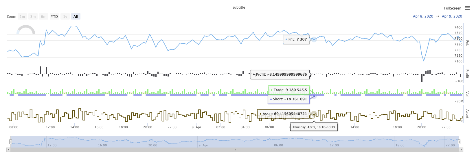
Je suis désolé.
KLineChart(chartCfg), cette fonction est utilisée pour utiliser une méthode de dessin similaire au langage Pine pour le dessin personnalisé lorsque la stratégie est en cours d'exécution.KLineChart()méthode ou l'une desChart() methods.
Code de référence:
function main() {
    // Call the KLineChart function to create a chart control object c
    let c = KLineChart({
        overlay: true
    })

    // Use the spot exchange object test to obtain K-line data. If you use the futures exchange object test, you need to set up the contract first.
    let bars = exchange.GetRecords()
    if (!bars) {
        return
    }

    bars.forEach(function(bar, index) {
        c.begin(bar)
        c.barcolor(bar.Close > bar.Open ? 'rgba(255, 0, 0, 0.2)' : 'rgba(0, 0, 0, 0.2)')
        if (bar.Close > bar.Open) {
            c.bgcolor('rgba(0, 255, 0, 0.5)')
        }
        let h = c.plot(bar.High, 'high')
        let l = c.plot(bar.Low, 'low')

        c.fill(h, l, {
            color: bar.Close > bar.Open ? 'rgba(255, 0, 0, 0.2)' : 'rgba(255, 0, 0, 0.2)'
        })
        c.hline(bar.High)
        c.plotarrow(bar.Close - bar.Open)
        c.plotshape(bar.Low, {
            style: 'diamond'
        })
        c.plotchar(bar.Close, {
            char: 'X'
        })
        c.plotcandle(bar.Open*0.9, bar.High*0.9, bar.Low*0.9, bar.Close*0.9)
        if (bar.Close > bar.Open) {
            // long/short/closelong/closeshort
            c.signal("long", bar.High, 1.5)
        } else if (bar.Close < bar.Open) {
            c.signal("closelong", bar.Low, 1.5)
        }
        c.close()
    })
}
def main():
    # Call the KLineChart function to create a chart control object c
    c = KLineChart({
        "overlay": True
    })

    # Use the spot exchange object test to obtain K-line data. If you use the futures exchange object test, you need to set up the contract first.
    bars = exchange.GetRecords()
    if not bars:
        return

    for bar in bars:
        c.begin(bar)
        c.barcolor('rgba(255, 0, 0, 0.2)' if bar.Close > bar.Open else 'rgba(0, 0, 0, 0.2)')
        if bar.Close > bar.Open:
            c.bgcolor('rgba(0, 255, 0, 0.5)')

        h = c.plot(bar.High, 'high')
        l = c.plot(bar.Low, 'low')

        c.fill(h, l, 'rgba(255, 0, 0, 0.2)' if bar.Close > bar.Open else 'rgba(255, 0, 0, 0.2)')
        c.hline(bar.High)
        c.plotarrow(bar.Close - bar.Open)
        c.plotshape(bar.Low, style = 'diamond')
        c.plotchar(bar.Close, char = 'X')
        c.plotcandle(bar.Open*0.9, bar.High*0.9, bar.Low*0.9, bar.Close*0.9)
        if bar.Close > bar.Open:
            # long/short/closelong/closeshort
            c.signal("long", bar.High, 1.5)
        elif bar.Close < bar.Open:
            c.signal("closelong", bar.Low, 1.5)

        c.close()
// Not supported currently
S'il doit y avoir un objet de commande de graphique pour dessiner dans la zone de dessin personnalisé de la stratégie, utiliser la fonctionKLineChartLe paramètre de laKLineChartfonction est une structure de configuration de graphique, la structure de graphique utilisée dans le code de référence est très simple{overlay: true}). Cette structure de configuration de graphique définit uniquement le contenu de dessin à produire sur le graphique principal.overlayest réglée surfalseSi vous avez besoin de spécifier une fonction de dessin pour dessiner sur le graphique principal, vous pouvez également spécifier le paramètreoverlaycommetruedans l'appel de fonction spécifique.
L'opération de dessin est exécutée en traversant les données de la ligne K. L'opération de dessin doit commencer par unc.begin(bar)appel de fonction et fin avec unc.close()Les fonctions d'interface de dessin du langage Pine prises en charge dans l'opération de dessin sont:
-
couleur de barre: couleur de ligne K
barcolor (couleur, décalage, modifiable, titre, affichage)
c.barcolor(bar.Close > bar.Open ? 'rgba(255, 0, 0, 0.2)' : 'rgba(0, 0, 0, 0.2)') // Use the example illustrated in the reference code in this example, without giving unnecessary detailsc.barcolor('rgba(255, 0, 0, 0.2)' if bar.Close > bar.Open else 'rgba(0, 0, 0, 0.2)')displayparamètres facultatifs:aucun , tous
-
bgcolor: Remplissez le fond de la ligne K avec la couleur spécifiée
bgcolor ((couleur, décalage, modifiable, show_last, titre, affichage, superposition)
c.bgcolor('rgba(0, 255, 0, 0.5)')c.bgcolor('rgba(0, 255, 0, 0.5)')displayParamètres facultatifs:aucun , tous
-
Tracé: Tracer une série de données sur le graphique
graphique (série, titre, couleur, largeur de ligne, style, trackprice, base de données, décalage, joint, modifiable, show_last, affichage)
c.plot(bar.High, 'high')h = c.plot(bar.High, 'high')styleparamètres facultatifs:stepline_diamond , stepline , cross , areaabr , area , circles , colonnes , histogramme , linebr , line displayparamètres facultatifs:aucun , tous
-
remplir: remplir le fond entre deux dessins ou lignes avec la couleur fournie
remplir ((ligne1, ligne2, couleur, titre, modifiable, remplir des espaces, afficher)
let h = c.plot(bar.High, 'high')
let l = c.plot(bar.Low, 'low')

c.fill(h, l, {color: bar.Close > bar.Open ? 'rgba(255, 0, 0, 0.2)' : 'rgba(255, 0, 0, 0.2)'})
h = c.plot(bar.High, 'high') l = c.plot(bar.Low, 'low') c.fill(h, l, {"color": 'rgba(255, 0, 0, 0.2)' if bar.Close > bar.Open else 'rgba(255, 0, 0, 0.2)'})displayparamètres facultatifs:aucun , tous
Depuis le
JavaScriptLe langage ne peut pas spécifier les paramètres entrants selon les noms des paramètres formels de la fonction, afin de résoudre ce problème, un{key: value}structure peut être utilisé pour spécifier le paramètre passé dans un certain nom de paramètre formel, par exemple dans le code de référence, utilisation{color: bar.Close > bar.Open ? 'rgba(255, 0, 0, 0.2)' : 'rgba(255, 0, 0, 0.2)'}pour préciser lecolorparamètre dufillSi vous avez besoin de spécifier des paramètres avec plusieurs noms de paramètres consécutivement, vous pouvez utiliser{key1: value1, key2: value2, key3: value3}. Par exemple, dans cet exemple, ajouter un paramètre spécifiant untitle:{color: bar.Close > bar.Open ? 'rgba(255, 0, 0, 0.2)' : 'rgba(255, 0, 0, 0.2)', title: 'fill'}.Pour la valeur de couleur, vous pouvez utiliser le
'rgba(255, 0, 0, 0.2)'méthode de réglage ou d'utilisation du'#FF0000'méthode à définir. -
ligne: Rendre une ligne horizontale à un niveau de prix fixe donné
ligne ((prix, titre, couleur, style de ligne, largeur de ligne, modifiable, affichage)
c.hline(bar.High)c.hline(bar.High)linestyleparamètres facultatifs:pointillés , pointillés , solides displayparamètres facultatifs:aucun , tous
-
Plotarrow: Dessiner des flèches vers le haut et vers le bas sur le graphique
Plotarrow ((série, titre, colorup, coloradown, décalage, minheight, maxheight, modifiable, show_last, affichage)
c.plotarrow(bar.Close - bar.Open)c.plotarrow(bar.Close - bar.Open)displayparamètres facultatifs:aucun , tous
-
Plotshape: dessiner des formes visuelles sur le graphique
plotshape ((série, titre, style, emplacement, couleur, décalage, texte, couleur de texte, modifiable, taille, show_last, affichage)
c.plotshape(bar.Low, {style: 'diamond'})c.plotshape(bar.Low, style = 'diamond')-
styleParamètres facultatifs:diamant , carré , étiquette_en bas , étiquette_en haut , flèche_en bas , flèche_en haut , cercle , drapeau , triangle_en bas , triangle_en haut , croix , xcross -
locationparamètres facultatifs:barre supérieure , barre inférieure , top , bottom , absolu -
sizeparamètres facultatifs:10px , 14px , 20px , 40px , 80px , par rapport au size.tiny,size.small,size.normal,size.large,size.hugedans la langue du pinsize.autoestsize.small. -
displayparamètres facultatifs:aucun , tous
-
-
plotchar: dessiner des formes visibles sur le graphique en utilisant n'importe quel caractère Unicode donné
graphique (série, titre, graphique, emplacement, couleur, décalage, texte, couleur de texte, modifiable, taille, show_last, affichage)
c.plotchar(bar.Close, {char: 'X'})c.plotchar(bar.Close, char = 'X')-
locationparamètres facultatifs:barre supérieure , barre inférieure , top , bottom , absolu -
sizeparamètres facultatifs:10px , 14px , 20px , 40px , 80px , par rapport au size.tiny,size.small,size.normal,size.large,size.hugedans la langue du pinsize.autoestsize.small. -
displayparamètres facultatifs:aucun , tous
-
-
Plotcandle: dessiner un graphique de ligne K sur le graphique
plotcandle ((ouvert, haut, bas, près, titre, couleur, wickcolor, modifiable, show_last, bordercolor, display)
c.plotcandle(bar.Open*0.9, bar.High*0.9, bar.Low*0.9, bar.Close*0.9)c.plotcandle(bar.Open*0.9, bar.High*0.9, bar.Low*0.9, bar.Close*0.9)displayParamètres facultatifs:aucun , tous
-
signal: des fonctions qui ne sont pas disponibles dans le langage Pine sont utilisées ici pour tracer des signaux d'achat et de vente
signal ((direction, prix, quantité, identifiant)
c.signal("long", bar.High, 1.5)c.signal("long", bar.High, 1.5)Le paramètre d'entrée
"long"indique la direction de la transaction, facultatif"long","closelong","short","closeshort"Le paramètre d'entréebar.Highest la position de l'axe Y du signal marqueur.1.5représente le nombre de transactions du signal. Le quatrième paramètre peut être passé pour remplacer le contenu du texte dessiné par défaut. Le texte par défaut du marqueur de signal dessiné est la direction de négociation, par exemple:"closelong".
Pour certaines couleurs, styles et autres paramètres utilisés dans les appels de fonctions ci-dessus, veuillez vous référer àArticle spécial sur le dessin avec la fonction KLineChart
LogReset (Réinitialisation du journal)
LogReset()est utilisé pour effacer les journaux. Vous pouvez passer un paramètre entier pour spécifier le nombre de journaux récents à conserver et effacer le reste des journaux. Le journal de démarrage est compté à chaque fois qu'il est démarré, donc si aucun paramètre n'est passé et qu'il n'y a pas de sortie de journal au début de la stratégie, le journal ne sera pas affiché du tout, en attendant que le journal du docker revienne (pas une situation anormale).
function main() {
    // Mainta