 ["abc", "def", {"type": "button", "cmd": "coverAll", "name": "close position"}]
      ]
  })"_json;

  auto ticker = exchange.GetTicker();
  json jsonTicker = R"({"Buy": 0, "Sell": 0, "High": 0, "Low": 0, "Volume": 0, "Last": 0, "Time": 0})"_json;
  jsonTicker["Buy"] = ticker.Buy;
  jsonTicker["Sell"] = ticker.Sell;
  jsonTicker["Last"] = ticker.Last;
  jsonTicker["Volume"] = ticker.Volume;
  jsonTicker["Time"] = ticker.Time;
  jsonTicker["High"] = ticker.High;
  jsonTicker["Low"] = ticker.Low;

  json arr = R"([{"body": {}, "colspan": 2}, "abc"])"_json;
  arr[0]["body"] = jsonTicker;
  table["rows"].push_back(arr);
  LogStatus("`" + table.dump() + "`");
}
)
- Vertical merger
```js
function main() {
var table = {
type: 'table',
title: 'Table demo',
cols: ['ColumnA', 'ColumnB', 'ColumnC'],
rows: [
['A1', 'B1', {'type':'button', 'cmd': 'coverAll', 'name': 'C1'}]
]
}
var ticker = exchange.GetTicker()
var name = exchange.GetName()
table.rows.push([{body : "A2 + B2:" + JSON.stringify(ticker), colspan : 2}, "C2"])
table.rows.push([{body : "A3 + A4 + A5:" + name, rowspan : 3}, "B3", "C3"])
// A3 is merged by the first cell in the previous row
table.rows.push(["B4", "C4"])
// A2 is merged by the first cell in the previous row
table.rows.push(["B5", "C5"])
table.rows.push(["A6", "B6", "C6"])
LogStatus('`' + JSON.stringify(table) + '`')
}
import json
def main():
    table = {
        "type" : "table",
        "title" : "Table demo",
        "cols" : ["ColumnA", "ColumnB", "ColumnC"],
        "rows" : [
            ["A1", "B1", {"type": "button", "cmd": "coverAll", "name": "C1"}]
        ]
    }

    ticker = exchange.GetTicker()
    name = exchange.GetName()

    table["rows"].append([{"body": "A2 + B2:" + json.dumps(ticker), "colspan": 2}, "C2"])
    table["rows"].append([{"body": "A3 + A4 + A5:" + name, "rowspan": 3}, "B3", "C3"])
    table["rows"].append(["B4", "C4"])
    table["rows"].append(["B5", "C5"])
    table["rows"].append(["A6", "B6", "C6"])
    LogStatus("`" + json.dumps(table) + "`")
void main() {
    json table = R"({
        "type" : "table",
        "title" : "Table demo",
        "cols" : ["ColumnA", "ColumnB", "ColumnC"],
        "rows" : [
            ["A1", "B1", {"type": "button", "cmd": "coverAll", "name": "C1"}]
        ]
    })"_json;
    // In order to test, the code is short and easy to read, and the constructed data is used here
    json jsonTicker = R"({"High": 0, "Low": 0, "Buy": 0, "Sell": 0, "Last": 0, "Time": 0, "Volume": 0})"_json;
    auto name = exchange.GetName();
    json arr1 = R"([{"body": "", "colspan": 2}, "C2"])"_json;
    arr1[0]["body"] = "A2 + B2:" + jsonTicker.dump();
    json arr2 = R"([{"body": "", "rowspan": 3}, "B3", "C3"])"_json;
    arr2[0]["body"] = "A3 + A4 + A5:" + name;
    table["rows"].push_back(arr1);
    table["rows"].push_back(arr2);
    table["rows"].push_back(R"(["B4", "C4"])"_json);
    table["rows"].push_back(R"(["B5", "C5"])"_json);
    table["rows"].push_back(R"(["A6", "B6", "C6"])"_json);
    LogStatus("`" + table.dump() + "`");
}
)
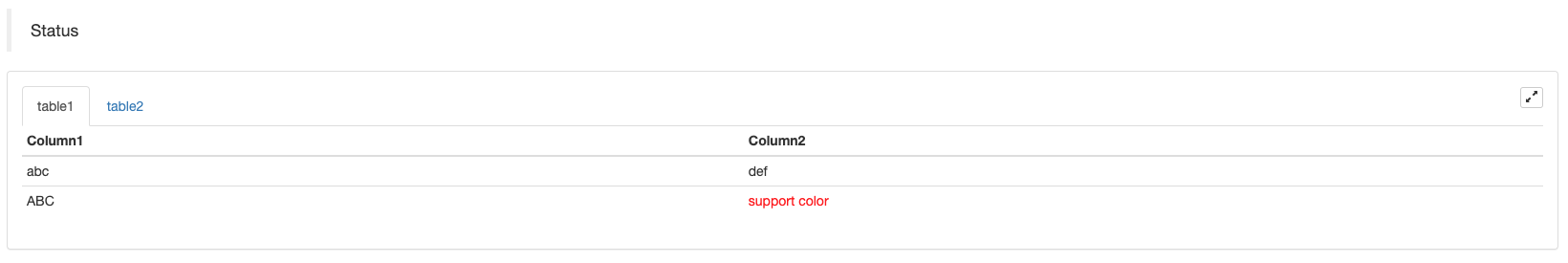
स्थिति पट्टी का तालिका पृष्टीकरण प्रदर्शनः
function main() {
    var table1 = {type: 'table', title: 'table1', cols: ['Column1', 'Column2'], rows: [ ['abc', 'def'], ['ABC', 'support color #ff0000']]}
    var table2 = {type: 'table', title: 'table2', cols: ['Column1', 'Column2'], rows: [ ['abc', 'def'], ['ABC', 'support color #ff0000']]}
    LogStatus('`' + JSON.stringify([table1, table2]) + '`')
}
import json
def main():
    table1 = {"type": "table", "title": "table1", "cols": ["Column1", "Column2"], "rows": [ ["abc", "def"], ["ABC", "support color #ff0000"]]}
    table2 = {"type": "table", "title": "table2", "cols": ["Column1", "Column2"], "rows": [ ["abc", "def"], ["ABC", "support color #ff0000"]]}
    LogStatus("`" + json.dumps([table1, table2]) + "`")
void main() {
    json table1 = R"({"type": "table", "title": "table1", "cols": ["Column1", "Column2"], "rows": [ ["abc", "def"], ["ABC", "support color #ff0000"]]})"_json;
    json table2 = R"({"type": "table", "title": "table2", "cols": ["Column1", "Column2"], "rows": [ ["abc", "def"], ["ABC", "support color #ff0000"]]})"_json;
    json arr = R"([])"_json;
    arr.push_back(table1);
    arr.push_back(table2);
    LogStatus("`" + arr.dump() + "`");
}
तालिकाओं को पृष्ठबद्ध करने के अतिरिक्त, कई तालिकाओं को ऊपर से नीचे तक व्यवस्थित किया जा सकता है।
function main(){
    var tab1 = {
        type : "table",
        title : "table1",
        cols : ["1", "2"],
        rows : []
    }
    var tab2 = {
        type : "table",
        title : "table2",
        cols : ["1", "2", "3"],
        rows : []
    }
    var tab3 = {
        type : "table",
        title : "table3",
        cols : ["A", "B", "C"],
        rows : []
    }

    tab1.rows.push(["jack", "lucy"])
    tab2.rows.push(["A", "B", "C"])
    tab3.rows.push(["A", "B", "C"])

    LogStatus('`' + JSON.stringify(tab1) + '`\n' +
        '`' + JSON.stringify(tab2) + '`\n' +
        '`' + JSON.stringify(tab3) + '`')

    Log("exit")
}
import json
def main():
    tab1 = {
        "type": "table",
        "title": "table1",
        "cols": ["1", "2"],
        "rows": []
    }
    tab2 = {
        "type": "table",
        "title": "table2",
        "cols": ["1", "2", "3"],
        "rows": []
    }
    tab3 = {
        "type": "table",
        "title": "table3",
        "cols": ["A", "B", "C"],
        "rows": []
    }

    tab1["rows"].append(["jack", "lucy"])
    tab2["rows"].append(["A", "B", "C"])
    tab3["rows"].append(["A", "B", "C"])
    LogStatus("`" + json.dumps(tab1) + "`\n" +
        "`" + json.dumps(tab2) + "`\n" +
        "`" + json.dumps(tab3) + "`")
void main() {
    json tab1 = R"({
        "type": "table",
        "title": "table1",
        "cols": ["1", "2"],
        "rows": []
    })"_json;
    json tab2 = R"({
        "type": "table",
        "title": "table2",
        "cols": ["1", "2", "3"],
        "rows": []
    })"_json;
    json tab3 = R"({
        "type": "table",
        "title": "table3",
        "cols": ["A", "B", "C"],
        "rows": []
    })"_json;
    tab1["rows"].push_back(R"(["jack", "lucy"])"_json);
    tab2["rows"].push_back(R"(["A", "B", "C"])"_json);
    tab3["rows"].push_back(R"(["A", "B", "C"])"_json);
    LogStatus("`" + tab1.dump() + "`\n" +
        "`" + tab2.dump() + "`\n" +
        "`" + tab3.dump() + "`");
}
ऑपरेशन का परिणाम:)
नोटः
जब रणनीति बॉट बॉट पृष्ठ पर चल रहा है, यदि आप इतिहास रिकॉर्ड के माध्यम से स्क्रॉल करते हैं, तो स्थिति पट्टी एक निष्क्रिय स्थिति में प्रवेश करेगी और अद्यतन करना बंद कर देगी। स्थिति पट्टी डेटा केवल तभी ताज़ा होगा जब लॉग पहले पृष्ठ पर होगा.
स्थिति पट्टी में कोडित छवियों के आउटपुट का समर्थन करता हैbase64, और साथ ही में कोडित छवियों के आउटपुट का समर्थन करता हैbase64क्योंकि एन्कोडेड इमेज की स्ट्रिंग की लंबाई सामान्यतः बहुत लंबी होती है, इसलिए कोई नमूना कोड प्रदान नहीं किया जाता है।
EnableLog()
EnableLog(IsEnable)आदेश सूचना के लिए लॉग रिकॉर्डिंग चालू या बंद करता है। पैरामीटर मानःisEnablebool प्रकार का है। यदिIsEnableपर सेट हैfalse, आदेश लॉग मुद्रित नहीं किया जाएगा और यह बॉट डेटाबेस में नहीं लिखा जाएगा.
चार्ट ((...)
Chart(...), चार्ट ड्राइंग को अनुकूलित करने का कार्य।
Chart({…}); पैरामीटर हैHighCharts.StockChartके मापदंडउच्च स्टॉककि में सीरियल किया जा सकता हैJSON, एक जोड़कर_isStockमूल पैरामीटर के लिए विशेषता. यदि आप निर्दिष्ट_isStock:false, यह एक सामान्य चार्ट के रूप में प्रदर्शित किया जाएगा।
नोटः
यदि आप की विशेषता सेट_isStockतकfalse, इस्तेमाल किया गया चार्ट हैःउच्च चार्ट, जैसा कि चार्ट में दिखाया गया हैः
)
अगर हम विशेषता सेट_isStockतकtrue, इस्तेमाल किया गया चार्ट हैःउच्चस्तरीय(डिफ़ॉल्ट_isStockजैसा कि चार्ट में दिखाया गया हैः
)
वस्तु पर लौटने के लिए, आप कॉल कर सकते हैंadd(n, data) (n(जैसे 0) का सूचकांक हैseries, औरdataनिर्दिष्ट सूचकांक में डेटा जोड़ने के लिए) ।series; कॉलreset()चार्ट डेटा को साफ करने के लिए, औरresetएक संख्यात्मक पैरामीटर ले सकता है और आरक्षित वस्तुओं की संख्या निर्दिष्ट कर सकता है।
आप कॉल कर सकते हैंadd(n, data, i) (iइन आंकड़ों का सूचकांक हैseries) में डेटा बदलने के लिएseries.
यह ऋणात्मक हो सकता है,
chart.add(0, [1574993606000, 13.5], -1), के अंतिम बिंदु के डेटा को बदलनाseries[0].data.
इसके लिए कई चार्ट प्रदर्शित करने के लिए समर्थन करता है, आपको केवल कॉन्फ़िगरेशन के दौरान सरणी मापदंडों में पारित करने की आवश्यकता है, जैसेःvar chart = Chart([{…}, {…}, {…}])उदाहरण के लिए, चार्ट 1 में दोseries, चार्ट 2 में एक हैseries, और चार्ट 3 में एक हैseries. फिर, श्रृंखला आईडी 0 और 1 को निर्दिष्ट करते समय जोड़ने का प्रतिनिधित्व करता है चार्ट के दो क्रम स्तंभों के डेटा को अद्यतन करने के लिए 1; श्रृंखला आईडी 2 को निर्दिष्ट करते समय जोड़ने से पहले संदर्भित करता हैseriesचार्ट 2 के डेटा; सीरीज ID3 निर्दिष्ट करने से पहले के डेटा को संदर्भित करता हैseriesचार्ट 3 का।
HighStocks: http://api.highcharts.com/highstock
बहु-चार्ट प्रदर्शन से संबंधित विशेषता सेटिंग्सःउदाहरण
उदाहरण के लिए, चार्ट कॉन्फ़िगरेशन ऑब्जेक्टः
var cfgA = {
    extension: {
        // It does not participate in grouping, displayed separately, and its default is 'group'
        layout: 'single',
        // This is the specified height, which can be set to string "300px" (set "300", and "300px" will be displayed instead automatically)
        height: 300,
        // It is the unit value of the specified width, with a total value of 12
        col: 8
    },
    title: {
        text: 'Market Chart'
    },
    xAxis: {
        type: 'datetime'
    },
    series: [{
        name: 'Buy 1',
        data: []
    }, {
        name: 'Sell 1',
        data: []
    }]
}

var cfgB = {
    title: {
        text: 'Spread chart'
    },
    xAxis: {
        type: 'datetime'
    },
    series: [{
        name: 'Spread',
        type: 'column',
        data: []
    }]
}

var cfgC = {
    _isStock: false,
    title: {
        text: 'Pie Chart'
    },
    series: [{
        type: 'pie',
        name: 'one',
        // After specifying the initial data, you don't need to update it with the "add" function; Changing the chart configuration directly will update the series
        data: [
            ["A", 25],
            ["B", 25],
            ["C", 25],
            ["D", 25]
        ]
    }]
}

var cfgD = {
    extension: {
        layout: 'single',
        // The unit value of the specified width, with a total value of 12
        col: 8,
        height: '300px'
    },
    title: {
        text: 'Market Chart'
    },
    xAxis: {
        type: 'datetime'
    },
    series: [{
        name: 'Buy 1',
        data: []
    }, {
        name: 'Sell 1',
        data: []
    }]
}

var cfgE = {
    __isStock: false,
    extension: {
        layout: 'single',
        col: 4,
        height: '300px'
    },
    title: {
        text: 'Pie Chart2'
    },
    series: [{
        type: 'pie',
        name: 'one',
        data: [
            ["A", 25],
            ["B", 25],
            ["C", 25],
            ["D", 25]
        ]
    }]
}
cfgA = {
    "extension" : {
        "layout" : "single",
        "height" : 300,
        "col" : 8
    },
    "title" : {
        "text" : "Market Chart"
    },
    "xAxis" : {
        "type" : "datetime"
    },
    "series" : [{
        "name" : "Buy 1",
        "data" : []
    }, {
        "name" : "Sell 1",
        "data" : []
    }]
}

cfgB = {
    "title" : {
        "text" : "Spread chart"
    },
    "xAxis" : {
        "type" : "datetime"
    },
    "series" : [{
        "name" : "Spread",
        "type" : "column",
        "data" : []
    }]
}

cfgC = {
    "__isStock" : False,
    "title" : {
        "text" : "Pie Chart"
    },
    "series" : [{
        "type" : "pie",
        "name" : "one",
        "data" : [
            ["A", 25],
            ["B", 25],
            ["C", 25],
            ["D", 25]
        ]
    }]
}

cfgD = {
    "extension" : {
        "layout" : "single",
        "col" : 8,
        "height" : "300px"
    },
    "title" : {
        "text" : "Market Chart"
    },
    "series" : [{
        "name" : "Buy 1",
        "data" : []
    }, {
        "name" : "Sell 1",
        "data" : []
    }]
}

cfgE = {
    "__isStock" : False,
    "extension" : {
        "layout" : "single",
        "col" : 4,
        "height" : "300px"
    },
    "title" : {
        "text" : "Pie Chart2"
    },
    "series" : [{
        "type" : "pie",
        "name" : "one",
        "data" : [
            ["A", 25],
            ["B", 25],
            ["C", 25],
            ["D", 25]
        ]
    }]
}
json cfgA = R"({
    "extension" : {
        "layout" : "single",
        "height" : 300,
        "col" : 8
    },
    "title" : {
        "text" : "Market Chart"
    },
    "xAxis" : {
        "type" : "datetime"
    },
    "series" : [{
        "name" : "Buy 1",
        "data" : []
    }, {
        "name" : "Sell 1",
        "data" : []
    }]
})"_json;

json cfgB = R"({
    "title" : {
        "text" : "Spread chart"
    },
    "xAxis" : {
        "type" : "datetime"
    },
    "series" : [{
        "name" : "Spread",
        "type" : "column",
        "data" : []
    }]
})"_json;

json cfgC = R"({
    "__isStock" : false,
    "title" : {
        "text" : "Pie Chart"
    },
    "series" : [{
        "type" : "pie",
        "name" : "one",
        "data" : [
            ["A", 25],
            ["B", 25],
            ["C", 25],
            ["D", 25]
        ]
    }]
})"_json;

json cfgD = R"({
    "extension" : {
        "layout" : "single",
        "col" : 8,
        "height" : "300px"
    },
    "title" : {
        "text" : "Market Chart"
    },
    "series" : [{
        "name" : "Buy 1",
        "data" : []
    }, {
        "name" : "Sell 1",
        "data" : []
    }]
})"_json;

json cfgE = R"({
    "__isStock" : false,
    "extension" : {
        "layout" : "single",
        "col" : 4,
        "height" : "300px"
    },
    "title" : {
        "text" : "Pie Chart2"
    },
    "series" : [{
        "type" : "pie",
        "name" : "one",
        "data" : [
            ["A", 25],
            ["B", 25],
            ["C", 25],
            ["D", 25]
        ]
    }]
})"_json;
-
cfgA.extension.layoutगुणयदि यह विशेषता सेट है और मान
single है, तो चार्ट ओवरलैप नहीं होगा (यह एक टैब लेबल के रूप में प्रदर्शित नहीं होगा) और अलग से प्रदर्शित किया जाएगा (टाइल डिस्प्ले) । -
cfgA.extension.heightगुणइस विशेषता का उपयोग चार्ट की ऊंचाई सेट करने के लिए किया जाता है। मान एक संख्यात्मक प्रकार हो सकता है, या
300px मोड पर सेट किया जा सकता है। -
cfgA.extension.colगुणइस विशेषता का उपयोग चार्ट की चौड़ाई निर्धारित करने के लिए किया जाता है। पृष्ठ चौड़ाई को कुल मिलाकर 12 इकाइयों में विभाजित किया जाता है, और
8 सेट करने का मतलब है कि चार्ट 8 इकाइयों की चौड़ाई पर कब्जा कर लेता है। पूर्ण उदाहरण रणनीति चलाएँः
उपरोक्त उदाहरणों में चार्ट विन्यास वस्तुओं का प्रभाव प्रदर्शनः
)
)
-
चार्ट कॉन्फ़िगरेशन ऑब्जेक्ट पर डेटा के लिए, चार्ट कॉन्फ़िगरेशन को सीधे संशोधित करें, और फिर डेटा अपडेट को महसूस करने के लिए चार्ट को अपडेट करें:
उदाहरण के लिए,
JavaScriptउदाहरण का कोड भाग (पूर्ण उदाहरण):cfgC.series[0].data[0][1] = Math.random() * 100 cfgE.series[0].data[0][1] = Math.random() * 100 // "Update" is actually equivalent to resetting the configuration of the chart chart.update([cfgA, cfgB, cfgC, cfgD, cfgE])द्वारा डेटा अद्यतन करें
addविधि, जैसे कि पाई चार्ट में एक आइटम जोड़ना, और यहाँ निम्नलिखित हैJavaScriptउदाहरण का कोड भाग (पूर्ण उदाहरण):// Add a data point to the pie chart; "add" can only update the data points added by the "add" method, the built-in data points cannot be updated later chart.add(3, { name: "ZZ", y: Math.random() * 100 }) -
इसके उपयोग के उदाहरण संलग्न हैं
Chartकार्यसरल चित्रण उदाहरणः
// This chart is an object in JavaScript language. Before using the "Chart" function, we need to declare an object variable of a chart configuration
var chart = {
    // It is marked as a general chart; if you are interested, you can change it to false and run it
    __isStock: true,
    // Zoom tool
    tooltip: {xDateFormat: '%Y-%m-%d %H:%M:%S, %A'},
    // Title
    title : { text : 'Spread analysis chart'},
    // Choose a range
    rangeSelector: {
        buttons:  [{type: 'hour',count: 1, text: '1h'}, {type: 'hour',count: 3, text: '3h'}, {type: 'hour', count: 8, text: '8h'}, {type: 'all',text: 'All'}],
        selected: 0,
        inputEnabled: false
    },
    // The horizontal axis of the coordinate axis is: x axis, and the currently set "Types of" is: time
    xAxis: { type: 'datetime'},
    // The vertical axis of the coordinate axis is: y axis, and the default value is adjusted with the data size
    yAxis : {
        // Title
        title: {text: 'Spread'},
        // Whether to enable the right vertical axis
        opposite: false
    },
    // Data system column; this attribute holds each data system column (line, K-line diagram, label, etc.)
    series : [
        // The index is 0, and the data in the data column is stored in the data array.
        {name : "line1", id : "line 1,buy1Price", data : []},
        // The index is 1, and set dashStyle: 'shortdash', namely: set the dashed line
        {name : "line2", id : "line 2,lastPrice", dashStyle : 'shortdash', data : []}
    ]
}
function main(){
    // Call the "Chart" function to initialize the chart
    var ObjChart = Chart(chart)
    // Empty
    ObjChart.reset()
    while(true){
        // Get the timestamp of this polling, that is, a millisecond timestamp, used to determine the position of the X axis written to the chart
        var nowTime = new Date().getTime()
        // Get market data
        var ticker = _C(exchange.GetTicker)
        // Get "Buy 1" price from the return value of market data
        var buy1Price = ticker.Buy
        // To obtain the last executed price, in order to avoid the overlap of the 2 lines, we add 1
        var lastPrice = ticker.Last + 1
        // Use timestamp as X value and "Buy 1" price as Y value, and pass them into the data sequence of index 0
        ObjChart.add(0, [nowTime, buy1Price])
        // Same as above
        ObjChart.add(1, [nowTime, lastPrice])
        Sleep(2000)
    }
}
import time chart = { "__isStock" : True, "tooltip" : {"xDateFormat" : "%Y-%m-%d %H:%M:%S, %A"}, "title" : {"text" : "Spread analysis chart"}, "rangeSelector" : { "buttons" : [{"type": "count", "count": 1, "text": "1h"}, {"type": "hour", "count": 3, "text": "3h"}, {"type": "hour", "count": 8, "text": "8h"}, {"type": "all", "text": "All"}], "selected": 0, "inputEnabled": False }, "xAxis": {"type": "datetime"}, "yAxis": { "title": {"text": "Spread"}, "opposite": False }, "series": [{ "name": "line1", "id": "line 1,buy1Price", "data": [] }, { "name": "line2", "id": "line 2,lastPrice", "dashStyle": "shortdash", "data": [] }] } def main(): ObjChart = Chart(chart) ObjChart.reset() while True: nowTime = time.time() * 1000 ticker = exchange.GetTicker() buy1Price = ticker["Buy"] lastPrice = ticker["Last"] + 1 ObjChart.add(0, [nowTime, buy1Price]) ObjChart.add(1, [nowTime, lastPrice]) Sleep(2000)void main() { // When write strategies in C++, try not to declare global variables that are not basic types, so the declaration of the chart configuration objects is in the "main" function json chart = R"({ "__isStock" : true, "tooltip" : {"xDateFormat" : "%Y-%m-%d %H:%M:%S, %A"}, "title" : {"text" : "Spread analysis chart"}, "rangeSelector" : { "buttons" : [{"type": "count", "count": 1, "text": "1h"}, {"type": "hour", "count": 3, "text": "3h"}, {"type": "hour", "count": 8, "text": "8h"}, {"type": "all", "text": "All"}], "selected": 0, "inputEnabled": false }, "xAxis": {"type": "datetime"}, "yAxis": { "title": {"text": "Spread"}, "opposite": false }, "series": [{ "name": "line1", "id": "line 1,buy1Price", "data": [] }, { "name": "line2", "id": "line 2,lastPrice", "dashStyle": "shortdash", "data": [] }] })"_json; auto ObjChart = Chart(chart); ObjChart.reset(); while(true) { auto nowTime = Unix() * 1000; auto ticker = exchange.GetTicker(); auto buy1Price = ticker.Buy; auto lastPrice = ticker.Last + 1.0; ObjChart.add(0, {nowTime, buy1Price}); ObjChart.add(1, {nowTime, lastPrice}); Sleep(2000); } }त्रिकोणमितीय वक्र को खींचने का उदाहरणः
// The object used to initialize the chart
var chart = {
    // Chart title
    title: {text: "line value triggers plotLines value"},
    // The related settings of Y axis
    yAxis: {
        // The horizontal line perpendicular to y axis, used as a trigger line, is an array of structures where multiple trigger lines can be set
        plotLines: [{
            // Trigger line value; set a number, and this line will be displayed in the corresponding numerical position
            value: 0,
            // Set the color of the trigger line
            color: 'red',
            // Width
            width: 2,
            // Labels displayed
            label: {
                // Label text
                text: 'Trigger value',
                // Center label position
                align: 'center'
            }
        }]
    },
    // The related settings of X axis, and here the setting type is the time axis
    xAxis: {type: "datetime"},
    series: [
        {name: "sin", type: "spline", data: []},
        // This is a more important data system column; you can set multiple data system column, according to the array index control
        {name: "cos", type: "spline", data: []}
    ]
}
function main(){
    // Pi
    var pi = 3.1415926535897
    // Variable for recording timestamp
    var time = 0
    // Angle
    var angle = 0
    // Coordinate y value, used to receive sine and cosine values
    var y = 0
    // Call the API to initialize charts with "chart" objects
    var objChart = Chart(chart)
    // When initializing, clear the chart
    objChart.reset()
    // Set the value of the trigger line to 1
    chart.yAxis.plotLines[0].value = 1
    // Loop
    while(true){
        // Get the timestamp of the current moment
        time = new Date().getTime()
        // The angle is increased by 5 degrees every 500ms, and the sine value is calculated
        y = Math.sin(angle * 2 * pi / 360)
        // Write the calculated y value to the data of the corresponding index of the chart; the first parameter of the "add" function is the specified index
        objChart.add(0, [time, y])
        // Calculate the cosine value
        y = Math.cos(angle * 2 * pi / 360)
        objChart.add(1, [time, y])
        // Increase by 5 degrees
        angle += 5
        // Pause for 5 seconds, to avoid drawing too frequently and the data growing too fast
        Sleep(5000)
    }
}
import math import time chart = { "title": {"text": "line value triggers plotLines value"}, "yAxis": { "plotLines": [{ "value": 0, "color": "red", "width": 2, "label": { "text": "Trigger value", "align": "center" } }] }, "xAxis": {"type": "datetime"}, "series": [{"name": "sin", "type": "spline", "data": []}, {"name": "cos", "type": "spline", "data": []}] } def main(): pi = 3.1415926535897 ts = 0 angle = 0 y = 0 objChart = Chart(chart) objChart.reset() chart["yAxis"]["plotLines"][0]["value"] = 1 while True: ts = time.time() * 1000 y = math.sin(angle * 2 * pi / 360) objChart.add(0, [ts, y]) y = math.cos(angle * 2 * pi / 360) objChart.add(1, [ts, y]) angle += 5 Sleep(5000)void main() { json chart = R"({ "title": {"text": "line value triggers plotLines value"}, "yAxis": { "plotLines": [{ "value": 0, "color": "red", "width": 2, "label": { "text": "Trigger value", "align": "center" } }] }, "xAxis": {"type": "datetime"}, "series": [{"name": "sin", "type": "spline", "data": []}, {"name": "cos", "type": "spline", "data": []}] })"_json; auto pi = 3.1415926535897; auto ts = 0; auto angle = 0.0; auto y = 0.0; auto objChart = Chart(chart); objChart.reset(); chart["yAxis"]["plotLines"][0]["value"] = 1; while(true) { ts = Unix() * 1000; y = sin(angle * 2 * pi / 360); objChart.add(0, {ts, y}); y = cos(angle * 2 * pi / 360); objChart.add(1, {ts, y}); angle += 5; Sleep(5000); } }में
cppरणनीति,Chartफ़ंक्शन चार्ट को कॉन्फ़िगर करने के लिए एक एन्कोडेड स्ट्रिंग का भी उपयोग कर सकता हैःvoid main () { Chart c = Chart(R"EOF({"chart":{"type":"line"},"title":{"text":"Simple chart"},"xAxis":{"title":{"text":"Date"}},"yAxis":{"title":{"text":"Number"}},"series":[{"name":"number","data":[]}]})EOF"); c.reset(); for (size_t i = 0; i < 10; i++) { // For example, int64 of "sprintf" function has different parameters in 32-bit and 64-bit, so it is best to use "toString" to transfer the platform-related types into strings and then pass c.add(0, format("[%s, %d]", toString(Unix() + i).c_str(), rand() % 100)); } })
-
मिश्रित चार्ट का एक जटिल उदाहरणजावास्क्रिप्ट रणनीति पता
/*backtest
start: 2020-03-11 00:00:00
end: 2020-04-09 23:59:00
period: 1d
exchanges: [{"eid":"Bitfinex","currency":"BTC_USD"}]
*/

var chartCfg = {
    subtitle: {
        text: "subtitle",
    },
    yAxis: [{
        height: "40%",
        lineWidth: 2,
        title: {
            text: 'PnL',
        },
        tickPixelInterval: 20,
        minorGridLineWidth: 1,
        minorTickWidth: 0,
        opposite: true,
        labels: {
            align: "right",
            x: -3,
        }
    }, {
        title: {
            text: 'Profit',
        },
        top: "42%",
        height: "18%",
        offset: 0,
        lineWidth: 2
    }, {
        title: {
            text: 'Vol',
        },
        top: '62%',
        height: '18%',
        offset: 0,
        lineWidth: 2
    }, {
        title: {
            text: 'Asset',
        },
        top: '82%',
        height: '18%',
        offset: 0,
        lineWidth: 2
    }],
    series: [{
        name: 'PnL',
        data: [],
        id: 'primary',
        tooltip: {
            xDateFormat: '%Y-%m-%d %H:%M:%S'
        },
        yAxis: 0
    }, {
        type: 'column',
        lineWidth: 2,
        name: 'Profit',
        data: [],
        yAxis: 1,
    }, {
        type: 'column',
        name: 'Trade',
        data: [],
        yAxis: 2
    }, {
        type: 'area',
        step: true,
        lineWidth: 0,
        name: 'Long',
        data: [],
        yAxis: 2
    }, {
        type: 'area',
        step: true,
        lineWidth: 0,
        name: 'Short',
        data: [],
        yAxis: 2
    }, {
        type: 'line',
        step: true,
        color: '#5b4b00',
        name: 'Asset',
        data: [],
        yAxis: 3
    }, {
        type: 'pie',
        innerSize: '70%',
        name: 'Random',
        data: [],
        center: ['3%', '6%'],
        size: '15%',
        dataLabels: {
            enabled: false
        },
        startAngle: -90,
        endAngle: 90,
    }],
};

function main() {
    let c = Chart(chartCfg);
    let preTicker = null;
    while (true) {
        let t = exchange.GetTicker();

        c.add(0, [t.Time, t.Last]); // PnL
        c.add(1, [t.Time, preTicker ? t.Last - preTicker.Last : 0]); // profit
        let r = Math.random();
        var pos = parseInt(t.Time/86400);
        c.add(2, [t.Time, pos/2]); // Vol
        c.add(3, [t.Time, r > 0.8 ? pos : null]); // Long
        c.add(4, [t.Time, r < 0.8 ? -pos : null]); // Short
        c.add(5, [t.Time, Math.random() * 100]); // Asset
        // update pie
        chartCfg.series[chartCfg.series.length-1].data = [
            ["A", Math.random()*100],
            ["B", Math.random()*100],
         ];
        c.update(chartCfg)
        preTicker = t;
    }
}
'''backtest
start: 2020-03-11 00:00:00
end: 2020-04-09 23:59:00
period: 1d
exchanges: [{"eid":"Bitfinex","currency":"BTC_USD"}]
'''

import random

chartCfg = {
    "subtitle": {
        "text": "subtitle"
    },
    "yAxis": [{
        "height": "40%",
        "lineWidth": 2,
        "title": {
            "text": 'PnL'
        },
        "tickPixelInterval": 20,
        "minorGridLineWidth": 1,
        "minorTickWidth": 0,
        "opposite": True,
        "labels": {
            "align": "right",
            "x": -3
        }
    }, {
        "title": {
            "text": 'Profit'
        },
        "top": "42%",
        "height": "18%",
        "offset": 0,
        "lineWidth": 2
    }, {
        "title": {
            "text": 'Vol'
        },
        "top": '62%',
        "height": '18%',
        "offset": 0,
        "lineWidth": 2
    }, {
        "title": {
            "text": 'Asset'
        },
        "top": '82%',
        "height": '18%',
        "offset": 0,
        "lineWidth": 2
    }],
    "series": [{
        "name": 'PnL',
        "data": [],
        "id": 'primary',
        "tooltip": {
            "xDateFormat": '%Y-%m-%d %H:%M:%S'
        },
        "yAxis": 0
    }, {
        "type": 'column',
        "lineWidth": 2,
        "name": 'Profit',
        "data": [],
        "yAxis": 1
    }, {
        "type": 'column',
        "name": 'Trade',
        "data": [],
        "yAxis": 2
    }, {
        "type": 'area',
        "step": True,
        "lineWidth": 0,
        "name": 'Long',
        "data": [],
        "yAxis": 2
    }, {
        "type": 'area',
        "step": True,
        "lineWidth": 0,
        "name": 'Short',
        "data": [],
        "yAxis": 2
    }, {
        "type": 'line',
        "step": True,
        "color": '#5b4b00',
        "name": 'Asset',
        "data": [],
        "yAxis": 3
    }, {
        "type": 'pie',
        "innerSize": '70%',
        "name": 'Random',
        "data": [],
        "center": ['3%', '6%'],
        "size": '15%',
        "dataLabels": {
            "enabled": False
        },
        "startAngle": -90,
        "endAngle": 90
    }]
}

def main():
    c = Chart(chartCfg)
    preTicker = None
    while True:
        t = exchange.GetTicker()
        c.add(0, [t["Time"], t["Last"]])
        profit = t["Last"] - preTicker["Last"] if preTicker else 0
        c.add(1, [t["Time"], profit])
        r = random.random()
        pos = t["Time"] / 86400
        c.add(2, [t["Time"], pos / 2])
        long = pos if r > 0.8 else None
        c.add(3, [t["Time"], long])
        short = -pos if r < 0.8 else None
        c.add(4, [t["Time"], short])
        c.add(5, [t["Time"], random.random() * 100])

        # update pie
        chartCfg["series"][len(chartCfg["series"]) - 1]["data"] = [
            ["A", random.random() * 100],
            ["B", random.random() * 100]
        ]
        c.update(chartCfg)
        preTicker = t
/*backtest
start: 2020-03-11 00:00:00
end: 2020-04-09 23:59:00
period: 1d
exchanges: [{"eid":"Bitfinex","currency":"BTC_USD"}]
*/

void main() {
    json chartCfg = R"({
        "subtitle": {
            "text": "subtitle"
        },
        "yAxis": [{
            "height": "40%",
            "lineWidth": 2,
            "title": {
                "text": "PnL"
            },
            "tickPixelInterval": 20,
            "minorGridLineWidth": 1,
            "minorTickWidth": 0,
            "opposite": true,
            "labels": {
                "align": "right",
                "x": -3
            }
        }, {
            "title": {
                "text": "Profit"
            },
            "top": "42%",
            "height": "18%",
            "offset": 0,
            "lineWidth": 2
        }, {
            "title": {
                "text": "Vol"
            },
            "top": "62%",
            "height": "18%",
            "offset": 0,
            "lineWidth": 2
        }, {
            "title": {
                "text": "Asset"
            },
            "top": "82%",
            "height": "18%",
            "offset": 0,
            "lineWidth": 2
        }],
        "series": [{
            "name": "PnL",
            "data": [],
            "id": "primary",
            "tooltip": {
                "xDateFormat": "%Y-%m-%d %H:%M:%S"
            },
            "yAxis": 0
        }, {
            "type": "column",
            "lineWidth": 2,
            "name": "Profit",
            "data": [],
            "yAxis": 1
        }, {
            "type": "column",
            "name": "Trade",
            "data": [],
            "yAxis": 2
        }, {
            "type": "area",
            "step": true,
            "lineWidth": 0,
            "name": "Long",
            "data": [],
            "yAxis": 2
        }, {
            "type": "area",
            "step": true,
            "lineWidth": 0,
            "name": "Short",
            "data": [],
            "yAxis": 2
        }, {
            "type": "line",
            "step": true,
            "color": "#5b4b00",
            "name": "Asset",
            "data": [],
            "yAxis": 3
        }, {
            "type": "pie",
            "innerSize": "70%",
            "name": "Random",
            "data": [],
            "center": ["3%", "6%"],
            "size": "15%",
            "dataLabels": {
                "enabled": false
            },
            "startAngle": -90,
            "endAngle": 90
        }]
    })"_json;

    Chart c = Chart(chartCfg);
    Ticker preTicker;
    while(true) {
        auto t = exchange.GetTicker();
        c.add(0, {t.Time, t.Last});
        auto profit = preTicker.Valid ? t.Last - preTicker.Last : 0;
        c.add(1, {t.Time, profit});
        auto r = rand() % 100;
        auto pos = t.Time / 86400.0;
        c.add(2, {t.Time, pos / 2.0});
        auto longPos = r > 0.8 ? pos : NULL;
        c.add(3, {t.Time, longPos});
        auto shortPos = r < 0.8 ? -pos : NULL;
        c.add(4, {t.Time, shortPos});
        c.add(5, {t.Time, rand() % 100});

        // update pie
        json pie = R"([["A", 0], ["B", 0]])"_json;
        pie[0][1] = rand() % 100;
        pie[1][1] = rand() % 100;
        chartCfg["series"][chartCfg["series"].size() - 1]["data"] = pie;

        c.update(chartCfg);
        preTicker = t;
    }
}
चार्टों के बीच,pieचार्ट समय अक्ष के बिना एक चार्ट है, और चार्ट विन्यास डेटा अद्यतन करते समय सीधे अद्यतन किया जाना चाहिए। उदाहरण के लिए उपरोक्त उदाहरण में कोड, डेटा अद्यतन करने के बाद, उपयोगc.update(chartCfg)चार्ट को निम्नानुसार अद्यतन करने के लिएः
    // update pie
    chartCfg.series[chartCfg.series.length-1].data = [
        ["A", Math.random()*100],
        ["B", Math.random()*100],
    ];
    c.update(chartCfg)
    # update pie
    chartCfg["series"][len(chartCfg["series"]) - 1]["data"] = [
        ["A", random.random() * 100],
        ["B", random.random() * 100]
    ]
    c.update(chartCfg)
    // update pie
    json pie = R"([["A", 0], ["B", 0]])"_json;
    pie[0][1] = rand() % 100;
    pie[1][1] = rand() % 100;
    chartCfg["series"][chartCfg["series"].size() - 1]["data"] = pie;
    c.update(chartCfg);
ऑपरेशन परिणाम: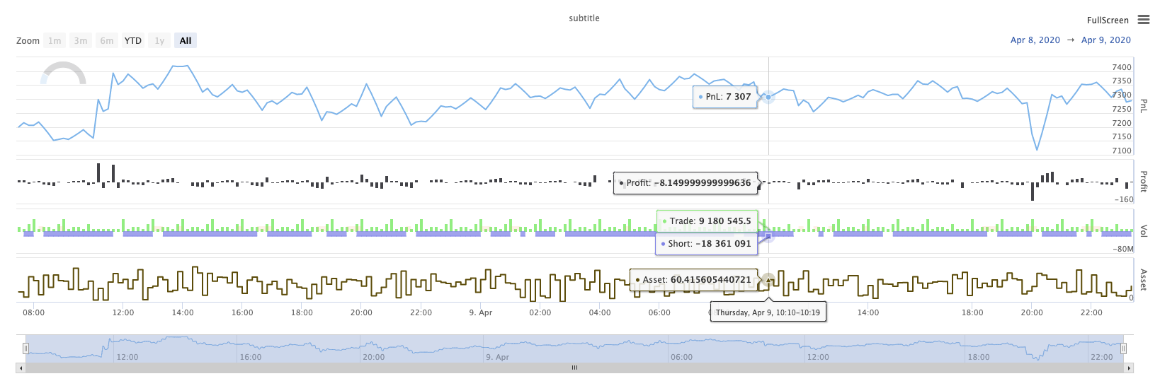
KLineChart(...)
KLineChart(chartCfg), इस फ़ंक्शन का उपयोग रणनीति चल रहा है जब कस्टम ड्राइंग के लिए पाइन भाषा के समान एक ड्राइंग विधि का उपयोग करने के लिए किया जाता है। रणनीति कस्टम ड्राइंग केवल का उपयोग कर सकते हैंKLineChart()विधि याChart() methods.
संदर्भ के लिए कोडः
function main() {
    // Call the KLineChart function to create a chart control object c
    let c = KLineChart({
        overlay: true
    })

    // Use the spot exchange object test to obtain K-line data. If you use the futures exchange object test, you need to set up the contract first.
    let bars = exchange.GetRecords()
    if (!bars) {
        return
    }

    bars.forEach(function(bar, index) {
        c.begin(bar)
        c.barcolor(bar.Close > bar.Open ? 'rgba(255, 0, 0, 0.2)' : 'rgba(0, 0, 0, 0.2)')
        if (bar.Close > bar.Open) {
            c.bgcolor('rgba(0, 255, 0, 0.5)')
        }
        let h = c.plot(bar.High, 'high')
        let l = c.plot(bar.Low, 'low')

        c.fill(h, l, {
            color: bar.Close > bar.Open ? 'rgba(255, 0, 0, 0.2)' : 'rgba(255, 0, 0, 0.2)'
        })
        c.hline(bar.High)
        c.plotarrow(bar.Close - bar.Open)
        c.plotshape(bar.Low, {
            style: 'diamond'
        })
        c.plotchar(bar.Close, {
            char: 'X'
        })
        c.plotcandle(bar.Open*0.9, bar.High*0.9, bar.Low*0.9, bar.Close*0.9)
        if (bar.Close > bar.Open) {
            // long/short/closelong/closeshort
            c.signal("long", bar.High, 1.5)
        } else if (bar.Close < bar.Open) {
            c.signal("closelong", bar.Low, 1.5)
        }
        c.close()
    })
}
def main():
    # Call the KLineChart function to create a chart control object c
    c = KLineChart({
        "overlay": True
    })

    # Use the spot exchange object test to obtain K-line data. If you use the futures exchange object test, you need to set up the contract first.
    bars = exchange.GetRecords()
    if not bars:
        return

    for bar in bars:
        c.begin(bar)
        c.barcolor('rgba(255, 0, 0, 0.2)' if bar.Close > bar.Open else 'rgba(0, 0, 0, 0.2)')
        if bar.Close > bar.Open:
            c.bgcolor('rgba(0, 255, 0, 0.5)')

        h = c.plot(bar.High, 'high')
        l = c.plot(bar.Low, 'low')

        c.fill(h, l, 'rgba(255, 0, 0, 0.2)' if bar.Close > bar.Open else 'rgba(255, 0, 0, 0.2)')
        c.hline(bar.High)
        c.plotarrow(bar.Close - bar.Open)
        c.plotshape(bar.Low, style = 'diamond')
        c.plotchar(bar.Close, char = 'X')
        c.plotcandle(bar.Open*0.9, bar.High*0.9, bar.Low*0.9, bar.Close*0.9)
        if bar.Close > bar.Open:
            # long/short/closelong/closeshort
            c.signal("long", bar.High, 1.5)
        elif bar.Close < bar.Open:
            c.signal("closelong", bar.Low, 1.5)

        c.close()
// Not supported currently
यदि रणनीति के कस्टम ड्राइंग क्षेत्र में ड्राइंग के लिए एक चार्ट नियंत्रण ऑब्जेक्ट होना चाहिए, तो फ़ंक्शन का उपयोग करेंKLineChartइस ऑब्जेक्ट बनाने के लिए. पैरामीटर केKLineChartसमारोह एक चार्ट विन्यास संरचना है, संदर्भ कोड में इस्तेमाल चार्ट संरचना बहुत सरल है{overlay: true}). यह चार्ट विन्यास संरचना केवल मुख्य चार्ट पर आउटपुट करने के लिए ड्राइंग सामग्री सेट करता है. यदिoverlayपर सेट हैfalse, चार्ट पर सामग्री उप-चार्ट पर आउटपुट है. यदि आप मुख्य चार्ट पर आकर्षित करने के लिए एक ड्राइंग समारोह निर्दिष्ट करने की जरूरत है, तो आप भी पैरामीटर निर्दिष्ट कर सकते हैंoverlayजैसा किtrueविशिष्ट फ़ंक्शन कॉल में।
ड्राइंग ऑपरेशन के-लाइन डेटा पर पार करके निष्पादित किया जाता है। ड्राइंग ऑपरेशन एक के साथ शुरू होना चाहिएc.begin(bar)फ़ंक्शन कॉल और एक के साथ अंतc.close()फ़ंक्शन कॉल. ड्राइंग ऑपरेशन में समर्थित पाइन भाषा के ड्राइंग इंटरफ़ेस फ़ंक्शन हैंः
-
बार कलर: सेट K-लाइन रंग
barcolor ((रंग, ऑफसेट, संपादन योग्य, show_last, शीर्षक, प्रदर्शन)
c.barcolor(bar.Close > bar.Open ? 'rgba(255, 0, 0, 0.2)' : 'rgba(0, 0, 0, 0.2)') // Use the example illustrated in the reference code in this example, without giving unnecessary detailsc.barcolor('rgba(255, 0, 0, 0.2)' if bar.Close > bar.Open else 'rgba(0, 0, 0, 0.2)')displayवैकल्पिक पैरामीटरःकोई नहीं , सभी
-
bgcolor: निर्दिष्ट रंग के साथ K-लाइन की पृष्ठभूमि भरें
bgcolor ((रंग, ऑफसेट, संपादन योग्य, show_last, शीर्षक, प्रदर्शन, ओवरले)
c.bgcolor('rgba(0, 255, 0, 0.5)')c.bgcolor('rgba(0, 255, 0, 0.5)')displayवैकल्पिक पैरामीटरःकोई नहीं , सभी
-
ग्राफः चार्ट पर डेटा की एक श्रृंखला को ग्राफ करें
plot ((श्रृंखला, शीर्षक, रंग, लाइनविड्थ, शैली, ट्रैकप्राइस, हिस्टबेस, ऑफसेट, ज्वाइन, संपादन योग्य, शो_लास्ट, डिस्प्ले)
c.plot(bar.High, 'high')h = c.plot(bar.High, 'high')styleवैकल्पिक मापदंडःstepline_diamond , stepline , cross , areabr , area , circles , columns , histogram , linebr , line displayवैकल्पिक पैरामीटरःकोई नहीं , सभी
-
भरना: दो चित्रों या रेखाओं के बीच की पृष्ठभूमि को प्रदान किए गए रंग से भरें
fill ((hline1, hline2, रंग, शीर्षक, संपादन योग्य, fillgaps, प्रदर्शित)
let h = c.plot(bar.High, 'high')
let l = c.plot(bar.Low, 'low')

c.fill(h, l, {color: bar.Close > bar.Open ? 'rgba(255, 0, 0, 0.2)' : 'rgba(255, 0, 0, 0.2)'})
h = c.plot(bar.High, 'high') l = c.plot(bar.Low, 'low') c.fill(h, l, {"color": 'rgba(255, 0, 0, 0.2)' if bar.Close > bar.Open else 'rgba(255, 0, 0, 0.2)'})displayवैकल्पिक पैरामीटरःकोई नहीं , सभी
के बाद से
JavaScriptभाषा फंक्शन के नाम के अनुसार इनकमिंग मापदंडों को निर्दिष्ट नहीं कर सकता औपचारिक मापदंडों, इस समस्या को हल करने के लिए, एक{key: value}संरचना का उपयोग एक निश्चित औपचारिक पैरामीटर नाम में पारित पैरामीटर को निर्दिष्ट करने के लिए किया जा सकता है, उदाहरण के लिए संदर्भ कोड में, उपयोग{color: bar.Close > bar.Open ? 'rgba(255, 0, 0, 0.2)' : 'rgba(255, 0, 0, 0.2)'}निर्दिष्ट करने केcolorपैरामीटरfillयदि आपको कई पैरामीटर नामों के साथ पैरामीटर निर्दिष्ट करने की आवश्यकता है, तो आप उपयोग कर सकते हैं{key1: value1, key2: value2, key3: value3}उदाहरण के लिए, इस उदाहरण में, एक पैरामीटर निर्दिष्ट जोड़ेंtitle:{color: bar.Close > bar.Open ? 'rgba(255, 0, 0, 0.2)' : 'rgba(255, 0, 0, 0.2)', title: 'fill'}.रंग मूल्य के लिए, आप का उपयोग कर सकते हैं
'rgba(255, 0, 0, 0.2)'सेट करने या उपयोग करने के लिए विधि'#FF0000'सेट करने के लिए विधि। -
hline: एक निश्चित निश्चित मूल्य स्तर पर एक क्षैतिज रेखा दर्शाता है
line ((मूल्य, शीर्षक, रंग, लाइन शैली, लाइन चौड़ाई, संपादन योग्य, प्रदर्शन)
c.hline(bar.High)c.hline(bar.High)linestyleवैकल्पिक मापदंडःडैशेड , डॉटेड , सॉलिड displayवैकल्पिक पैरामीटरःकोई नहीं , सभी
-
प्लॉटरॉः चार्ट पर ऊपर और नीचे के तीर खींचें
प्लॉटरो ((सीरीज़, शीर्षक, रंग, रंग, ऑफसेट, मिन्हहाइट, मैक्सहाइट, संपादन योग्य, शो_लास्ट, डिस्प्ले)
c.plotarrow(bar.Close - bar.Open)c.plotarrow(bar.Close - bar.Open)displayवैकल्पिक पैरामीटरःकोई नहीं , सभी
-
प्लॉटशेपः चार्ट पर दृश्य आकृतियां बनाएं
plotshape ((श्रृंखला, शीर्षक, शैली, स्थान, रंग, ऑफसेट, पाठ, textcolor, संपादन योग्य, आकार, show_last, प्रदर्शन)
c.plotshape(bar.Low, {style: 'diamond'})c.plotshape(bar.Low, style = 'diamond')-
styleवैकल्पिक मापदंडःdiamond , square , label_down , label_up , arrow_down , arrow_up , circle , flag , triangle_down , triangle_up , cross , xcross -
locationवैकल्पिक मापदंडःऊपर का पट्टी , नीचे का पट्टी , ऊपर का पट्टी , नीचे का पट्टी , पूर्ण पट्टी -
sizeवैकल्पिक पैरामीटरः10px , 14px , 20px , 40px , 80px , size.tiny,size.small,size.normal,size.large,size.hugeपाइन भाषा मेंsize.autoहैsize.small. -
displayवैकल्पिक पैरामीटरःकोई नहीं , सभी
-
-
plotchar: किसी भी दिए गए यूनिकोड वर्ण का उपयोग करके चार्ट पर दृश्यमान आकृतियों को आकर्षित करें
plotchar ((श्रृंखला, शीर्षक, चार, स्थान, रंग, ऑफसेट, पाठ, textcolor, संपादन योग्य, आकार, show_last, प्रदर्शन)
c.plotchar(bar.Close, {char: 'X'})c.plotchar(bar.Close, char = 'X')-
locationवैकल्पिक मापदंडःऊपर का पट्टी , नीचे का पट्टी , ऊपर का पट्टी , नीचे का पट्टी , पूर्ण पट्टी -
sizeवैकल्पिक पैरामीटरः10px , 14px , 20px , 40px , 80px , size.tiny,size.small,size.normal,size.large,size.hugeपाइन भाषा मेंsize.autoहैsize.small. -
displayवैकल्पिक पैरामीटरःकोई नहीं , सभी
-
-
plotcandle: चार्ट पर एक K-लाइन चार्ट खींचें
plotcandle ((खुला, उच्च, निम्न, बंद, शीर्षक, रंग, wickcolor, संपादन योग्य, show_last, bordercolor, display)
c.plotcandle(bar.Open*0.9, bar.High*0.9, bar.Low*0.9, bar.Close*0.9)c.plotcandle(bar.Open*0.9, bar.High*0.9, bar.Low*0.9, bar.Close*0.9)displayवैकल्पिक पैरामीटरःकोई नहीं , सभी
-
सिग्नल: पाइन भाषा में उपलब्ध नहीं होने वाले कार्यों का उपयोग यहां खरीद और बिक्री संकेतों को आकर्षित करने के लिए किया जाता है
संकेत ((दिशा, कीमत, मात्रा, आईडी)
c.signal("long", bar.High, 1.5)c.signal("long", bar.High, 1.5)इनपुट पैरामीटर
"long"लेन-देन की दिशा दर्शाता है, वैकल्पिक"long","closelong","short","closeshort". आने वाला पैरामीटरbar.Highमार्कर सिग्नल की Y-अक्ष स्थिति है। इनपुट पैरामीटर1.5संकेत के ट्रेडों की संख्या का प्रतिनिधित्व करता है। डिफ़ॉल्ट रूप से खींची गई पाठ सामग्री को बदलने के लिए चौथा पैरामीटर पारित किया जा सकता है। खींची गई संकेत मार्कर का डिफ़ॉल्ट पाठ ट्रेडिंग दिशा है, उदाहरण के लिएः"closelong".
कुछ रंग, शैली और अन्य सेटिंग्स के लिए उपरोक्त फ़ंक्शन कॉल में उपयोग किया जाता है, कृपया देखेंKLineChart फ़ंक्शन के साथ ड्राइंग पर विशेष लेख
लॉग रीसेट करें (()
LogReset()लॉग को साफ करने के लिए प्रयोग किया जाता है. आप बनाए रखने के लिए हाल के लॉग की संख्या को निर्दिष्ट करने के लिए एक पूर्णांक पैरामीटर में पास कर सकते हैं, और शेष लॉग को साफ कर सकते हैं. स्टार्टअप लॉग को हर बार शुरू होने पर गिना जाता है, इसलिए यदि कोई पैरामीटर पारित नहीं किया जाता है, और रणनीति की शुरुआत में कोई लॉग आउटपुट नहीं है, तो लॉग बिल्कुल प्रदर्शित नहीं होगा, डॉकर लॉग की वापसी की प्रतीक्षा कर रहा है (एक असामान्य स्थिति नहीं) । फ़ंक्शन का कोई रिटर्न मान नहीं है।
function main() {
    // Mainta