 ["abc", "def", {"type": "button", "cmd": "coverAll", "name": "close position"}]
      ]
  })"_json;

  auto ticker = exchange.GetTicker();
  json jsonTicker = R"({"Buy": 0, "Sell": 0, "High": 0, "Low": 0, "Volume": 0, "Last": 0, "Time": 0})"_json;
  jsonTicker["Buy"] = ticker.Buy;
  jsonTicker["Sell"] = ticker.Sell;
  jsonTicker["Last"] = ticker.Last;
  jsonTicker["Volume"] = ticker.Volume;
  jsonTicker["Time"] = ticker.Time;
  jsonTicker["High"] = ticker.High;
  jsonTicker["Low"] = ticker.Low;

  json arr = R"([{"body": {}, "colspan": 2}, "abc"])"_json;
  arr[0]["body"] = jsonTicker;
  table["rows"].push_back(arr);
  LogStatus("`" + table.dump() + "`");
}
)
- Vertical merger
```js
function main() {
var table = {
type: 'table',
title: 'Table demo',
cols: ['ColumnA', 'ColumnB', 'ColumnC'],
rows: [
['A1', 'B1', {'type':'button', 'cmd': 'coverAll', 'name': 'C1'}]
]
}
var ticker = exchange.GetTicker()
var name = exchange.GetName()
table.rows.push([{body : "A2 + B2:" + JSON.stringify(ticker), colspan : 2}, "C2"])
table.rows.push([{body : "A3 + A4 + A5:" + name, rowspan : 3}, "B3", "C3"])
// A3 is merged by the first cell in the previous row
table.rows.push(["B4", "C4"])
// A2 is merged by the first cell in the previous row
table.rows.push(["B5", "C5"])
table.rows.push(["A6", "B6", "C6"])
LogStatus('`' + JSON.stringify(table) + '`')
}
import json
def main():
    table = {
        "type" : "table",
        "title" : "Table demo",
        "cols" : ["ColumnA", "ColumnB", "ColumnC"],
        "rows" : [
            ["A1", "B1", {"type": "button", "cmd": "coverAll", "name": "C1"}]
        ]
    }

    ticker = exchange.GetTicker()
    name = exchange.GetName()

    table["rows"].append([{"body": "A2 + B2:" + json.dumps(ticker), "colspan": 2}, "C2"])
    table["rows"].append([{"body": "A3 + A4 + A5:" + name, "rowspan": 3}, "B3", "C3"])
    table["rows"].append(["B4", "C4"])
    table["rows"].append(["B5", "C5"])
    table["rows"].append(["A6", "B6", "C6"])
    LogStatus("`" + json.dumps(table) + "`")
void main() {
    json table = R"({
        "type" : "table",
        "title" : "Table demo",
        "cols" : ["ColumnA", "ColumnB", "ColumnC"],
        "rows" : [
            ["A1", "B1", {"type": "button", "cmd": "coverAll", "name": "C1"}]
        ]
    })"_json;
    // In order to test, the code is short and easy to read, and the constructed data is used here
    json jsonTicker = R"({"High": 0, "Low": 0, "Buy": 0, "Sell": 0, "Last": 0, "Time": 0, "Volume": 0})"_json;
    auto name = exchange.GetName();
    json arr1 = R"([{"body": "", "colspan": 2}, "C2"])"_json;
    arr1[0]["body"] = "A2 + B2:" + jsonTicker.dump();
    json arr2 = R"([{"body": "", "rowspan": 3}, "B3", "C3"])"_json;
    arr2[0]["body"] = "A3 + A4 + A5:" + name;
    table["rows"].push_back(arr1);
    table["rows"].push_back(arr2);
    table["rows"].push_back(R"(["B4", "C4"])"_json);
    table["rows"].push_back(R"(["B5", "C5"])"_json);
    table["rows"].push_back(R"(["A6", "B6", "C6"])"_json);
    LogStatus("`" + table.dump() + "`");
}
)
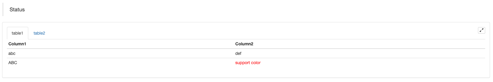
ٹیبل صفحہ بندی حالت بار کی نمائش:
function main() {
    var table1 = {type: 'table', title: 'table1', cols: ['Column1', 'Column2'], rows: [ ['abc', 'def'], ['ABC', 'support color #ff0000']]}
    var table2 = {type: 'table', title: 'table2', cols: ['Column1', 'Column2'], rows: [ ['abc', 'def'], ['ABC', 'support color #ff0000']]}
    LogStatus('`' + JSON.stringify([table1, table2]) + '`')
}
import json
def main():
    table1 = {"type": "table", "title": "table1", "cols": ["Column1", "Column2"], "rows": [ ["abc", "def"], ["ABC", "support color #ff0000"]]}
    table2 = {"type": "table", "title": "table2", "cols": ["Column1", "Column2"], "rows": [ ["abc", "def"], ["ABC", "support color #ff0000"]]}
    LogStatus("`" + json.dumps([table1, table2]) + "`")
void main() {
    json table1 = R"({"type": "table", "title": "table1", "cols": ["Column1", "Column2"], "rows": [ ["abc", "def"], ["ABC", "support color #ff0000"]]})"_json;
    json table2 = R"({"type": "table", "title": "table2", "cols": ["Column1", "Column2"], "rows": [ ["abc", "def"], ["ABC", "support color #ff0000"]]})"_json;
    json arr = R"([])"_json;
    arr.push_back(table1);
    arr.push_back(table2);
    LogStatus("`" + arr.dump() + "`");
}
صفحات کی ترتیب کے علاوہ، متعدد میزیں اوپر سے نیچے تک ترتیب دی جاسکتی ہیں۔
function main(){
    var tab1 = {
        type : "table",
        title : "table1",
        cols : ["1", "2"],
        rows : []
    }
    var tab2 = {
        type : "table",
        title : "table2",
        cols : ["1", "2", "3"],
        rows : []
    }
    var tab3 = {
        type : "table",
        title : "table3",
        cols : ["A", "B", "C"],
        rows : []
    }

    tab1.rows.push(["jack", "lucy"])
    tab2.rows.push(["A", "B", "C"])
    tab3.rows.push(["A", "B", "C"])

    LogStatus('`' + JSON.stringify(tab1) + '`\n' +
        '`' + JSON.stringify(tab2) + '`\n' +
        '`' + JSON.stringify(tab3) + '`')

    Log("exit")
}
import json
def main():
    tab1 = {
        "type": "table",
        "title": "table1",
        "cols": ["1", "2"],
        "rows": []
    }
    tab2 = {
        "type": "table",
        "title": "table2",
        "cols": ["1", "2", "3"],
        "rows": []
    }
    tab3 = {
        "type": "table",
        "title": "table3",
        "cols": ["A", "B", "C"],
        "rows": []
    }

    tab1["rows"].append(["jack", "lucy"])
    tab2["rows"].append(["A", "B", "C"])
    tab3["rows"].append(["A", "B", "C"])
    LogStatus("`" + json.dumps(tab1) + "`\n" +
        "`" + json.dumps(tab2) + "`\n" +
        "`" + json.dumps(tab3) + "`")
void main() {
    json tab1 = R"({
        "type": "table",
        "title": "table1",
        "cols": ["1", "2"],
        "rows": []
    })"_json;
    json tab2 = R"({
        "type": "table",
        "title": "table2",
        "cols": ["1", "2", "3"],
        "rows": []
    })"_json;
    json tab3 = R"({
        "type": "table",
        "title": "table3",
        "cols": ["A", "B", "C"],
        "rows": []
    })"_json;
    tab1["rows"].push_back(R"(["jack", "lucy"])"_json);
    tab2["rows"].push_back(R"(["A", "B", "C"])"_json);
    tab3["rows"].push_back(R"(["A", "B", "C"])"_json);
    LogStatus("`" + tab1.dump() + "`\n" +
        "`" + tab2.dump() + "`\n" +
        "`" + tab3.dump() + "`");
}
آپریشن کا نتیجہ:)
نوٹ:
جب حکمت عملی بوٹ بوٹ پیج پر چل رہا ہے ، اگر آپ ہسٹری ریکارڈز کے ذریعے سکرول کرتے ہیں تو ، اسٹیٹس بار غیر فعال حالت میں داخل ہوگا اور اپ ڈیٹ کرنا بند کردے گا۔ اسٹیٹس بار کے ڈیٹا کو صرف اس وقت تازہ کاری کی جائے گی جب لاگ پہلے صفحے پر ہو۔
حالت بار میں کوڈت تصاویر کی پیداوار کی حمایت کرتا ہےbase64، اور بھی میں کوڈت تصاویر کی پیداوار کی حمایتbase64دکھائے گئے ٹیبلٹس میں۔ کیونکہ کوڈ شدہ تصویر کی تار کی لمبائی عام طور پر بہت لمبی ہوتی ہے ، لہذا کوئی نمونہ کوڈ فراہم نہیں کیا جاتا ہے۔
EnableLog()
EnableLog(IsEnable)آرڈر کی معلومات کے لیے لاگ ریکارڈنگ کو آن یا آف کرتا ہے۔ پیرامیٹر ویلیو:isEnableبول ٹائپ ہے. اگرIsEnableپر مقرر کیا گیا ہےfalse، آرڈر لاگ پرنٹ نہیں کیا جائے گا اور یہ بوٹ ڈیٹا بیس میں نہیں لکھا جائے گا.
چارٹ ((...)
Chart(...)، چارٹ ڈرائنگ اپنی مرضی کے مطابق کرنے کی تقریب.
Chart({…})؛ پیرامیٹر ہےHighCharts.StockChartپیرامیٹرزہائی اسٹاکمیں سیریل کیا جا سکتا ہے کہJSON، ایک_isStockمقامی پیرامیٹر کے لئے وصف. اگر آپ کی وضاحت_isStock:false، یہ ایک عام چارٹ کے طور پر دکھایا جائے گا.
نوٹ:
اگر آپ کی وصف مقرر کریں_isStockکرنے کے لئےfalse، استعمال شدہ چارٹ یہ ہے:ہائی چارٹس، جیسا کہ چارٹ میں دکھایا گیا ہے:
)
اگر ہم کی صفت مقرر کریں_isStockکرنے کے لئےtrue، استعمال شدہ چارٹ یہ ہے:ہائی اسٹاک(ڈیفالٹ)_isStockجیسا کہ چارٹ میں دکھایا گیا ہے:
)
آبجیکٹ پر واپس جانے کے لئے، آپ کو فون کر سکتے ہیںadd(n, data) (n(جیسے 0) کا انڈیکس ہےseries، اورdataچارٹ میں لکھا اعداد و شمار ہے) مخصوص انڈیکس کے اعداد و شمار کو شامل کرنے کے لئےseriesکال کریںreset()چارٹ کے اعداد و شمار کو صاف کرنے کے لئے، اورresetایک عددی پیرامیٹر لے سکتے ہیں اور مخصوص اشیاء کی تعداد کی وضاحت کر سکتے ہیں.
آپ کال کر سکتے ہیںadd(n, data, i) (iان اعداد و شمار کا انڈیکس ہےseriesکے اعداد و شمار کو تبدیل کرنے کے لئےseries.
یہ منفی ہوسکتا ہے ،
chart.add(0, [1574993606000, 13.5], -1)، کے آخری نقطہ کے اعداد و شمار کو تبدیلseries[0].data.
یہ متعدد چارٹ ظاہر کرنے کے لئے حمایت کرتا ہے کے لئے، آپ کو صرف ترتیب کے دوران صف پیرامیٹرز میں منتقل کرنے کی ضرورت ہے، جیسے:var chart = Chart([{…}, {…}, {…}])مثال کے طور پر، چارٹ 1 میں دو ہیںseries، گراف 2 میں ایک ہےseries، اور چارٹ 3 میں ایک ہےseriesاس کے بعد، سیریز کی شناخت 0 اور 1 کی وضاحت کریں جب جمع کرنے سے اعداد و شمار کو اپ ڈیٹ کرنے کے لئے نمائندگی کرتا ہے چارٹ کے دو آرڈر کالم 1 کی؛ سیریز کی شناخت 2 کی وضاحت کرتے وقت جمع کرنے سے مراد پہلیseriesچارٹ 2 کے اعداد و شمار؛ سیریز کی وضاحت ID3 پہلی کے اعداد و شمار سے مراد ہےseriesگراف 3 کی.
HighStocks: http://api.highcharts.com/highstock
کثیر چارٹ ڈسپلے سے متعلق صفات کی ترتیبات:مثال
مثال کے طور پر، چارٹ ترتیب اشیاء:
var cfgA = {
    extension: {
        // It does not participate in grouping, displayed separately, and its default is 'group'
        layout: 'single',
        // This is the specified height, which can be set to string "300px" (set "300", and "300px" will be displayed instead automatically)
        height: 300,
        // It is the unit value of the specified width, with a total value of 12
        col: 8
    },
    title: {
        text: 'Market Chart'
    },
    xAxis: {
        type: 'datetime'
    },
    series: [{
        name: 'Buy 1',
        data: []
    }, {
        name: 'Sell 1',
        data: []
    }]
}

var cfgB = {
    title: {
        text: 'Spread chart'
    },
    xAxis: {
        type: 'datetime'
    },
    series: [{
        name: 'Spread',
        type: 'column',
        data: []
    }]
}

var cfgC = {
    _isStock: false,
    title: {
        text: 'Pie Chart'
    },
    series: [{
        type: 'pie',
        name: 'one',
        // After specifying the initial data, you don't need to update it with the "add" function; Changing the chart configuration directly will update the series
        data: [
            ["A", 25],
            ["B", 25],
            ["C", 25],
            ["D", 25]
        ]
    }]
}

var cfgD = {
    extension: {
        layout: 'single',
        // The unit value of the specified width, with a total value of 12
        col: 8,
        height: '300px'
    },
    title: {
        text: 'Market Chart'
    },
    xAxis: {
        type: 'datetime'
    },
    series: [{
        name: 'Buy 1',
        data: []
    }, {
        name: 'Sell 1',
        data: []
    }]
}

var cfgE = {
    __isStock: false,
    extension: {
        layout: 'single',
        col: 4,
        height: '300px'
    },
    title: {
        text: 'Pie Chart2'
    },
    series: [{
        type: 'pie',
        name: 'one',
        data: [
            ["A", 25],
            ["B", 25],
            ["C", 25],
            ["D", 25]
        ]
    }]
}
cfgA = {
    "extension" : {
        "layout" : "single",
        "height" : 300,
        "col" : 8
    },
    "title" : {
        "text" : "Market Chart"
    },
    "xAxis" : {
        "type" : "datetime"
    },
    "series" : [{
        "name" : "Buy 1",
        "data" : []
    }, {
        "name" : "Sell 1",
        "data" : []
    }]
}

cfgB = {
    "title" : {
        "text" : "Spread chart"
    },
    "xAxis" : {
        "type" : "datetime"
    },
    "series" : [{
        "name" : "Spread",
        "type" : "column",
        "data" : []
    }]
}

cfgC = {
    "__isStock" : False,
    "title" : {
        "text" : "Pie Chart"
    },
    "series" : [{
        "type" : "pie",
        "name" : "one",
        "data" : [
            ["A", 25],
            ["B", 25],
            ["C", 25],
            ["D", 25]
        ]
    }]
}

cfgD = {
    "extension" : {
        "layout" : "single",
        "col" : 8,
        "height" : "300px"
    },
    "title" : {
        "text" : "Market Chart"
    },
    "series" : [{
        "name" : "Buy 1",
        "data" : []
    }, {
        "name" : "Sell 1",
        "data" : []
    }]
}

cfgE = {
    "__isStock" : False,
    "extension" : {
        "layout" : "single",
        "col" : 4,
        "height" : "300px"
    },
    "title" : {
        "text" : "Pie Chart2"
    },
    "series" : [{
        "type" : "pie",
        "name" : "one",
        "data" : [
            ["A", 25],
            ["B", 25],
            ["C", 25],
            ["D", 25]
        ]
    }]
}
json cfgA = R"({
    "extension" : {
        "layout" : "single",
        "height" : 300,
        "col" : 8
    },
    "title" : {
        "text" : "Market Chart"
    },
    "xAxis" : {
        "type" : "datetime"
    },
    "series" : [{
        "name" : "Buy 1",
        "data" : []
    }, {
        "name" : "Sell 1",
        "data" : []
    }]
})"_json;

json cfgB = R"({
    "title" : {
        "text" : "Spread chart"
    },
    "xAxis" : {
        "type" : "datetime"
    },
    "series" : [{
        "name" : "Spread",
        "type" : "column",
        "data" : []
    }]
})"_json;

json cfgC = R"({
    "__isStock" : false,
    "title" : {
        "text" : "Pie Chart"
    },
    "series" : [{
        "type" : "pie",
        "name" : "one",
        "data" : [
            ["A", 25],
            ["B", 25],
            ["C", 25],
            ["D", 25]
        ]
    }]
})"_json;

json cfgD = R"({
    "extension" : {
        "layout" : "single",
        "col" : 8,
        "height" : "300px"
    },
    "title" : {
        "text" : "Market Chart"
    },
    "series" : [{
        "name" : "Buy 1",
        "data" : []
    }, {
        "name" : "Sell 1",
        "data" : []
    }]
})"_json;

json cfgE = R"({
    "__isStock" : false,
    "extension" : {
        "layout" : "single",
        "col" : 4,
        "height" : "300px"
    },
    "title" : {
        "text" : "Pie Chart2"
    },
    "series" : [{
        "type" : "pie",
        "name" : "one",
        "data" : [
            ["A", 25],
            ["B", 25],
            ["C", 25],
            ["D", 25]
        ]
    }]
})"_json;
-
cfgA.extension.layoutصفتاگر یہ صفت مقرر کی گئی ہے اور قدر
single ہے، چارٹ اوورلیپ نہیں کیا جائے گا (یہ ایک ٹیبڈ لیبل کے طور پر ظاہر نہیں کیا جائے گا) اور علیحدہ علیحدہ دکھایا جائے گا (ٹائل ڈسپلے). -
cfgA.extension.heightصفتیہ خصوصیت چارٹ کی اونچائی مقرر کرنے کے لئے استعمال ہوتی ہے۔ قدر عددی قسم کی ہوسکتی ہے ، یا
300px موڈ پر مقرر کی جاسکتی ہے۔ -
cfgA.extension.colصفتاس وصف کا استعمال چارٹ کی چوڑائی کو ترتیب دینے کے لئے کیا جاتا ہے۔ صفحے کی چوڑائی کو مجموعی طور پر 12 یونٹوں میں تقسیم کیا جاتا ہے ، اور
8 کی ترتیب کا مطلب یہ ہے کہ چارٹ چوڑائی کے 8 یونٹوں پر قبضہ کرتا ہے۔ مکمل مثال کی حکمت عملی چلائیں:
مندرجہ بالا مثالوں میں چارٹ ترتیب اشیاء کے اثر کی نمائش:
)
)
-
چارٹ کی ترتیب اشیاء پر اعداد و شمار کے لئے، براہ راست چارٹ کی ترتیب میں ترمیم کریں، اور پھر ڈیٹا اپ ڈیٹ کا احساس کرنے کے لئے چارٹ کو اپ ڈیٹ کریں:
مثال کے طور پر
JavaScriptمثال کا کوڈ حصہ (مکمل مثال):cfgC.series[0].data[0][1] = Math.random() * 100 cfgE.series[0].data[0][1] = Math.random() * 100 // "Update" is actually equivalent to resetting the configuration of the chart chart.update([cfgA, cfgB, cfgC, cfgD, cfgE])کی طرف سے ڈیٹا کو اپ ڈیٹ کریں
addطریقہ، جیسے کہ پائ گراف میں ایک آئٹم شامل کرنا، اور یہاں مندرجہ ذیل ہےJavaScriptمثال کا کوڈ حصہ (مکمل مثال):// Add a data point to the pie chart; "add" can only update the data points added by the "add" method, the built-in data points cannot be updated later chart.add(3, { name: "ZZ", y: Math.random() * 100 }) -
منسلک استعمال کی مثالیں
Chartفنکشنسادہ ڈرائنگ مثال:
// This chart is an object in JavaScript language. Before using the "Chart" function, we need to declare an object variable of a chart configuration
var chart = {
    // It is marked as a general chart; if you are interested, you can change it to false and run it
    __isStock: true,
    // Zoom tool
    tooltip: {xDateFormat: '%Y-%m-%d %H:%M:%S, %A'},
    // Title
    title : { text : 'Spread analysis chart'},
    // Choose a range
    rangeSelector: {
        buttons:  [{type: 'hour',count: 1, text: '1h'}, {type: 'hour',count: 3, text: '3h'}, {type: 'hour', count: 8, text: '8h'}, {type: 'all',text: 'All'}],
        selected: 0,
        inputEnabled: false
    },
    // The horizontal axis of the coordinate axis is: x axis, and the currently set "Types of" is: time
    xAxis: { type: 'datetime'},
    // The vertical axis of the coordinate axis is: y axis, and the default value is adjusted with the data size
    yAxis : {
        // Title
        title: {text: 'Spread'},
        // Whether to enable the right vertical axis
        opposite: false
    },
    // Data system column; this attribute holds each data system column (line, K-line diagram, label, etc.)
    series : [
        // The index is 0, and the data in the data column is stored in the data array.
        {name : "line1", id : "line 1,buy1Price", data : []},
        // The index is 1, and set dashStyle: 'shortdash', namely: set the dashed line
        {name : "line2", id : "line 2,lastPrice", dashStyle : 'shortdash', data : []}
    ]
}
function main(){
    // Call the "Chart" function to initialize the chart
    var ObjChart = Chart(chart)
    // Empty
    ObjChart.reset()
    while(true){
        // Get the timestamp of this polling, that is, a millisecond timestamp, used to determine the position of the X axis written to the chart
        var nowTime = new Date().getTime()
        // Get market data
        var ticker = _C(exchange.GetTicker)
        // Get "Buy 1" price from the return value of market data
        var buy1Price = ticker.Buy
        // To obtain the last executed price, in order to avoid the overlap of the 2 lines, we add 1
        var lastPrice = ticker.Last + 1
        // Use timestamp as X value and "Buy 1" price as Y value, and pass them into the data sequence of index 0
        ObjChart.add(0, [nowTime, buy1Price])
        // Same as above
        ObjChart.add(1, [nowTime, lastPrice])
        Sleep(2000)
    }
}
import time chart = { "__isStock" : True, "tooltip" : {"xDateFormat" : "%Y-%m-%d %H:%M:%S, %A"}, "title" : {"text" : "Spread analysis chart"}, "rangeSelector" : { "buttons" : [{"type": "count", "count": 1, "text": "1h"}, {"type": "hour", "count": 3, "text": "3h"}, {"type": "hour", "count": 8, "text": "8h"}, {"type": "all", "text": "All"}], "selected": 0, "inputEnabled": False }, "xAxis": {"type": "datetime"}, "yAxis": { "title": {"text": "Spread"}, "opposite": False }, "series": [{ "name": "line1", "id": "line 1,buy1Price", "data": [] }, { "name": "line2", "id": "line 2,lastPrice", "dashStyle": "shortdash", "data": [] }] } def main(): ObjChart = Chart(chart) ObjChart.reset() while True: nowTime = time.time() * 1000 ticker = exchange.GetTicker() buy1Price = ticker["Buy"] lastPrice = ticker["Last"] + 1 ObjChart.add(0, [nowTime, buy1Price]) ObjChart.add(1, [nowTime, lastPrice]) Sleep(2000)void main() { // When write strategies in C++, try not to declare global variables that are not basic types, so the declaration of the chart configuration objects is in the "main" function json chart = R"({ "__isStock" : true, "tooltip" : {"xDateFormat" : "%Y-%m-%d %H:%M:%S, %A"}, "title" : {"text" : "Spread analysis chart"}, "rangeSelector" : { "buttons" : [{"type": "count", "count": 1, "text": "1h"}, {"type": "hour", "count": 3, "text": "3h"}, {"type": "hour", "count": 8, "text": "8h"}, {"type": "all", "text": "All"}], "selected": 0, "inputEnabled": false }, "xAxis": {"type": "datetime"}, "yAxis": { "title": {"text": "Spread"}, "opposite": false }, "series": [{ "name": "line1", "id": "line 1,buy1Price", "data": [] }, { "name": "line2", "id": "line 2,lastPrice", "dashStyle": "shortdash", "data": [] }] })"_json; auto ObjChart = Chart(chart); ObjChart.reset(); while(true) { auto nowTime = Unix() * 1000; auto ticker = exchange.GetTicker(); auto buy1Price = ticker.Buy; auto lastPrice = ticker.Last + 1.0; ObjChart.add(0, {nowTime, buy1Price}); ObjChart.add(1, {nowTime, lastPrice}); Sleep(2000); } }مثلثاتی منحنی خطوط کی مثال:
// The object used to initialize the chart
var chart = {
    // Chart title
    title: {text: "line value triggers plotLines value"},
    // The related settings of Y axis
    yAxis: {
        // The horizontal line perpendicular to y axis, used as a trigger line, is an array of structures where multiple trigger lines can be set
        plotLines: [{
            // Trigger line value; set a number, and this line will be displayed in the corresponding numerical position
            value: 0,
            // Set the color of the trigger line
            color: 'red',
            // Width
            width: 2,
            // Labels displayed
            label: {
                // Label text
                text: 'Trigger value',
                // Center label position
                align: 'center'
            }
        }]
    },
    // The related settings of X axis, and here the setting type is the time axis
    xAxis: {type: "datetime"},
    series: [
        {name: "sin", type: "spline", data: []},
        // This is a more important data system column; you can set multiple data system column, according to the array index control
        {name: "cos", type: "spline", data: []}
    ]
}
function main(){
    // Pi
    var pi = 3.1415926535897
    // Variable for recording timestamp
    var time = 0
    // Angle
    var angle = 0
    // Coordinate y value, used to receive sine and cosine values
    var y = 0
    // Call the API to initialize charts with "chart" objects
    var objChart = Chart(chart)
    // When initializing, clear the chart
    objChart.reset()
    // Set the value of the trigger line to 1
    chart.yAxis.plotLines[0].value = 1
    // Loop
    while(true){
        // Get the timestamp of the current moment
        time = new Date().getTime()
        // The angle is increased by 5 degrees every 500ms, and the sine value is calculated
        y = Math.sin(angle * 2 * pi / 360)
        // Write the calculated y value to the data of the corresponding index of the chart; the first parameter of the "add" function is the specified index
        objChart.add(0, [time, y])
        // Calculate the cosine value
        y = Math.cos(angle * 2 * pi / 360)
        objChart.add(1, [time, y])
        // Increase by 5 degrees
        angle += 5
        // Pause for 5 seconds, to avoid drawing too frequently and the data growing too fast
        Sleep(5000)
    }
}
import math import time chart = { "title": {"text": "line value triggers plotLines value"}, "yAxis": { "plotLines": [{ "value": 0, "color": "red", "width": 2, "label": { "text": "Trigger value", "align": "center" } }] }, "xAxis": {"type": "datetime"}, "series": [{"name": "sin", "type": "spline", "data": []}, {"name": "cos", "type": "spline", "data": []}] } def main(): pi = 3.1415926535897 ts = 0 angle = 0 y = 0 objChart = Chart(chart) objChart.reset() chart["yAxis"]["plotLines"][0]["value"] = 1 while True: ts = time.time() * 1000 y = math.sin(angle * 2 * pi / 360) objChart.add(0, [ts, y]) y = math.cos(angle * 2 * pi / 360) objChart.add(1, [ts, y]) angle += 5 Sleep(5000)void main() { json chart = R"({ "title": {"text": "line value triggers plotLines value"}, "yAxis": { "plotLines": [{ "value": 0, "color": "red", "width": 2, "label": { "text": "Trigger value", "align": "center" } }] }, "xAxis": {"type": "datetime"}, "series": [{"name": "sin", "type": "spline", "data": []}, {"name": "cos", "type": "spline", "data": []}] })"_json; auto pi = 3.1415926535897; auto ts = 0; auto angle = 0.0; auto y = 0.0; auto objChart = Chart(chart); objChart.reset(); chart["yAxis"]["plotLines"][0]["value"] = 1; while(true) { ts = Unix() * 1000; y = sin(angle * 2 * pi / 360); objChart.add(0, {ts, y}); y = cos(angle * 2 * pi / 360); objChart.add(1, {ts, y}); angle += 5; Sleep(5000); } }میں
cppحکمت عملی،Chartتقریب بھی چارٹ کو ترتیب دینے کے لئے ایک کوڈت تار استعمال کر سکتے ہیں:void main () { Chart c = Chart(R"EOF({"chart":{"type":"line"},"title":{"text":"Simple chart"},"xAxis":{"title":{"text":"Date"}},"yAxis":{"title":{"text":"Number"}},"series":[{"name":"number","data":[]}]})EOF"); c.reset(); for (size_t i = 0; i < 10; i++) { // For example, int64 of "sprintf" function has different parameters in 32-bit and 64-bit, so it is best to use "toString" to transfer the platform-related types into strings and then pass c.add(0, format("[%s, %d]", toString(Unix() + i).c_str(), rand() % 100)); } })
-
مخلوط چارٹ کی ایک پیچیدہ مثالجاوا اسٹریٹجی ایڈریس
/*backtest
start: 2020-03-11 00:00:00
end: 2020-04-09 23:59:00
period: 1d
exchanges: [{"eid":"Bitfinex","currency":"BTC_USD"}]
*/

var chartCfg = {
    subtitle: {
        text: "subtitle",
    },
    yAxis: [{
        height: "40%",
        lineWidth: 2,
        title: {
            text: 'PnL',
        },
        tickPixelInterval: 20,
        minorGridLineWidth: 1,
        minorTickWidth: 0,
        opposite: true,
        labels: {
            align: "right",
            x: -3,
        }
    }, {
        title: {
            text: 'Profit',
        },
        top: "42%",
        height: "18%",
        offset: 0,
        lineWidth: 2
    }, {
        title: {
            text: 'Vol',
        },
        top: '62%',
        height: '18%',
        offset: 0,
        lineWidth: 2
    }, {
        title: {
            text: 'Asset',
        },
        top: '82%',
        height: '18%',
        offset: 0,
        lineWidth: 2
    }],
    series: [{
        name: 'PnL',
        data: [],
        id: 'primary',
        tooltip: {
            xDateFormat: '%Y-%m-%d %H:%M:%S'
        },
        yAxis: 0
    }, {
        type: 'column',
        lineWidth: 2,
        name: 'Profit',
        data: [],
        yAxis: 1,
    }, {
        type: 'column',
        name: 'Trade',
        data: [],
        yAxis: 2
    }, {
        type: 'area',
        step: true,
        lineWidth: 0,
        name: 'Long',
        data: [],
        yAxis: 2
    }, {
        type: 'area',
        step: true,
        lineWidth: 0,
        name: 'Short',
        data: [],
        yAxis: 2
    }, {
        type: 'line',
        step: true,
        color: '#5b4b00',
        name: 'Asset',
        data: [],
        yAxis: 3
    }, {
        type: 'pie',
        innerSize: '70%',
        name: 'Random',
        data: [],
        center: ['3%', '6%'],
        size: '15%',
        dataLabels: {
            enabled: false
        },
        startAngle: -90,
        endAngle: 90,
    }],
};

function main() {
    let c = Chart(chartCfg);
    let preTicker = null;
    while (true) {
        let t = exchange.GetTicker();

        c.add(0, [t.Time, t.Last]); // PnL
        c.add(1, [t.Time, preTicker ? t.Last - preTicker.Last : 0]); // profit
        let r = Math.random();
        var pos = parseInt(t.Time/86400);
        c.add(2, [t.Time, pos/2]); // Vol
        c.add(3, [t.Time, r > 0.8 ? pos : null]); // Long
        c.add(4, [t.Time, r < 0.8 ? -pos : null]); // Short
        c.add(5, [t.Time, Math.random() * 100]); // Asset
        // update pie
        chartCfg.series[chartCfg.series.length-1].data = [
            ["A", Math.random()*100],
            ["B", Math.random()*100],
         ];
        c.update(chartCfg)
        preTicker = t;
    }
}
'''backtest
start: 2020-03-11 00:00:00
end: 2020-04-09 23:59:00
period: 1d
exchanges: [{"eid":"Bitfinex","currency":"BTC_USD"}]
'''

import random

chartCfg = {
    "subtitle": {
        "text": "subtitle"
    },
    "yAxis": [{
        "height": "40%",
        "lineWidth": 2,
        "title": {
            "text": 'PnL'
        },
        "tickPixelInterval": 20,
        "minorGridLineWidth": 1,
        "minorTickWidth": 0,
        "opposite": True,
        "labels": {
            "align": "right",
            "x": -3
        }
    }, {
        "title": {
            "text": 'Profit'
        },
        "top": "42%",
        "height": "18%",
        "offset": 0,
        "lineWidth": 2
    }, {
        "title": {
            "text": 'Vol'
        },
        "top": '62%',
        "height": '18%',
        "offset": 0,
        "lineWidth": 2
    }, {
        "title": {
            "text": 'Asset'
        },
        "top": '82%',
        "height": '18%',
        "offset": 0,
        "lineWidth": 2
    }],
    "series": [{
        "name": 'PnL',
        "data": [],
        "id": 'primary',
        "tooltip": {
            "xDateFormat": '%Y-%m-%d %H:%M:%S'
        },
        "yAxis": 0
    }, {
        "type": 'column',
        "lineWidth": 2,
        "name": 'Profit',
        "data": [],
        "yAxis": 1
    }, {
        "type": 'column',
        "name": 'Trade',
        "data": [],
        "yAxis": 2
    }, {
        "type": 'area',
        "step": True,
        "lineWidth": 0,
        "name": 'Long',
        "data": [],
        "yAxis": 2
    }, {
        "type": 'area',
        "step": True,
        "lineWidth": 0,
        "name": 'Short',
        "data": [],
        "yAxis": 2
    }, {
        "type": 'line',
        "step": True,
        "color": '#5b4b00',
        "name": 'Asset',
        "data": [],
        "yAxis": 3
    }, {
        "type": 'pie',
        "innerSize": '70%',
        "name": 'Random',
        "data": [],
        "center": ['3%', '6%'],
        "size": '15%',
        "dataLabels": {
            "enabled": False
        },
        "startAngle": -90,
        "endAngle": 90
    }]
}

def main():
    c = Chart(chartCfg)
    preTicker = None
    while True:
        t = exchange.GetTicker()
        c.add(0, [t["Time"], t["Last"]])
        profit = t["Last"] - preTicker["Last"] if preTicker else 0
        c.add(1, [t["Time"], profit])
        r = random.random()
        pos = t["Time"] / 86400
        c.add(2, [t["Time"], pos / 2])
        long = pos if r > 0.8 else None
        c.add(3, [t["Time"], long])
        short = -pos if r < 0.8 else None
        c.add(4, [t["Time"], short])
        c.add(5, [t["Time"], random.random() * 100])

        # update pie
        chartCfg["series"][len(chartCfg["series"]) - 1]["data"] = [
            ["A", random.random() * 100],
            ["B", random.random() * 100]
        ]
        c.update(chartCfg)
        preTicker = t
/*backtest
start: 2020-03-11 00:00:00
end: 2020-04-09 23:59:00
period: 1d
exchanges: [{"eid":"Bitfinex","currency":"BTC_USD"}]
*/

void main() {
    json chartCfg = R"({
        "subtitle": {
            "text": "subtitle"
        },
        "yAxis": [{
            "height": "40%",
            "lineWidth": 2,
            "title": {
                "text": "PnL"
            },
            "tickPixelInterval": 20,
            "minorGridLineWidth": 1,
            "minorTickWidth": 0,
            "opposite": true,
            "labels": {
                "align": "right",
                "x": -3
            }
        }, {
            "title": {
                "text": "Profit"
            },
            "top": "42%",
            "height": "18%",
            "offset": 0,
            "lineWidth": 2
        }, {
            "title": {
                "text": "Vol"
            },
            "top": "62%",
            "height": "18%",
            "offset": 0,
            "lineWidth": 2
        }, {
            "title": {
                "text": "Asset"
            },
            "top": "82%",
            "height": "18%",
            "offset": 0,
            "lineWidth": 2
        }],
        "series": [{
            "name": "PnL",
            "data": [],
            "id": "primary",
            "tooltip": {
                "xDateFormat": "%Y-%m-%d %H:%M:%S"
            },
            "yAxis": 0
        }, {
            "type": "column",
            "lineWidth": 2,
            "name": "Profit",
            "data": [],
            "yAxis": 1
        }, {
            "type": "column",
            "name": "Trade",
            "data": [],
            "yAxis": 2
        }, {
            "type": "area",
            "step": true,
            "lineWidth": 0,
            "name": "Long",
            "data": [],
            "yAxis": 2
        }, {
            "type": "area",
            "step": true,
            "lineWidth": 0,
            "name": "Short",
            "data": [],
            "yAxis": 2
        }, {
            "type": "line",
            "step": true,
            "color": "#5b4b00",
            "name": "Asset",
            "data": [],
            "yAxis": 3
        }, {
            "type": "pie",
            "innerSize": "70%",
            "name": "Random",
            "data": [],
            "center": ["3%", "6%"],
            "size": "15%",
            "dataLabels": {
                "enabled": false
            },
            "startAngle": -90,
            "endAngle": 90
        }]
    })"_json;

    Chart c = Chart(chartCfg);
    Ticker preTicker;
    while(true) {
        auto t = exchange.GetTicker();
        c.add(0, {t.Time, t.Last});
        auto profit = preTicker.Valid ? t.Last - preTicker.Last : 0;
        c.add(1, {t.Time, profit});
        auto r = rand() % 100;
        auto pos = t.Time / 86400.0;
        c.add(2, {t.Time, pos / 2.0});
        auto longPos = r > 0.8 ? pos : NULL;
        c.add(3, {t.Time, longPos});
        auto shortPos = r < 0.8 ? -pos : NULL;
        c.add(4, {t.Time, shortPos});
        c.add(5, {t.Time, rand() % 100});

        // update pie
        json pie = R"([["A", 0], ["B", 0]])"_json;
        pie[0][1] = rand() % 100;
        pie[1][1] = rand() % 100;
        chartCfg["series"][chartCfg["series"].size() - 1]["data"] = pie;

        c.update(chartCfg);
        preTicker = t;
    }
}
چارٹس کے درمیان،pieچارٹ وقت کے محور کے بغیر ایک چارٹ ہے، اور چارٹ کی ترتیب کو ڈیٹا کو اپ ڈیٹ کرتے وقت براہ راست اپ ڈیٹ کرنے کی ضرورت ہے. مثال کے طور پر مندرجہ بالا مثال میں کوڈ، ڈیٹا کو اپ ڈیٹ کرنے کے بعد، استعمالc.update(chartCfg)چارٹ کو مندرجہ ذیل طور پر اپ ڈیٹ کرنا:
    // update pie
    chartCfg.series[chartCfg.series.length-1].data = [
        ["A", Math.random()*100],
        ["B", Math.random()*100],
    ];
    c.update(chartCfg)
    # update pie
    chartCfg["series"][len(chartCfg["series"]) - 1]["data"] = [
        ["A", random.random() * 100],
        ["B", random.random() * 100]
    ]
    c.update(chartCfg)
    // update pie
    json pie = R"([["A", 0], ["B", 0]])"_json;
    pie[0][1] = rand() % 100;
    pie[1][1] = rand() % 100;
    chartCfg["series"][chartCfg["series"].size() - 1]["data"] = pie;
    c.update(chartCfg);
آپریشن کا نتیجہ: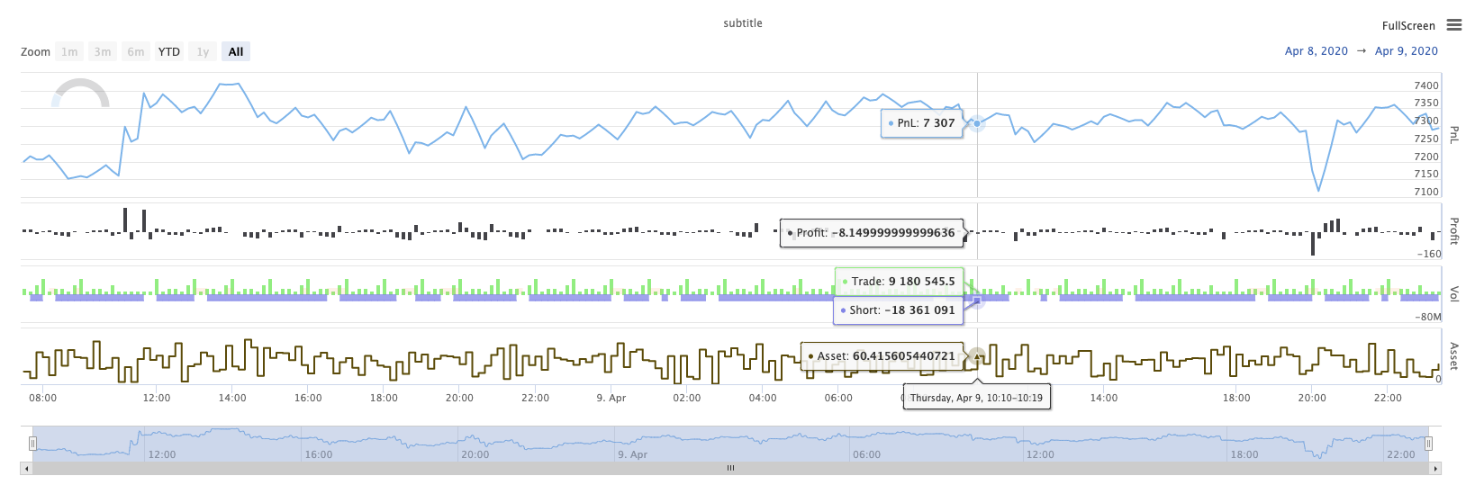
KLineChart ((...)
KLineChart(chartCfg)، اس فنکشن کا استعمال حکمت عملی چل رہا ہے جب اپنی مرضی کے مطابق ڈرائنگ کے لئے پائن زبان کی طرح ایک ڈرائنگ کا طریقہ استعمال کرنے کے لئے استعمال کیا جاتا ہے. حکمت عملی اپنی مرضی کے مطابق ڈرائنگ صرف استعمال کر سکتے ہیںKLineChart()طریقہ کار یاChart() methods.
حوالہ کا کوڈ:
function main() {
    // Call the KLineChart function to create a chart control object c
    let c = KLineChart({
        overlay: true
    })

    // Use the spot exchange object test to obtain K-line data. If you use the futures exchange object test, you need to set up the contract first.
    let bars = exchange.GetRecords()
    if (!bars) {
        return
    }

    bars.forEach(function(bar, index) {
        c.begin(bar)
        c.barcolor(bar.Close > bar.Open ? 'rgba(255, 0, 0, 0.2)' : 'rgba(0, 0, 0, 0.2)')
        if (bar.Close > bar.Open) {
            c.bgcolor('rgba(0, 255, 0, 0.5)')
        }
        let h = c.plot(bar.High, 'high')
        let l = c.plot(bar.Low, 'low')

        c.fill(h, l, {
            color: bar.Close > bar.Open ? 'rgba(255, 0, 0, 0.2)' : 'rgba(255, 0, 0, 0.2)'
        })
        c.hline(bar.High)
        c.plotarrow(bar.Close - bar.Open)
        c.plotshape(bar.Low, {
            style: 'diamond'
        })
        c.plotchar(bar.Close, {
            char: 'X'
        })
        c.plotcandle(bar.Open*0.9, bar.High*0.9, bar.Low*0.9, bar.Close*0.9)
        if (bar.Close > bar.Open) {
            // long/short/closelong/closeshort
            c.signal("long", bar.High, 1.5)
        } else if (bar.Close < bar.Open) {
            c.signal("closelong", bar.Low, 1.5)
        }
        c.close()
    })
}
def main():
    # Call the KLineChart function to create a chart control object c
    c = KLineChart({
        "overlay": True
    })

    # Use the spot exchange object test to obtain K-line data. If you use the futures exchange object test, you need to set up the contract first.
    bars = exchange.GetRecords()
    if not bars:
        return

    for bar in bars:
        c.begin(bar)
        c.barcolor('rgba(255, 0, 0, 0.2)' if bar.Close > bar.Open else 'rgba(0, 0, 0, 0.2)')
        if bar.Close > bar.Open:
            c.bgcolor('rgba(0, 255, 0, 0.5)')

        h = c.plot(bar.High, 'high')
        l = c.plot(bar.Low, 'low')

        c.fill(h, l, 'rgba(255, 0, 0, 0.2)' if bar.Close > bar.Open else 'rgba(255, 0, 0, 0.2)')
        c.hline(bar.High)
        c.plotarrow(bar.Close - bar.Open)
        c.plotshape(bar.Low, style = 'diamond')
        c.plotchar(bar.Close, char = 'X')
        c.plotcandle(bar.Open*0.9, bar.High*0.9, bar.Low*0.9, bar.Close*0.9)
        if bar.Close > bar.Open:
            # long/short/closelong/closeshort
            c.signal("long", bar.High, 1.5)
        elif bar.Close < bar.Open:
            c.signal("closelong", bar.Low, 1.5)

        c.close()
// Not supported currently
حکمت عملی کے اپنی مرضی کے مطابق ڈرائنگ کے علاقے میں ڈرائنگ کے لئے ایک چارٹ کنٹرول آبجیکٹ ہونا ضروری ہے تو، تقریب کا استعمال کریںKLineChartاس اعتراض کو تخلیق کرنے کے لئے.KLineChartتقریب ایک چارٹ ترتیب کی ساخت ہے، حوالہ کوڈ میں استعمال کیا جاتا چارٹ کی ساخت بہت آسان ہے{overlay: true}). یہ چارٹ ترتیب کی ساخت صرف مرکزی چارٹ پر آؤٹ پٹ کرنے کے لئے ڈرائنگ مواد مقرر کرتا ہے.overlayپر مقرر کیا گیا ہےfalse، چارٹ پر مواد ذیلی چارٹ پر آؤٹ پٹ ہے. اگر آپ کو مرکزی چارٹ پر ڈرائنگ کرنے کے لئے ایک ڈرائنگ تقریب کی وضاحت کرنے کی ضرورت ہے، آپ کو بھی پیرامیٹر کی وضاحت کر سکتے ہیںoverlayبطورtrueمخصوص فنکشن کال میں.
ڈرائنگ آپریشن K لائن کے اعداد و شمار پر عبور کرکے انجام دیا جاتا ہے۔ ڈرائنگ آپریشن کا آغاز ایکc.begin(bar)فنکشن کال اور ایک کے ساتھ ختمc.close()فنکشن کال۔ ڈرائنگ آپریشن میں تائید شدہ پائن زبان کے ڈرائنگ انٹرفیس افعال یہ ہیں:
-
بارکولر: سیٹ K لائن رنگ
barcolor ((رنگ، آفسیٹ، قابل تدوین، show_last، عنوان، ڈسپلے)
c.barcolor(bar.Close > bar.Open ? 'rgba(255, 0, 0, 0.2)' : 'rgba(0, 0, 0, 0.2)') // Use the example illustrated in the reference code in this example, without giving unnecessary detailsc.barcolor('rgba(255, 0, 0, 0.2)' if bar.Close > bar.Open else 'rgba(0, 0, 0, 0.2)')displayاختیاری پیرامیٹرز:کوئی نہیں ، تمام
-
bgcolor: مخصوص رنگ کے ساتھ K لائن کے پس منظر کو بھریں
bgcolor ((رنگ، آفسیٹ، قابل تدوین، show_last، عنوان، ڈسپلے، اوورلے)
c.bgcolor('rgba(0, 255, 0, 0.5)')c.bgcolor('rgba(0, 255, 0, 0.5)')displayاختیاری پیرامیٹرز:کوئی نہیں ، تمام
-
پلاٹ: چارٹ پر اعداد و شمار کی ایک سیریز پلاٹ
پلاٹ ((سیریز، عنوان، رنگ، لائن کی چوڑائی، انداز، ٹریک قیمت، ہسٹ بیس، آفسیٹ، جوائن، قابل تدوین، شو_لاسٹ، ڈسپلے)
c.plot(bar.High, 'high')h = c.plot(bar.High, 'high')styleاختیاری پیرامیٹرز:stepline_diamond , stepline , cross , areabr , area , circles , columns , histogram , linebr , line displayاختیاری پیرامیٹرز:کوئی نہیں ، تمام
-
بھریں: دو ڈرائنگ یا لائنوں کے درمیان پس منظر کو فراہم کردہ رنگ کے ساتھ بھریں
بھریں (صفحہ1،صفحہ2، رنگ، عنوان، قابل تدوین، خالی جگہوں کو بھریں، دکھائیں)
let h = c.plot(bar.High, 'high')
let l = c.plot(bar.Low, 'low')

c.fill(h, l, {color: bar.Close > bar.Open ? 'rgba(255, 0, 0, 0.2)' : 'rgba(255, 0, 0, 0.2)'})
h = c.plot(bar.High, 'high') l = c.plot(bar.Low, 'low') c.fill(h, l, {"color": 'rgba(255, 0, 0, 0.2)' if bar.Close > bar.Open else 'rgba(255, 0, 0, 0.2)'})displayاختیاری پیرامیٹرز:کوئی نہیں ، تمام
کے بعد
JavaScriptزبان کے نام کے مطابق آنے والے پیرامیٹرز کی وضاحت نہیں کر سکتے ہیں تقریب رسمی پیرامیٹرز، اس مسئلے کو حل کرنے کے لئے، ایک{key: value}ساخت ایک مخصوص رسمی پیرامیٹر نام میں منظور پیرامیٹر کی وضاحت کرنے کے لئے استعمال کیا جا سکتا ہے، مثال کے طور پر حوالہ کوڈ میں، استعمال{color: bar.Close > bar.Open ? 'rgba(255, 0, 0, 0.2)' : 'rgba(255, 0, 0, 0.2)'}کی وضاحت کرنے کے لئےcolorپیرامیٹرfillاگر آپ کو متعدد پیرامیٹر ناموں کے ساتھ پیرامیٹرز کی وضاحت کرنے کی ضرورت ہے تو، آپ استعمال کر سکتے ہیں{key1: value1, key2: value2, key3: value3}مثال کے طور پر، اس مثال میں، ایک پیرامیٹر کی وضاحت کرنے کے لئے شامل کریںtitle:{color: bar.Close > bar.Open ? 'rgba(255, 0, 0, 0.2)' : 'rgba(255, 0, 0, 0.2)', title: 'fill'}.رنگ قدر کے لئے، آپ کو استعمال کر سکتے ہیں
'rgba(255, 0, 0, 0.2)'مقرر کرنے کا طریقہ، یا استعمال'#FF0000'طریقہ مقرر کرنے کے لئے -
hline: ایک مقررہ مقررہ قیمت کی سطح پر ایک افقی لائن فراہم کرتا ہے
hline ((قیمت، عنوان، رنگ، لائن سٹائل، لائن چوڑائی، قابل تدوین، ڈسپلے)
c.hline(bar.High)c.hline(bar.High)linestyleاختیاری پیرامیٹرز:ڈیشڈ ، ڈاٹڈ ، سولیڈ displayاختیاری پیرامیٹرز:کوئی نہیں ، تمام
-
پلاٹاراؤ: چارٹ پر اوپر اور نیچے تیر کھینچیں
پلاٹ (سیریز، عنوان، رنگ، رنگ ڈاؤن، آفسیٹ، مائن ہائیٹ، میکس ہائیٹ، قابل تدوین، شو_لاسٹ، ڈسپلے)
c.plotarrow(bar.Close - bar.Open)c.plotarrow(bar.Close - bar.Open)displayاختیاری پیرامیٹرز:کوئی نہیں ، تمام
-
plotshape: چارٹ پر بصری شکلیں بنائیں
plotshape ((سیریز، عنوان، انداز، مقام، رنگ، آفسیٹ، متن، textcolor، قابل تدوین، سائز، show_last، ڈسپلے)
c.plotshape(bar.Low, {style: 'diamond'})c.plotshape(bar.Low, style = 'diamond')-
styleاختیاری پیرامیٹرز:ڈائمنڈ ، کوارٹر ، لیبل_ڈاؤن ، لیبل_اپ ، پیڑ_ڈاؤن ، پیڑ_اپ ، دائرہ ، پرچم ، مثلث_ڈاؤن ، مثلث_اپ ، کراس ، ایکس کراس -
locationاختیاری پیرامیٹرز:اوپربار ، نیچےبار ، اوپر ، نیچے ، مطلق -
sizeاختیاری پیرامیٹرز:10px ، 14px ، 20px ، 40px ، 80px ، size.tiny,size.small,size.normal,size.large,size.hugeپائن زبان میںsize.autoہےsize.small. -
displayاختیاری پیرامیٹرز:کوئی نہیں ، تمام
-
-
plotchar: کسی بھی دیئے گئے یونیکوڈ کردار کا استعمال کرتے ہوئے چارٹ پر مرئی شکلیں ڈرا
plotchar ((سیریز، عنوان، چار، مقام، رنگ، آفسیٹ، متن، textcolor، قابل تدوین، سائز، show_last، ڈسپلے)
c.plotchar(bar.Close, {char: 'X'})c.plotchar(bar.Close, char = 'X')-
locationاختیاری پیرامیٹرز:اوپربار ، نیچےبار ، اوپر ، نیچے ، مطلق -
sizeاختیاری پیرامیٹرز:10px ، 14px ، 20px ، 40px ، 80px ، size.tiny,size.small,size.normal,size.large,size.hugeپائن زبان میںsize.autoہےsize.small. -
displayاختیاری پیرامیٹرز:کوئی نہیں ، تمام
-
-
plotcandle: چارٹ پر ایک K لائن چارٹ ڈرائنگ
plotcandle ((کھولیں، اعلی، کم، قریب، عنوان، رنگ، wickcolor، قابل تدوین، show_last، bordercolor، ڈسپلے)
c.plotcandle(bar.Open*0.9, bar.High*0.9, bar.Low*0.9, bar.Close*0.9)c.plotcandle(bar.Open*0.9, bar.High*0.9, bar.Low*0.9, bar.Close*0.9)displayاختیاری پیرامیٹرز:کوئی نہیں ، تمام
-
سگنل: پائین زبان میں دستیاب نہیں ہیں کہ افعال یہاں خریدنے اور فروخت سگنل بنانے کے لئے استعمال کیا جاتا ہے
سگنل ((ہدایت، قیمت، مقدار، شناخت)
c.signal("long", bar.High, 1.5)c.signal("long", bar.High, 1.5)ان پٹ پیرامیٹر
"long"ٹرانزیکشن سمت، اختیاری اشارہ کرتا ہے"long","closelong","short","closeshort". آنے والے پیرامیٹرbar.Highمارکر سگنل کی Y محور پوزیشن ہے. ان پٹ پیرامیٹر1.5سگنل کی تجارت کی تعداد کی نمائندگی کرتا ہے۔ چوتھا پیرامیٹر ڈیفالٹ کے ذریعہ تیار کردہ متن کے مواد کی جگہ لے سکتا ہے۔ تیار کردہ سگنل مارکر کا ڈیفالٹ متن تجارتی سمت ہے ، مثال کے طور پر:"closelong".
مندرجہ بالا فنکشن کالز میں استعمال کچھ رنگ، سٹائل اور دیگر ترتیبات کے لئے، براہ مہربانی ملاحظہ کریںKLineChart فنکشن کے ساتھ ڈرائنگ پر خصوصی مضمون
لاگ ری سیٹ کریں
LogReset()لاگ ان کو صاف کرنے کے لئے استعمال کیا جاتا ہے۔ آپ کو برقرار رکھنے کے لئے حالیہ لاگ ان کی تعداد کی وضاحت کرنے کے لئے ، اور باقی لاگ ان کو صاف کرنے کے لئے ایک انٹیجر پیرامیٹر پاس کرسکتے ہیں۔ اسٹارٹ اپ لاگ ہر بار شروع ہونے پر گنتی کی جاتی ہے ، لہذا اگر کوئی پیرامیٹرز پاس نہیں ہوتے ہیں ، اور حکمت عملی کے آغاز میں لاگ آؤٹ پٹ نہیں ہوتا ہے تو ، لاگ بالکل ظاہر نہیں ہوگا ، ڈوکر لاگ کی واپسی کا انتظار کرتے ہوئے (غیر معمولی صورتحال نہیں) ۔ فنکشن کی کوئی واپسی کی قیمت نہیں ہے۔
function main() {
    // Mainta