Quantitative analysis of the digital currency market
Author: Goodness, Created: 2019-08-16 10:37:23, Updated: 2023-10-19 21:04:20
A data-driven digital currency speculative analytics method
How does the price of Bitcoin perform? What are the reasons for the rise and fall in the price of the digital currency? Are the market prices of the different coins inextricably linked or are they largely independent? How can we predict what will happen next?
Articles about digital currencies such as Bitcoin and Ethereum are now full of speculation, with hundreds of self-proclaimed experts advocating for the trends they expect to emerge. Many of these analyses lack a solid foundation for basic data and statistical models.
The aim of this article is to provide a brief introduction to the analysis of digital currencies using Python. We will retrieve, analyze and visualize data from different digital currencies through a simple Python script. In the process, we will discover these volatile market behaviors and interesting trends in how they evolve.
This is not an article explaining digital currencies, nor is it an opinion about which specific currencies will rise and which will fall. Rather, our focus in this tutorial is simply getting raw data and discovering the stories hidden in the numbers.
Step 1: Build our data work environment
This tutorial is designed for amateurs, engineers, and data scientists of all skill levels. Whether you're a bigwig or a novice programmer, the only skills you'll need are a basic understanding of the Python programming language and enough command-line operations to set up a data science project.
1.1 Install the inventor quantification host and set up Anaconda
- Inventor quantified custodian system
发明者量化平台FMZ.COM除了提供优质的各大主流交易所的数据源,还提供一套丰富的API接口以帮助我们在完成数据的分析后进行自动化交易。这套接口包括查询账户信息,查询各个主流交易所的高,开,低,收价格,成交量,各种常用技术分析指标等实用工具,特别是对于实际交易过程中连接各大主流交易所的公共API接口,提供了强大的技术支持。
All of the above features are packaged into a Docker-like system, and all we have to do is buy or lease our own cloud computing service and deploy the Docker system.
In the official name of the inventor's quantification platform, this Docker system is called the host system.
For more information on how to deploy hosts and bots, please refer to my previous post:https://www.fmz.com/bbs-topic/4140
Readers who want to buy their own cloud server deployment host can refer to this article:https://www.fmz.com/bbs-topic/2848
After successfully deploying a good cloud service and host system, next we'll install Python's biggest temple to date: Anaconda.
The easiest way to implement all the relevant programming environments (dependencies, version management, etc.) is to use Anaconda. It is a packed Python data science ecosystem and dependency library manager.
Since we are installing Anaconda on a cloud service, we recommend that the cloud server installs the command-line version of Anaconda on the Linux system.
For instructions on how to install Anaconda, please see the official guide to Anaconda:https://www.anaconda.com/distribution/
If you're an experienced Python programmer and don't feel the need to use Anaconda, that's totally fine. I'll assume you don't need help installing the necessary dependencies, you can jump straight to the second part.
1.2 Creating an Anaconda data analytics project environment
Once Anaconda is installed, we need to create a new environment to manage our dependency packages.
conda create --name cryptocurrency-analysis python=3
We have been working on creating a new Anaconda environment for our project.
Next, input the following:
source activate cryptocurrency-analysis (linux/MacOS操作)
或者
activate cryptocurrency-analysis (windows操作系统)
This is the only way to activate this environment.
Next, enter the following:
conda install numpy pandas nb_conda jupyter plotly
The project is implemented using the various dependency packages required to install it.
Note: Why use the Anaconda environment? If you plan to run many Python projects on your computer, it is helpful to separate the dependencies of different projects (software libraries and packages) to avoid conflicts.
1.3 How to create a Jupyter Notebook
Once the environment and dependency packages are installed, run.
jupyter notebook
To start the Python kernel, use your browser to access http://localhost:8888/To create a new Python notebook, make sure it uses:
Python [conda env:cryptocurrency-analysis]
Nucleus
1.4 Importing dependency packages
The first thing we need to do is import the dependencies we need.
import os
import numpy as np
import pandas as pd
import pickle
from datetime import datetime
We also need to import Plotly and turn on offline mode.
import plotly.offline as py
import plotly.graph_objs as go
import plotly.figure_factory as ff
py.init_notebook_mode(connected=True)
Step 2: Get price information on the digital currency
The preparation is complete and we can now start to collect the data to be analyzed. First, we will use the inventor's API to quantify the platform's API to obtain Bitcoin price data.
This will use the GetTicker function, for details on how to use both functions, see:https://www.fmz.com/api
2.1 Writing a data collection function in Quandl
To make it easier to get the data, we wrote a function to download and synchronize it from Quandl (((quandl.comThe inventor's quantification platform also provides a similar data interface, mainly for real-time trading, since this article is mainly about data analysis, we will use Quandl data here.
In real-time trading, the GetTicker and GetRecords functions can be called directly in Python to obtain price data. For their use, see:https://www.fmz.com/api
def get_quandl_data(quandl_id):
    # 下载和缓冲来自Quandl的数据列
    cache_path = '{}.pkl'.format(quandl_id).replace('/','-')
    try:
        f = open(cache_path, 'rb')
        df = pickle.load(f)
        print('Loaded {} from cache'.format(quandl_id))
    except (OSError, IOError) as e:
        print('Downloading {} from Quandl'.format(quandl_id))
        df = quandl.get(quandl_id, returns="pandas")
        df.to_pickle(cache_path)
        print('Cached {} at {}'.format(quandl_id, cache_path))
    return df
Here, a pickle library is used to sequence the data and store the downloaded data in a file so that the program does not download the same data again each time it runs. This function returns data in the Panda data frame format. If you are not familiar with the concept of a data frame, you can think of it as a powerful Excel spreadsheet.
2.2 Obtaining price data for digital currencies on the Kraken exchange
Let's use the Kraken Bitcoin exchange as an example, starting with the price of the Bitcoin it was acquired.
# 获取Kraken比特币交易所的价格
btc_usd_price_kraken = get_quandl_data('BCHARTS/KRAKENUSD')
Use the method head ((() to view the first five lines of a data box.
btc_usd_price_kraken.head()
The result is:
| BTC | Open | High | Low | Close | Volume (BTC) | Volume (Currency) | Weighted Price |
|---|---|---|---|---|---|---|---|
| 2014-01-07 | 874.67040 | 892.06753 | 810.00000 | 810.00000 | 15.622378 | 13151.472844 | 841.835522 |
| 2014-01-08 | 810.00000 | 899.84281 | 788.00000 | 824.98287 | 19.182756 | 16097.329584 | 839.156269 |
| 2014-01-09 | 825.56345 | 870.00000 | 807.42084 | 841.86934 | 8.158335 | 6784.249982 | 831.572913 |
| 2014-01-10 | 839.99000 | 857.34056 | 817.00000 | 857.33056 | 8.024510 | 6780.220188 | 844.938794 |
| 2014-01-11 | 858.20000 | 918.05471 | 857.16554 | 899.84105 | 18.748285 | 16698.566929 | 890.671709 |
The next step is to make a simple table to verify the correctness of the data through a visualization method.
# 做出BTC价格的表格
btc_trace = go.Scatter(x=btc_usd_price_kraken.index, y=btc_usd_price_kraken['Weighted Price'])
py.iplot([btc_trace])
这里,我们用Plotly来完成可视化部分。相对于使用一些更成熟的Python数据可视化库,比如Matplotlib,用Plotly是一个不那么普遍的选择,但Plotly确实是一个不错的选择,因为它可以调用D3.js的充分交互式图表。这些图表有非常漂亮的默认设置,易于探索,而且非常方便嵌入到网页中。
Tip: The generated chart can be compared to a Bitcoin price chart on a mainstream exchange (such as one on OKEX, Binance, or Huobi) as a quick integrity check to confirm that the downloaded data is broadly consistent.
2.3 Get price data from mainstream Bitcoin exchanges
Attentive readers may have noticed that some of the above data is missing, especially in late 2014 and early 2016; this is especially evident on the Kraken exchange. We certainly don't want these missing data to affect our price analysis.
The characteristic of a digital currency exchange is that the price of the currency is determined by the supply and demand relationship. Therefore, the price of no single transaction can be the dominant price of the market. To solve this problem, and the data gap mentioned above (possibly due to technical power outages and data errors), we will download data from the three main Bitcoin exchanges in the world and calculate the average price of Bitcoin.
Let's start by downloading the data of each exchange into a dataset made up of dictionary types.
# 下载COINBASE,BITSTAMP和ITBIT的价格数据
exchanges = ['COINBASE','BITSTAMP','ITBIT']

exchange_data = {}

exchange_data['KRAKEN'] = btc_usd_price_kraken

for exchange in exchanges:
    exchange_code = 'BCHARTS/{}USD'.format(exchange)
    btc_exchange_df = get_quandl_data(exchange_code)
    exchange_data[exchange] = btc_exchange_df
2.4 Integrate all data into one data stack
Next, we're going to define a special function that merges columns shared by each data column into a new data column. Let's call it the merge_dfs_on_column function.
def merge_dfs_on_column(dataframes, labels, col):
    '''Merge a single column of each dataframe into a new combined dataframe'''
    series_dict = {}
    for index in range(len(dataframes)):
        series_dict[labels[index]] = dataframes[index][col]

    return pd.DataFrame(series_dict)
Now, we're going to collate all the data sets together based on the price of the data sets.
# 整合所有数据帧
btc_usd_datasets = merge_dfs_on_column(list(exchange_data.values()), list(exchange_data.keys()), 'Weighted Price')
Finally, we use the linktail () method to look at the last five rows of data after the merger to ensure that the data is correct and complete.
btc_usd_datasets.tail()
The results showed:
| BTC | BITSTAMP | COINBASE | ITBIT | KRAKEN |
|---|---|---|---|---|
| 2017-08-14 | 4210.154943 | 4213.332106 | 4207.366696 | 4213.257519 |
| 2017-08-15 | 4101.447155 | 4131.606897 | 4127.036871 | 4149.146996 |
| 2017-08-16 | 4193.426713 | 4193.469553 | 4190.104520 | 4187.399662 |
| 2017-08-17 | 4338.694675 | 4334.115210 | 4334.449440 | 4346.508031 |
| 2017-08-18 | 4182.166174 | 4169.555948 | 4175.440768 | 4198.277722 |
As you can see from the table above, the data is in line with our expectations, with the data range being roughly the same, just slightly different based on the delays or the characteristics of each exchange.
2.5 Process of visualization of price data
From an analytical logic point of view, the next step is to visualize and compare these data. For this, we need to first define an auxiliary function, let's call it the df_scatter function.
def df_scatter(df, title, seperate_y_axis=False, y_axis_label='', scale='linear', initial_hide=False):
    '''Generate a scatter plot of the entire dataframe'''
    label_arr = list(df)
    series_arr = list(map(lambda col: df[col], label_arr))

    layout = go.Layout(
        title=title,
        legend=dict(orientation="h"),
        xaxis=dict(type='date'),
        yaxis=dict(
            title=y_axis_label,
            showticklabels= not seperate_y_axis,
            type=scale
        )
    )

    y_axis_config = dict(
        overlaying='y',
        showticklabels=False,
        type=scale )

    visibility = 'visible'
    if initial_hide:
        visibility = 'legendonly'

    # 每个系列的表格跟踪
    trace_arr = []
    for index, series in enumerate(series_arr):
        trace = go.Scatter(
            x=series.index,
            y=series,
            name=label_arr[index],
            visible=visibility
        )

        # 为系列添加单独的轴
        if seperate_y_axis:
            trace['yaxis'] = 'y{}'.format(index + 1)
            layout['yaxis{}'.format(index + 1)] = y_axis_config
        trace_arr.append(trace)

    fig = go.Figure(data=trace_arr, layout=layout)
    py.iplot(fig)
For ease of understanding, this article will not go into too much detail about the logic of this auxiliary function. For more information, see the official instruction documentation for Pandas and Plotly.
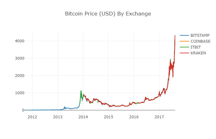
Now, we can easily create a graph of Bitcoin price data!
# 绘制所有BTC交易价格
df_scatter(btc_usd_datasets, 'Bitcoin Price (USD) By Exchange')
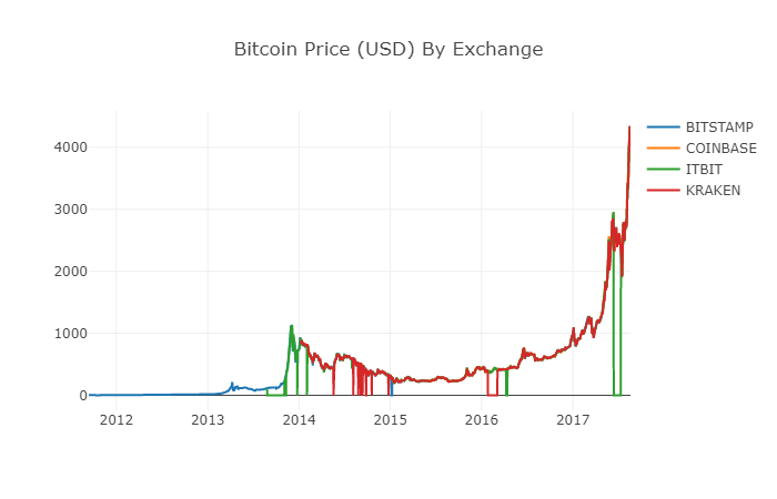
2.6 Clean and add total price data
As can be seen from the graph above, although the four series of data follow roughly the same path, there are still some irregular changes in them, which we will try to clear up.
During the time period of 2012-2017, we know that the price of Bitcoin was never equal to zero, so we first removed all zeros from the data box.
# 清除"0"值
btc_usd_datasets.replace(0, np.nan, inplace=True)
After reconstructing the data stack, we can see clearer graphics without missing data.
# 绘制修订后的数据框
df_scatter(btc_usd_datasets, 'Bitcoin Price (USD) By Exchange')
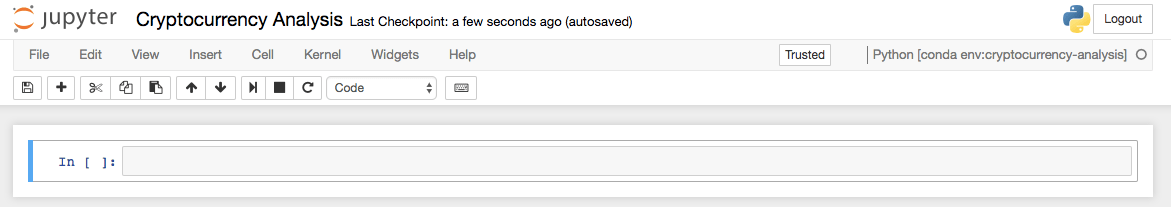
We can now calculate a new column: the average daily price of Bitcoin on all exchanges.
# 将平均BTC价格计算为新列
btc_usd_datasets['avg_btc_price_usd'] = btc_usd_datasets.mean(axis=1)
The new column is the price index of Bitcoin! Let's draw it again to see if there is a problem with what the data looks like.
# 绘制平均BTC价格
btc_trace = go.Scatter(x=btc_usd_datasets.index, y=btc_usd_datasets['avg_btc_price_usd'])
py.iplot([btc_trace])
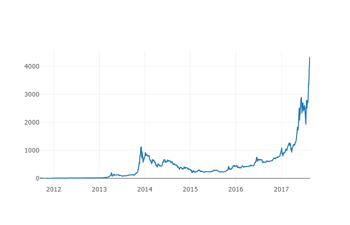
It looks like there really is no problem, and later on, we will continue to use this aggregated price sequence data to be able to determine the conversion rate between other digital currencies and the US dollar.
Step 3: Collect the price of the altcoins
So far, we have time series data on the price of Bitcoin. Next, we'll look at some data on non-Bitcoin digital currencies, which is the case of those altcoins, of course, the term altcoin may be a bit overweight, but as for the current state of the digital currencies, except for the top 10 by market capitalization (such as Bitcoin, Ethereum, EOS, USDT, etc.), most of which can be called as shillings are not a problem, and we should try to stay away from these currencies when trading, because they are too confusing and deceptive.
3.1 Define auxiliary functions through the Poloniex exchange API
First, we use the Poloniex exchange's API to get data information about digital currency transactions. We define two auxiliary functions to get the relevant data for the crypto, which are mainly to download and cache JSON data through the API.
First, we define the function get_json_data, which will download and cache JSON data from a given URL.
def get_json_data(json_url, cache_path):
    '''Download and cache JSON data, return as a dataframe.'''
    try:
        f = open(cache_path, 'rb')
        df = pickle.load(f)
        print('Loaded {} from cache'.format(json_url))
    except (OSError, IOError) as e:
        print('Downloading {}'.format(json_url))
        df = pd.read_json(json_url)
        df.to_pickle(cache_path)
        print('Cached {} at {}'.format(json_url, cache_path))
    return df
Next, we define a new function that generates an HTTP request from the Polonix API and calls the just-defined get_json_data function to save the data results of the call.
base_polo_url = 'https://poloniex.com/public?command=returnChartData¤cyPair={}&start={}&end={}&period={}'
start_date = datetime.strptime('2015-01-01', '%Y-%m-%d') # 从2015年开始获取数据
end_date = datetime.now() # 直到今天
pediod = 86400 # pull daily data (86,400 seconds per day)
def get_crypto_data(poloniex_pair):
'''Retrieve cryptocurrency data from poloniex'''
json_url = base_polo_url.format(poloniex_pair, start_date.timestamp(), end_date.timestamp(), pediod)
data_df = get_json_data(json_url, poloniex_pair)
data_df = data_df.set_index('date')
return data_df
The above function extracts the digital currency pairing character code (e.g. the BTC_ETH string) and returns a datastore containing the two currency historical prices.
3.2 Downloading trading price data from Poloniiex
The vast majority of coins cannot be purchased directly in US dollars, and individuals usually have to buy the digital currencies first and then exchange them into coins according to the price ratio between them. Therefore, we have to download the exchange rate for each digital currency to exchange bitcoin, and then convert it into US dollars using the existing Bitcoin price data. We download the data for the top 9 digital currency transactions: Ethereum, Litecoin, Ripple, EthereumClassic, Stellar, Dash, Siacoin, Monero, and NEM.
altcoins = ['ETH','LTC','XRP','ETC','STR','DASH','SC','XMR','XEM']

altcoin_data = {}
for altcoin in altcoins:
    coinpair = 'BTC_{}'.format(altcoin)
    crypto_price_df = get_crypto_data(coinpair)
    altcoin_data[altcoin] = crypto_price_df
Now, we have a dictionary with nine data sets, each containing data on the historical daily average price between Bitcoin and Bitcoin.
We can judge whether the data is correct by the last few lines of the Ethereum price chart.
altcoin_data['ETH'].tail()
| ETH | Open | High | Low | Close | Volume (BTC) | Volume (Currency) | Weighted Price |
|---|---|---|---|---|---|---|---|
| 2017-08-18 | 0.070510 | 0.071000 | 0.070170 | 0.070887 | 17364.271529 | 1224.762684 | 0.070533 |
| 2017-08-18 | 0.071595 | 0.072096 | 0.070004 | 0.070510 | 26644.018123 | 1893.136154 | 0.071053 |
| 2017-08-18 | 0.071321 | 0.072906 | 0.070482 | 0.071600 | 39655.127825 | 2841.549065 | 0.071657 |
| 2017-08-19 | 0.071447 | 0.071855 | 0.070868 | 0.071321 | 16116.922869 | 1150.361419 | 0.071376 |
| 2017-08-19 | 0.072323 | 0.072550 | 0.071292 | 0.071447 | 14425.571894 | 1039.596030 | 0.072066 |
3.3 Unify all price data in dollars
Now, we can combine the BTC to Bitcoin exchange rate data with our Bitcoin Price Index to directly calculate the historical price of each Bitcoin (unit: USD).
# 将USD Price计算为每个altcoin数据帧中的新列
for altcoin in altcoin_data.keys():
    altcoin_data[altcoin]['price_usd'] =  altcoin_data[altcoin]['weightedAverage'] * btc_usd_datasets['avg_btc_price_usd']
Here, we add a new column for the data bar of each coin to store its corresponding dollar price.
Next, we can reuse the previously defined function merge_dfs_on_column to create a merged datasheet that integrates the dollar prices of each digital currency.
# 将每个山寨币的美元价格合并为单个数据帧
combined_df = merge_dfs_on_column(list(altcoin_data.values()), list(altcoin_data.keys()), 'price_usd')
I got it!
Now let's simultaneously add the price of Bitcoin as the last bit to the merged data stack.
# 将BTC价格添加到数据帧
combined_df['BTC'] = btc_usd_datasets['avg_btc_price_usd']
Now we have a unique data stack that contains the daily dollar prices of the ten digital currencies we are verifying.
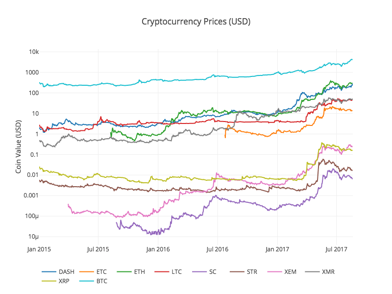
We recalled the previous functiondf_scatter to display the corresponding prices of all the coins in the form of a chart.
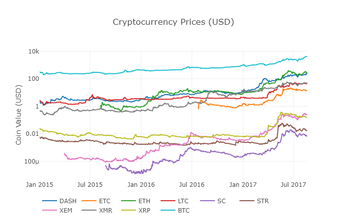
The graph looks fine, but this one gives us an overview of how the exchange rates of each digital currency have changed over the past few years.
Note: Here we use the y-axis of the logarithm specification to compare all the digital currencies on the same graph. You can also try other different parameter values (e.g. scale =
3.4 Beginning of the correlation analysis
A careful reader may have noticed that the prices of digital currencies seem to be related, despite their large differences in value and high volatility. Especially since the sharp rise in April 2017, even many small fluctuations seem to be synchronized with the fluctuations in the market as a whole.
Of course, conclusions based on data are more persuasive than intuitions based on images.
We can use the Panda corr () function to verify the above correlation hypothesis. This test calculates the Pearson correlation coefficient for each node in the data stack corresponding to the other node.
2017.8.22 Revision Note: This section has been modified to use the absolute value of the daily rate of return instead of the price when calculating the relevant coefficients.
A direct calculation based on a non-solid time series (e.g. raw price data) may result in correlation coefficient deviations. Our solution to this problem is to use the pct_change () method to convert the absolute value of each price in the data stack to the corresponding daily rate of return.
For example, let's calculate the relevant coefficients for 2016.
# 计算2016年数字货币的皮尔森相关系数
combined_df_2016 = combined_df[combined_df.index.year == 2016]
combined_df_2016.pct_change().corr(method='pearson')
| Name | DASH | ETC | ETH | LTC | SC | STR | XEM | XMR | XRP | BTC |
|---|---|---|---|---|---|---|---|---|---|---|
| DASH | 1.000000 | 0.003992 | 0.122695 | -0.012194 | 0.026602 | 0.058083 | 0.014571 | 0.121537 | 0.088657 | -0.014040 |
| ETC | 0.003992 | 1.000000 | -0.181991 | -0.131079 | -0.008066 | -0.102654 | -0.080938 | -0.105898 | -0.054095 | -0.170538 |
| ETH | 0.122695 | -0.181991 | 1.000000 | -0.064652 | 0.169642 | 0.035093 | 0.043205 | 0.087216 | 0.085630 | -0.006502 |
| LTC | -0.012194 | -0.131079 | -0.064652 | 1.000000 | 0.012253 | 0.113523 | 0.160667 | 0.129475 | 0.053712 | 0.750174 |
| SC | 0.026602 | -0.008066 | 0.169642 | 0.012253 | 1.000000 | 0.143252 | 0.106153 | 0.047910 | 0.021098 | 0.035116 |
| STR | 0.058083 | -0.102654 | 0.035093 | 0.113523 | 0.143252 | 1.000000 | 0.225132 | 0.027998 | 0.320116 | 0.079075 |
| XEM | 0.014571 | -0.080938 | 0.043205 | 0.160667 | 0.106153 | 0.225132 | 1.000000 | 0.016438 | 0.101326 | 0.227674 |
| XMR | 0.121537 | -0.105898 | 0.087216 | 0.129475 | 0.047910 | 0.027998 | 0.016438 | 1.000000 | 0.027649 | 0.127520 |
| XRP | 0.088657 | -0.054095 | 0.085630 | 0.053712 | 0.021098 | 0.320116 | 0.101326 | 0.027649 | 1.000000 | 0.044161 |
| BTC | -0.014040 | -0.170538 | -0.006502 | 0.750174 | 0.035116 | 0.079075 | 0.227674 | 0.127520 | 0.044161 | 1.000000 |
The above diagram shows all the correlative coefficients. Coefficients close to 1 or -1 respectively mean that the sequence is positively correlated or inversely correlated, and correlative coefficients close to 0 indicate that the corresponding objects are not related and their fluctuations are independent of each other.
In order to improve the visualization of the results, we created a new visualization help function.
def correlation_heatmap(df, title, absolute_bounds=True):
    '''Plot a correlation heatmap for the entire dataframe'''
    heatmap = go.Heatmap(
        z=df.corr(method='pearson').as_matrix(),
        x=df.columns,
        y=df.columns,
        colorbar=dict(title='Pearson Coefficient'),
    )

    layout = go.Layout(title=title)

    if absolute_bounds:
        heatmap['zmax'] = 1.0
        heatmap['zmin'] = -1.0

    fig = go.Figure(data=[heatmap], layout=layout)
    py.iplot(fig)
correlation_heatmap(combined_df_2016.pct_change(), "Cryptocurrency Correlations in 2016")
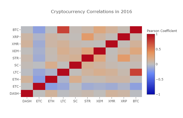
Here, the deep red numerical value represents strong correlation (each currency is clearly related to its own height), and the deep blue numerical value represents inverse correlation. All of the colors in between - light blue/orange/grey/brown - represent different degrees of weak correlation or uncorrelation.
What does this graph tell us? Basically, it illustrates the price fluctuations of different digital currencies over the course of 2016, with little statistically significant correlation.
Now, in order to verify our hypothesis of the increasing relevance of cryptocurrencies in recent months, we will repeat the same test using data from 2017.
combined_df_2017 = combined_df[combined_df.index.year == 2017]
combined_df_2017.pct_change().corr(method='pearson')
| Name | DASH | ETC | ETH | LTC | SC | STR | XEM | XMR | XRP | BTC |
|---|---|---|---|---|---|---|---|---|---|---|
| DASH | 1.000000 | 0.384109 | 0.480453 | 0.259616 | 0.191801 | 0.159330 | 0.299948 | 0.503832 | 0.066408 | 0.357970 |
| ETC | 0.384109 | 1.000000 | 0.602151 | 0.420945 | 0.255343 | 0.146065 | 0.303492 | 0.465322 | 0.053955 | 0.469618 |
| ETH | 0.480453 | 0.602151 | 1.000000 | 0.286121 | 0.323716 | 0.228648 | 0.343530 | 0.604572 | 0.120227 | 0.421786 |
| LTC | 0.259616 | 0.420945 | 0.286121 | 1.000000 | 0.296244 | 0.333143 | 0.250566 | 0.439261 | 0.321340 | 0.352713 |
| SC | 0.191801 | 0.255343 | 0.323716 | 0.296244 | 1.000000 | 0.417106 | 0.287986 | 0.374707 | 0.248389 | 0.377045 |
| STR | 0.159330 | 0.146065 | 0.228648 | 0.333143 | 0.417106 | 1.000000 | 0.396520 | 0.341805 | 0.621547 | 0.178706 |
| XEM | 0.299948 | 0.303492 | 0.343530 | 0.250566 | 0.287986 | 0.396520 | 1.000000 | 0.397130 | 0.270390 | 0.366707 |
| XMR | 0.503832 | 0.465322 | 0.604572 | 0.439261 | 0.374707 | 0.341805 | 0.397130 | 1.000000 | 0.213608 | 0.510163 |
| XRP | 0.066408 | 0.053955 | 0.120227 | 0.321340 | 0.248389 | 0.621547 | 0.270390 | 0.213608 | 1.000000 | 0.170070 |
| BTC | 0.357970 | 0.469618 | 0.421786 | 0.352713 | 0.377045 | 0.178706 | 0.366707 | 0.510163 | 0.170070 | 1.000000 |
Is the above data more relevant? Is it sufficient as a criterion for investment?
It is worth noting, however, that almost all digital currencies have become increasingly interconnected.
correlation_heatmap(combined_df_2017.pct_change(), "Cryptocurrency Correlations in 2017")
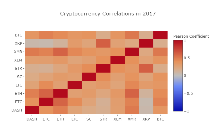
As you can see from the graph above, things are getting more and more interesting.
Why is this happening?
I'm not really sure about that, but the truth is, I'm not sure...
My first reaction is that hedge funds have recently started trading publicly in the digital currency market. These funds hold a lot of capital far beyond that of ordinary traders, and if a fund hedges its investment capital across multiple digital currencies, then using a similar trading strategy for each currency based on independent variables (e.g. the stock market).
A deeper understanding of XRP and STR
For example, it is clear from the above graph that XRP (Ripple's token) is the least correlated with other digital currencies. However, there is one notable exception here: STR (Stellar's token, officially named "Lumens"), is strongly correlated with XRP (coefficient of correlation: 0.62).
Interestingly, Stellar and Ripple are very similar fintech platforms, both of which aim to reduce the cumbersome steps involved in cross-border transfers between banks. Understandably, given the similarity of blockchain services using tokens, some big players and hedge funds may use similar trading strategies for their investments on Stellar and Ripple. This may be why XRP is more strongly associated with STR than other digital currencies.
All right, it's your turn!
The above explanations are largely speculative, and perhaps you would do better. Based on the foundation we have laid, you have hundreds of different ways to continue exploring the stories hidden in the data.
Here are some of my suggestions that readers can refer to for further research in these areas:
- Added more data on digital currencies for the entire analysis
- Adjust the time-scale and particle size of the correlation analysis to obtain an optimized or rough particle size trend view.
- Looking for trends from trading volume or blockchain data mining. Compared to raw price data, you may need more buy/sell ratio data if you want to predict future price fluctuations.
- Adding price data on stocks, commodities and fiat currencies to determine which of them are related to digital currencies (but don't forget the saying that correlation does not imply causation)
- Use Event Registry, GDELT, and Google Trends to quantify the number of buzzwords around a specific digital currency.
- Use the data to train a predictive machine learning model to predict tomorrow's prices. If you have bigger ambitions, you can even consider trying the above training with a circular neural network (RNN).
- Use your analytics to create an automated trading robot, through the corresponding application programming interface (API), which is applied on exchange websites such as Polonix or Coinbase. Beware: a poorly performing robot can easily make your assets go up in smoke.这里推荐使用发明者量化平台FMZ.COM。
The best part about Bitcoin, and about digital currencies in general, is their decentralized nature, which makes it freer, more democratic than any other asset. You can share your analysis open source, participate in the community, or write a blog! Hopefully, you have now mastered the skills needed to self-analyze, and the ability to do dialectical thinking when you read any speculative digital currency articles in the future, especially those with predictions that are not backed by data.https://www.fmz.com/bbsI'm not going to lie.
- Quantifying Fundamental Analysis in the Cryptocurrency Market: Let Data Speak for Itself!
- Quantified research on the basics of coin circles - stop believing in all kinds of crazy professors, data is objective!
- The inventor of the Quantitative Data Exploration Module, an essential tool in the field of quantitative trading.
- Mastering Everything - Introduction to FMZ New Version of Trading Terminal (with TRB Arbitrage Source Code)
- Get all the details about the new FMZ trading terminal (with the TRB suite source code)
- FMZ Quant: An Analysis of Common Requirements Design Examples in the Cryptocurrency Market (II)
- How to Exploit Brainless Selling Bots with a High-Frequency Strategy in 80 Lines of Code
- FMZ quantification: common demands on the cryptocurrency market design example analysis (II)
- How to exploit brainless robots for sale with high-frequency strategies of 80 lines of code
- FMZ Quant: An Analysis of Common Requirements Design Examples in the Cryptocurrency Market (I)
- FMZ quantification: common demands of the cryptocurrency market design instance analysis (1)
- Pairing transactions based on data-driven technology
- A Dual Thrust digital currency quantified transaction strategy is implemented in Python
ruixiao1989This is a very valuable article, I learned it, thank you.
GoodnessThank you for your love!