ARMA-EGARCHモデルに基づくビットコイン変動のモデル化と分析
作者: リン・ハーンリディア, 作成日:2022年11月15日 15:32:43, 更新日:2023年9月14日 20:30:52
最近,私はビットコインの変動性について分析をしました.それは言葉の多い,自発的なものです.私は単に私の理解とコードの一部を次のように共有します.私の能力は限られており,コードはあまり完璧ではありません.何か間違いがある場合は,それを指摘し,直接修正してください.
1. 金融 の 時間 列 の 簡潔 な 説明
金融のタイムシリーズとは,時間次元で観察された変数に基づいたストカスティックプロセスシリーズモデルのセットである.変数は通常,資産のリターン率である.リターンレートは投資スケールから独立し,統計的な性質があるため,基礎となる金融資産の投資機会を分析することがより価値があります.
ここでは,ビットコインの収益率が一般的な金融資産の収益率特性に適合していると大胆に仮定します. つまり,それはいくつかのサンプルの一貫性テストによって実証できる弱々しく滑らかなシリーズです.
準備,インポートライブラリ,エンカプセル機能
研究環境の構成が完了しました. 後の計算に必要なライブラリがここにインポートされています. 間歇的に書き込まれているため,冗長かもしれません. ご自分で片付けください.
[1] において
'''
start: 2020-02-01 00:00:00
end: 2020-03-01 00:00:00
period: 1h
exchanges: [{"eid":"Huobi","currency":"BTC_USDT","stocks":0}]
'''
from __future__ import absolute_import, division, print_function
from fmz import * # Import all FMZ functions
import pandas as pd
import numpy as np
import matplotlib.pyplot as plt
import matplotlib.lines as mlines
import seaborn as sns
import statsmodels.api as sm
import statsmodels.formula.api as smf
import statsmodels.tsa.api as smt
from statsmodels.graphics.api import qqplot
from statsmodels.stats.diagnostic import acorr_ljungbox as lb_test
from scipy import stats
from arch import arch_model
from datetime import timedelta
from itertools import product
from math import sqrt
from sklearn.metrics import r2_score, mean_absolute_error, mean_squared_error

task = VCtx(__doc__) # Initialization, verification of FMZ reading of historical data
print(exchange.GetAccount())
アウト[1]:
{
#### Encapsulate some of the functions, which will be used later. If there is a source, see the note
[17]:
# Plot functions
def tsplot(y, y_2, lags=None, title='', figsize=(18, 8)):  # source code: https://tomaugspurger.github.io/modern-7-timeseries.html
    fig = plt.figure(figsize=figsize)
    layout = (2, 2)
    ts_ax   = plt.subplot2grid(layout, (0, 0))
    ts2_ax = plt.subplot2grid(layout, (0, 1))
    acf_ax  = plt.subplot2grid(layout, (1, 0))
    pacf_ax = plt.subplot2grid(layout, (1, 1))
    y.plot(ax=ts_ax)
    ts_ax.set_title(title)
    y_2.plot(ax=ts2_ax)
    smt.graphics.plot_acf(y, lags=lags, ax=acf_ax)
    smt.graphics.plot_pacf(y, lags=lags, ax=pacf_ax)
    [ax.set_xlim(0) for ax in [acf_ax, pacf_ax]]
    sns.despine()
    plt.tight_layout()
    return ts_ax, ts2_ax, acf_ax, pacf_ax

# Performance evaluation
def get_rmse(y, y_hat):
    mse = np.mean((y - y_hat)**2)
    return np.sqrt(mse)

def get_mape(y, y_hat):
    perc_err = (100*(y - y_hat))/y
    return np.mean(abs(perc_err))

def get_mase(y, y_hat):
    abs_err = abs(y - y_hat)
    dsum=sum(abs(y[1:] - y_hat[1:]))
    t = len(y)
    denom = (1/(t - 1))* dsum
    return np.mean(abs_err/denom)

def mae(observation, forecast):
    error = mean_absolute_error(observation, forecast)
    print('Mean Absolute Error (MAE): {:.3g}'.format(error))
    return error

def mape(observation, forecast):
    observation, forecast = np.array(observation), np.array(forecast)
    # Might encounter division by zero error when observation is zero
    error = np.mean(np.abs((observation - forecast) / observation)) * 100
    print('Mean Absolute Percentage Error (MAPE): {:.3g}'.format(error))
    return error

def rmse(observation, forecast):
    error = sqrt(mean_squared_error(observation, forecast))
    print('Root Mean Square Error (RMSE): {:.3g}'.format(error))
    return error

def evaluate(pd_dataframe, observation, forecast):
    first_valid_date = pd_dataframe[forecast].first_valid_index()
    mae_error = mae(pd_dataframe[observation].loc[first_valid_date:, ], pd_dataframe[forecast].loc[first_valid_date:, ])
    mape_error = mape(pd_dataframe[observation].loc[first_valid_date:, ], pd_dataframe[forecast].loc[first_valid_date:, ])
    rmse_error = rmse(pd_dataframe[observation].loc[first_valid_date:, ], pd_dataframe[forecast].loc[first_valid_date:, ])

    ax = pd_dataframe.loc[:, [observation, forecast]].plot(figsize=(18,5))
    ax.xaxis.label.set_visible(False)
    return
1-2.Bitcoinの歴史的データについて簡単に説明しましょう.
統計的観点から,Bitcoinのいくつかのデータ特性を見てみましょう.過去年のデータ説明を例として,リターンレートはシンプルな方法で計算されます.つまり,閉値がロガリズム的に引かれます.公式は以下のとおりです: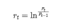
[3] において
df = get_bars('huobi.btc_usdt', '1d', count=10000, start='2019-01-01')
btc_year = pd.DataFrame(df['close'],dtype=np.float)
btc_year.index.name = 'date'
btc_year.index = pd.to_datetime(btc_year.index)
btc_year['log_price'] = np.log(btc_year['close'])
btc_year['log_return'] = btc_year['log_price'] - btc_year['log_price'].shift(1)
btc_year['log_return_100x'] = np.multiply(btc_year['log_return'], 100)

btc_year_test = pd.DataFrame(btc_year['log_return'].dropna(), dtype=np.float)
btc_year_test.index.name = 'date'
mean = btc_year_test.mean()
std = btc_year_test.std()
normal_result = pd.DataFrame(index=['Mean Value', 'Std Value', 'Skewness Value','Kurtosis Value'], columns=['model value'])
normal_result['model value']['Mean Value'] = ('%.4f'% mean[0])
normal_result['model value']['Std Value'] = ('%.4f'% std[0])
normal_result['model value']['Skewness Value'] = ('%.4f'% btc_year_test.skew())
normal_result['model value']['Kurtosis Value'] = ('%.4f'% btc_year_test.kurt())
normal_result
アウト[3]: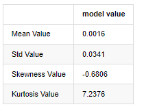
厚い脂肪尾の特徴は,時間スケールが短くなるほど,その特徴がより重要になるということです.データ周波数が増加するにつれてクルトーシスは増加し,高周波データではその特徴が非常に明らかになります.
2019年1月1日から現在までの日々の閉値データを例として,その対数回帰率の記述的な分析を行います. ビットコインの単純な回帰率シリーズは通常の分布に合致せず, 厚い脂肪尾の明らかな特徴を持っています.
配列の平均値は 0.0016,標準偏差は 0.0341,偏差は -0.6819,クルトーシスは 7.2243 で,通常の分布よりもはるかに高く,厚い脂肪尾の特徴を持っています.Bitcoin
[4] において
fig = plt.figure(figsize=(4,4))
ax = fig.add_subplot(111)
fig = qqplot(btc_year_test['log_return'], line='q', ax=ax, fit=True)
アウト[4]:
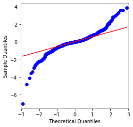
QQチャートは完璧で,Bitcoinの対数回帰列は結果から正常分布に適合していないことがわかります.
次に,波動性アグリゲーション効果を見てみましょう. つまり,金融時間列は,より大きな波動性の後,より大きな波動性とともに行います.
波動性クラスタリングは,波動性の正と負のフィードバック効果を反映し,脂肪尾の特徴と高度に相関している.経済学的には,これは波動性の時間列が自動相関する可能性があることを意味している.つまり,現在の期間の波動性は前期,前期2期,または前期3期との何らかの関係がある可能性があります.
[5] において
df = get_bars('huobi.btc_usdt', '1d', count=50000, start='2006-01-01')
btc_year = pd.DataFrame(df['close'],dtype=np.float)
btc_year.index.name = 'date'
btc_year.index = pd.to_datetime(btc_year.index)
btc_year['log_price'] = np.log(btc_year['close'])
btc_year['log_return'] = btc_year['log_price'] - btc_year['log_price'].shift(1)
btc_year['log_return_100x'] = np.multiply(btc_year['log_return'], 100)

btc_year_test = pd.DataFrame(btc_year['log_return'].dropna(), dtype=np.float)
btc_year_test.index.name = 'date'
sns.mpl.rcParams['figure.figsize'] = (18, 4)  # Volatility
ax1 = btc_year_test['log_return'].plot()
ax1.xaxis.label.set_visible(False)
アウト[5]:
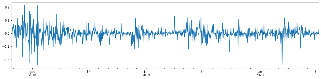
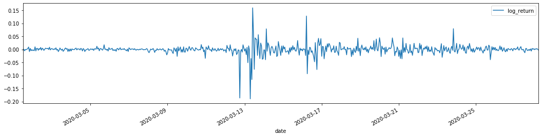
ビットコインの過去3年間の日々のロガリズム回帰率をグラフ化すると,不安定性クラスタリングの現象ははっきりと見ることができる. 2018年のビットコインの牛市の後,ほとんどの時間安定した姿勢にあった. 2020年3月,世界の金融市場が崩壊するにつれて,急激なマイナス振動とともに,一日にほぼ40%の降幅を記録したビットコイン流動性にも走行があった.
簡単に言うと,直感的な観察から,大きな変動が大きな確率で密度の高い変動に続くことがわかります. これは波動性の総和効果でもあります.この波動性範囲が予測可能であれば,BTCの短期取引に価値があります.これは波動性について議論する目的でもあります.
1-3. データ作成
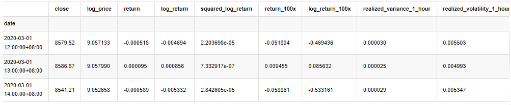
訓練サンプルセットを準備するには,まず,対照サンプルを確立し,ロガリズムリターンレートは観測波動率に相当する.日の波動性は直接観察できないため,毎時間のデータを使用して再サンプリングを行い,日の現実波動性を推論し,波動性の依存変数として取ります.
再採取方法は,毎時間データに基づいています.公式は以下のとおりです.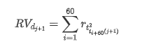
[4] において
count_num = 100000
start_date = '2020-03-01'

df = get_bars('huobi.btc_usdt', '1m', count=50000, start='2020-02-13')  # Take the minute data
kline_1m = pd.DataFrame(df['close'], dtype=np.float)
kline_1m.index.name = 'date'
kline_1m['log_price'] = np.log(kline_1m['close'])
kline_1m['return'] = kline_1m['close'].pct_change().dropna()
kline_1m['log_return'] = kline_1m['log_price'] - kline_1m['log_price'].shift(1)

kline_1m['squared_log_return'] = np.power(kline_1m['log_return'], 2)

kline_1m['return_100x'] = np.multiply(kline_1m['return'], 100)
kline_1m['log_return_100x'] = np.multiply(kline_1m['log_return'], 100)  # Enlarge 100 times

df = get_bars('huobi.btc_usdt', '1h', count=860, start='2020-02-13')  # Take the hour data
kline_all = pd.DataFrame(df['close'], dtype=np.float)
kline_all.index.name = 'date'
kline_all['log_price'] = np.log(kline_all['close'])  # Calculate daily logarithmic rate of return
kline_all['return'] = kline_all['log_price'].pct_change().dropna()
kline_all['log_return'] = kline_all['log_price'] - kline_all['log_price'].shift(1)  # Calculate logarithmic rate of return
kline_all['squared_log_return'] = np.power(kline_all['log_return'], 2)  # The exponential square of logarithmic daily rate of return

kline_all['return_100x'] = np.multiply(kline_all['return'], 100)
kline_all['log_return_100x'] = np.multiply(kline_all['log_return'], 100)  # Enlarge 100 times

kline_all['realized_variance_1_hour'] = kline_1m.loc[:, 'squared_log_return'].resample('h', closed='left', label='left').sum().copy()  # Resampling to days
kline_all['realized_volatility_1_hour'] = np.sqrt(kline_all['realized_variance_1_hour'])  # Volatility of variance derivation

kline_all = kline_all[4:-29] # Remove the last line because it is missing
kline_all.head(3)
アウト[4]: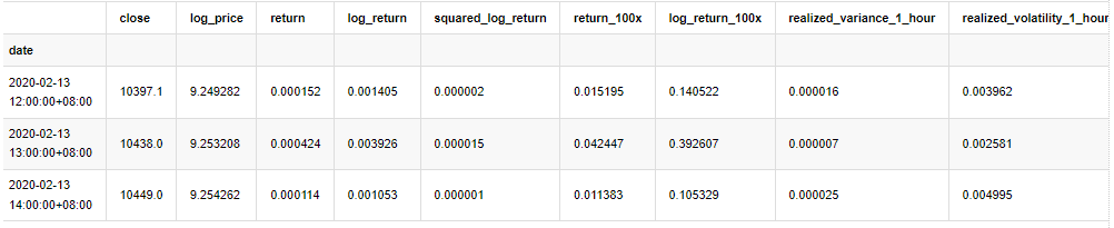
同じ方法でサンプルの外のデータを準備する
[5] において
# Prepare the data outside the sample with realized daily volatility
df = get_bars('huobi.btc_usdt', '1m', count=50000, start='2020-02-13')  # Take the minute data
kline_1m = pd.DataFrame(df['close'], dtype=np.float)
kline_1m.index.name = 'date'
kline_1m['log_price'] = np.log(kline_1m['close'])
kline_1m['log_return'] = kline_1m['log_price'] - kline_1m['log_price'].shift(1)
kline_1m['log_return_100x'] = np.multiply(kline_1m['log_return'], 100)  # Enlarge 100 times
kline_1m['squared_log_return'] = np.power(kline_1m['log_return_100x'], 2)
kline_1m#.tail()
df = get_bars('huobi.btc_usdt', '1h', count=860, start='2020-02-13')  # Take the hour data
kline_test = pd.DataFrame(df['close'], dtype=np.float)
kline_test.index.name = 'date'
kline_test['log_price'] = np.log(kline_test['close'])  # Calculate daily logarithmic rate of return
kline_test['log_return'] = kline_test['log_price'] - kline_test['log_price'].shift(1)  # Calculate logarithmic rate of return
kline_test['log_return_100x'] = np.multiply(kline_test['log_return'], 100)  # Enlarge 100 times
kline_test['squared_log_return'] = np.power(kline_test['log_return_100x'], 2)  # The exponential square of logarithmic daily rate of return
kline_test['realized_variance_1_hour'] = kline_1m.loc[:, 'squared_log_return'].resample('h', closed='left', label='left').sum()  # Resampling to days
kline_test['realized_volatility_1_hour'] = np.sqrt(kline_test['realized_variance_1_hour'])  # Volatility of variance derivation
kline_test = kline_test[4:-2]
抽出の基本データを理解するために,簡単な記述的な分析を行います.
[9]:
line_test = pd.DataFrame(kline_train['log_return'].dropna(), dtype=np.float)
line_test.index.name = 'date'

mean = line_test.mean()  # Calculate mean value and standard deviation
std = line_test.std()

line_test.sort_values(by = 'log_return', inplace = True)  # Resort
s_r = line_test.reset_index(drop = False)  # After resorting, update index
s_r['p'] = (s_r.index - 0.5) / len(s_r)  # Calculate the percentile p(i)
s_r['q'] = (s_r['log_return'] - mean) / std  # Calculate the value of q

st = line_test.describe()
x1 ,y1 = 0.25, st['log_return']['25%']
x2 ,y2 = 0.75, st['log_return']['75%']

fig = plt.figure(figsize = (18,8))
layout = (2, 2)
ax1 = plt.subplot2grid(layout, (0, 0), colspan=2)# Plot the data distribution
ax2 = plt.subplot2grid(layout, (1, 0))# Plot histogram
ax3 = plt.subplot2grid(layout, (1, 1))# Draw the QQ chart, the straight line is the connection of the quarter digit, three-quarters digit, which is basically conforms to the normal distribution

ax1.scatter(line_test.index, line_test.values)
line_test.hist(bins=30,alpha = 0.5,ax = ax2)
line_test.plot(kind = 'kde', secondary_y=True,ax = ax2)
ax3.plot(s_r['p'],s_r['log_return'],'k.',alpha = 0.1)
ax3.plot([x1,x2],[y1,y2],'-r')
sns.despine()
plt.tight_layout()
アウト[9]:
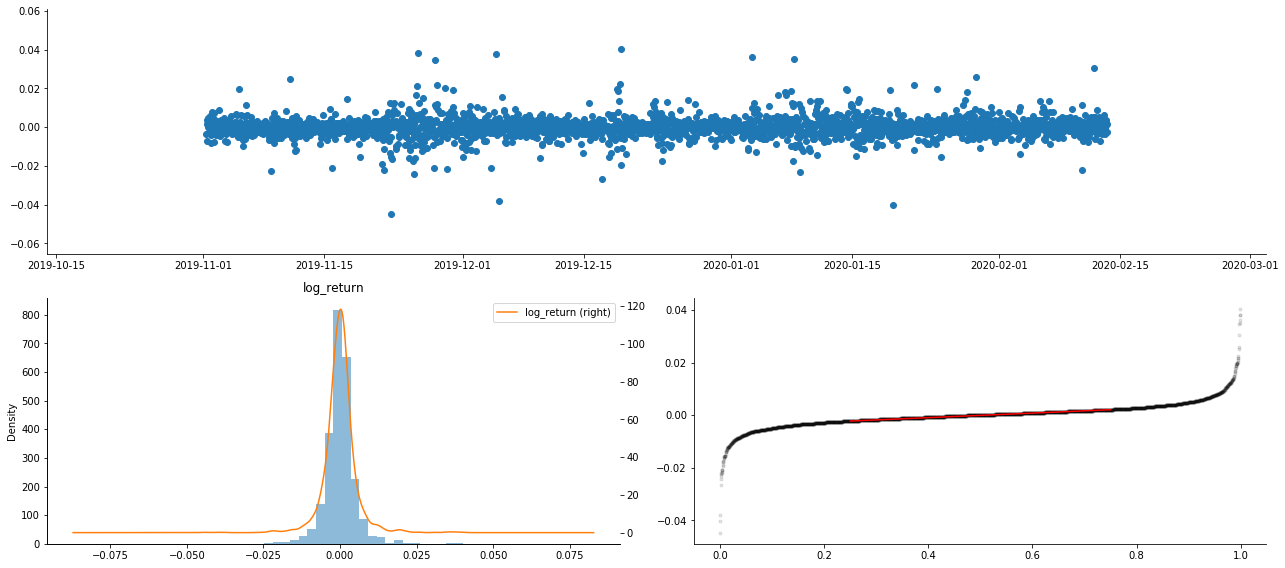
結果として,ロガリズム回帰の時間系列グラフには,明らかに変動の総和とレバレッジ効果があります.
ロガリズム帰還の分布図の偏差は0未満で,サンプルの帰還がわずかにマイナスで右に偏っていることを示しています. ロガリズム帰還のQQ図では,ロガリズム帰還の分布が正常ではないことがわかります.
データ分布の偏差度は1未満であり,サンプル内の返事がわずかに正し,わずかに右傾斜していることを示唆する.クルトーシス値は3以上であり,出力は厚い脂肪尾が分布していることを示唆する.
もう一つの統計テストをしてみましょう. [7]:
line_test = pd.DataFrame(kline_all['log_return'].dropna(), dtype=np.float)
line_test.index.name = 'date'
mean = line_test.mean()
std = line_test.std()
normal_result = pd.DataFrame(index=['Mean Value', 'Std Value', 'Skewness Value','Kurtosis Value',
                                    'Ks Test Value','Ks Test P-value',
                                    'Jarque Bera Test','Jarque Bera Test P-value'],
                    columns=['model value'])
normal_result['model value']['Mean Value'] = ('%.4f'% mean[0])
normal_result['model value']['Std Value'] = ('%.4f'% std[0])
normal_result['model value']['Skewness Value'] = ('%.4f'% line_test.skew())
normal_result['model value']['Kurtosis Value'] = ('%.4f'% line_test.kurt())
normal_result['model value']['Ks Test Value'] = stats.kstest(line_test, 'norm', (mean, std))[0]
normal_result['model value']['Ks Test P-value'] = stats.kstest(line_test, 'norm', (mean, std))[1]
normal_result['model value']['Jarque Bera Test'] = stats.jarque_bera(line_test)[0]
normal_result['model value']['Jarque Bera Test P-value'] = stats.jarque_bera(line_test)[1]
normal_result
アウト[7]:
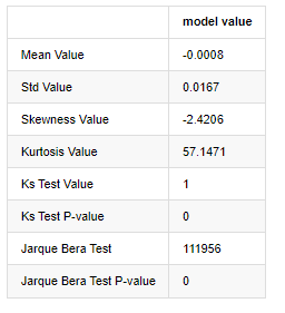
コルモゴロフ・スミルノフとジャルク・ベラテスト統計はそれぞれ使用される.元の仮説は有意差と正常分布が特徴である.P値は0.05%信頼度の重要な値未満である場合,元の仮説は拒否される.
カートーシス値が3より大きく,厚い脂肪尾の特徴を示していることが見られる.KSとJBのP値は信頼区間よりも小さい.正常分布の仮定は拒絶され,BTCの返金率は正常分布の特徴を持っていないことを証明し,経験的研究には厚い脂肪尾の特徴がある.
1-4 実現した変動と観測した変動の比較
観測のために square_log_return (対数積分の回帰2乗) と realized_variance (実感された変数) を組み合わせます
[11] で:
fig, ax = plt.subplots(figsize=(18, 6))
start = '2020-03-08 00:00:00+08:00'
end = '2020-03-20 00:00:00+08:00'

np.abs(kline_all['squared_log_return']).loc[start:end].plot(ax=ax,label='squared log return')
kline_all['realized_variance_1_hour'].loc[start:end].plot(ax=ax,label='realized variance')
plt.legend(loc='best')
アウト[11]:
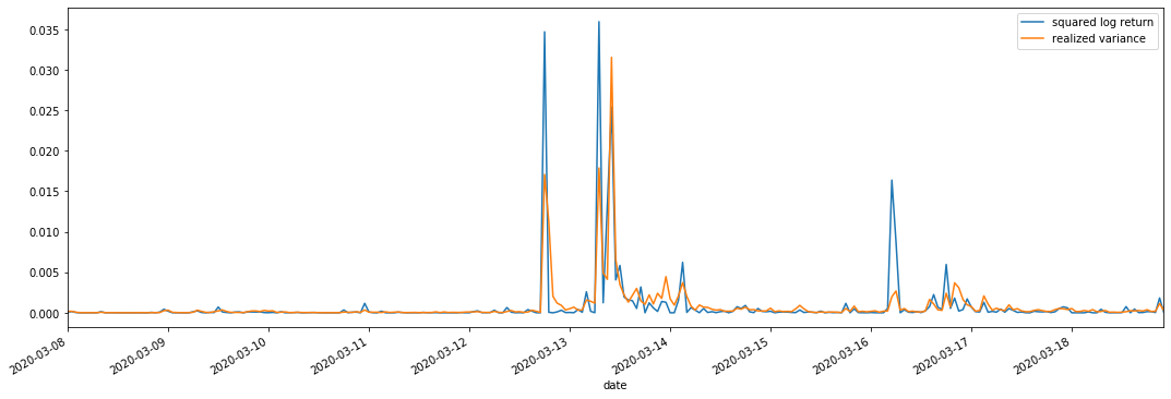
実現された分散範囲が大きいとき,収益率範囲の変動も大きくなり,実現された収益率もよりスムーズであることが見られる.両者は明らかな総和効果を観察することが容易である.
純粋な理論的観点から,RVは実際の変動に近いが,日中の変動は1泊1日のデータに属しているため,短期間の変動は平滑化される.したがって,観察の観点から,日中の変動は低周波の変動株市場に適している.高周波取引とBTCの7*24時間の市場特性は,RVをベンチマークの変動値として決定するのにより適している.
2. タイム シリーズ の 滑らか な 状態
静止していないシリーズである場合,静止していないシリーズにほぼ調整する必要があります.一般的な方法は差分処理を行うことです.理論的には,多くの次差の後に,静止していないシリーズを静止したシリーズに近似することができます.サンプルシリーズの共変数は安定している場合,観察の期待,変数および共変数は時間とともに変化しません.これは,サンプルシリーズは統計分析における推論のためにより便利であることを示しています.
単位の根テスト,すなわちADFテストは,ここで使用されます. ADFテストは,重要性を観察するためにtテストを使用します.原則として,シリーズは明らかな傾向を示さない場合,一定の項のみが保持されます. シリーズは傾向がある場合,回帰方程式には,一定の項と時間傾向項の両方が含まれなければなりません. さらに,情報基準に基づいて評価するためにAICとBIC基準を使用できます. 公式が必要であれば,次のとおりです: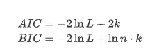
[8] で:
stable_test = kline_all['log_return']
adftest = sm.tsa.stattools.adfuller(np.array(stable_test), autolag='AIC')
adftest2 = sm.tsa.stattools.adfuller(np.array(stable_test), autolag='BIC')
output=pd.DataFrame(index=['ADF Statistic Test Value', "ADF P-value", "Lags", "Number of Observations",
                           "Critical Value(1%)","Critical Value(5%)","Critical Value(10%)"],
                    columns=['AIC','BIC'])
output['AIC']['ADF Statistic Test Value'] = adftest[0]
output['AIC']['ADF P-value'] = adftest[1]
output['AIC']['Lags'] = adftest[2]
output['AIC']['Number of Observations'] = adftest[3]
output['AIC']['Critical Value(1%)'] = adftest[4]['1%']
output['AIC']['Critical Value(5%)'] = adftest[4]['5%']
output['AIC']['Critical Value(10%)'] = adftest[4]['10%']
output['BIC']['ADF Statistic Test Value'] = adftest2[0]
output['BIC']['ADF P-value'] = adftest2[1]
output['BIC']['Lags'] = adftest2[2]
output['BIC']['Number of Observations'] = adftest2[3]
output['BIC']['Critical Value(1%)'] = adftest2[4]['1%']
output['BIC']['Critical Value(5%)'] = adftest2[4]['5%']
output['BIC']['Critical Value(10%)'] = adftest2[4]['10%']
output
アウト[8]: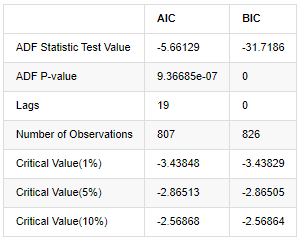
元の仮定は,シリーズに単位根がない,すなわち,代替仮定は,シリーズが静止しているということです.テストP値は0.05%の信頼レベル切断値よりもはるかに小さいので,元の仮定を拒否します.したがって,ログラントの返還率は静止シリーズであり,統計時間系列モデルを使用してモデル化することができます.
3. モデル識別と注文決定
平均値方程式を確立するために,誤差項に自動相関がないことを確認するために,配列に自動相関テストを行う必要があります.まず,自動相関 ACF と部分相関 PACF を次のようにプロットしてみましょう.
[19]:
tsplot(kline_all['log_return'], kline_all['log_return'], title='Log Return', lags=100)
アウト[19]:
断片化の効果が完璧であることがわかります. その瞬間,この絵が私にインスピレーションを与えてくれました. 市場は本当に無効ですか? 検証するために,我々は帰帰数列の自動相関分析を行い,モデルの遅延順序を決定します.
一般的に用いられる相関係数は,それとそれ自身との相関を測るため,すなわち過去のある時点で r (t) と r (t-l) の相関を測るため: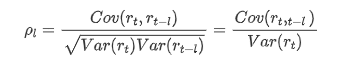
次に定量テストを行います.元の仮定は,すべての自動相関係数が0である,つまり,シリーズに自動相関は存在しないということです.テスト統計の式は次のように書きます: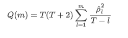
解析のために,次のように10つの自動相関系数を取られました.
[9]:
acf,q,p = sm.tsa.acf(kline_all['log_return'], nlags=15,unbiased=True,qstat = True, fft=False)  # Test 10 autocorrelation coefficients
output = pd.DataFrame(np.c_[range(1,16), acf[1:], q, p], columns=['lag', 'ACF', 'Q', 'P-value'])
output = output.set_index('lag')
output
アウト[9]: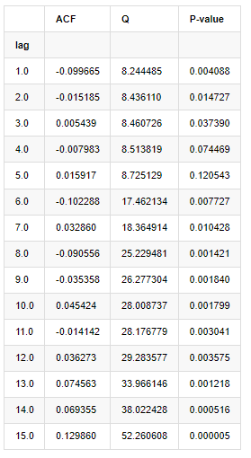
テスト統計QとP値によると,自動相関関数ACFが0順位後徐々に0になる.Qテスト統計のP値が元の仮定を拒絶するほど小さいので,シリーズに自動相関がある.
4. ARMAモデリング
ARとMAモデルはかなりシンプルです.簡単に言うと,Markdownは公式を書くのに疲れている.興味がある場合は,自分で確認してください.AR (自動回帰) モデルは主に時間列をモデル化するために使用されます.この列がACFテストを通過した場合,つまり1の間隔を持つ自動相関係数が重要になります.つまり,時間内のデータは時間tを予測するのに有用かもしれません.
MA (移動平均値) モデルは,過去 q 期間のランダムな干渉またはエラー予測を使用して,現在の予測値を線形的に表現します.
データのダイナミック構造を完全に記述するには,ARまたはMAモデルの順序を増やす必要があるが,そのようなパラメータは計算をより複雑にする.したがって,このプロセスを簡素化するために,自動回帰移動平均 (ARMA) モデルが提案されている.
価格時間列は一般的に静止性がないため,差異方法の静止性への最適化効果は,以前に議論されているため,ARIMA (p, d, q) (和 autoregressive移動平均) モデルは,既存のモデルを列に適用する上で,d順位差処理を追加する.しかし,ロガリズムを使用したため,直接ARMA (p, q) を使用することができます.
ARIMAモデルとARMAモデル構築プロセスの唯一の違いは,静止性を分析した後に不安定な結果が得られた場合,モデルは連続に直接二次差を加え,静止性テストを実行し,連続が安定するまで p と q の順序を決定するということです.モデルを構築して評価した後,次の予測が行われ,差を戻すステップをなくします.しかし,二次順位の価格差は意味がないため,ARMA は最良の選択です.
4-1 注文の選択
AICとBICの熱力学図で試してみます 熱力学図は,AICとBICの熱力学図で
[10] で:
def select_best_params():
    ps = range(0, 4)
    ds= range(1, 2)
    qs = range(0, 4)
    parameters = product(ps, ds, qs)
    parameters_list = list(parameters)

    p_min = 0
    d_min = 0
    q_min = 0
    p_max = 3
    d_max = 3
    q_max = 3

    results_aic = pd.DataFrame(index=['AR{}'.format(i) for i in range(p_min,p_max+1)],
                               columns=['MA{}'.format(i) for i in range(q_min,q_max+1)])
    results_bic = pd.DataFrame(index=['AR{}'.format(i) for i in range(p_min,p_max+1)],
                               columns=['MA{}'.format(i) for i in range(q_min,q_max+1)])

    best_params = []
    aic_results = []
    bic_results = []
    hqic_results = []
    best_aic = float("inf")
    best_bic = float("inf")
    best_hqic = float("inf")
    warnings.filterwarnings('ignore')
    for param in parameters_list:
        try:
            model = sm.tsa.SARIMAX(kline_all['log_price'], order=(param[0], param[1], param[2])).fit(disp=-1)
            results_aic.loc['AR{}'.format(param[0]), 'MA{}'.format(param[2])] = model.aic
            results_bic.loc['AR{}'.format(param[0]), 'MA{}'.format(param[2])] = model.bic
        except ValueError:
            continue

        aic_results.append([param, model.aic])
        bic_results.append([param, model.bic])
        hqic_results.append([param, model.hqic])

    results_aic = results_aic[results_aic.columns].astype(float)
    results_bic = results_bic[results_bic.columns].astype(float)

    # Draw thermodynamic diagrams of AIC and BIC to find the best
    fig = plt.figure(figsize=(18, 9))
    layout = (2, 2)
    aic_ax = plt.subplot2grid(layout, (0, 0))
    bic_ax = plt.subplot2grid(layout, (0, 1))

    aic_ax = sns.heatmap(results_aic,mask=results_aic.isnull(),ax=aic_ax,cmap='OrRd',annot=True,fmt='.2f',);
    aic_ax.set_title('AIC');
    bic_ax = sns.heatmap(results_bic,mask=results_bic.isnull(),ax=bic_ax,cmap='OrRd',annot=True,fmt='.2f',);
    bic_ax.set_title('BIC');

    aic_df = pd.DataFrame(aic_results)
    aic_df.columns = ['params', 'aic']
    best_params.append(aic_df.params[aic_df.aic.idxmin()])
    print('AIC best param: {}'.format(aic_df.params[aic_df.aic.idxmin()]))

    bic_df = pd.DataFrame(bic_results)
    bic_df.columns = ['params', 'bic']
    best_params.append(bic_df.params[bic_df.bic.idxmin()])
    print('BIC best param: {}'.format(bic_df.params[bic_df.bic.idxmin()]))

    hqic_df = pd.DataFrame(hqic_results)
    hqic_df.columns = ['params', 'hqic']
    best_params.append(hqic_df.params[hqic_df.hqic.idxmin()])
    print('HQIC best param: {}'.format(hqic_df.params[hqic_df.hqic.idxmin()]))

    for best_param in best_params:
        if best_params.count(best_param)>=2:
            print('Best Param Selected: {}'.format(best_param))
            return best_param

best_param = select_best_params()
アウト[10]: AIC 最良パラーム: (0, 1, 1) BIC 最良パラーム: (0, 1, 1) HQIC 最良パラーム: (0, 1, 1) ベストパラム 選択: (0, 1, 1)
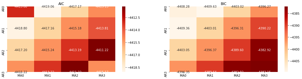
ロガリズム価格の最適な1階位パラメータ組み合わせは (0,1,1) であることは明らかである.これは単純で直接的なことである. ログ_リターン (ロガリズム回帰率) は同じ操作を実行する. AICの最適な値は (4,3),BICの最適な値は (0,1). したがって, ログ_リターン (ロガリズム回帰率) のパラメータの最適な組み合わせは (0,1).
4-2 ARMAモデリングとマッチング
SARIMAXは特性がより豊富であるため,このモデルをモデル化するために選択し,次のような記述的な分析を行うことにしました.
[11] で:
params = (0, 0, 1)
training_model = smt.SARIMAX(endog=kline_all['log_return'], trend='c', order=params, seasonal_order=(0, 0, 0, 0))
model_results = training_model.fit(disp=False)
model_results.summary()
アウト[11]:
ステートスペースモデルの結果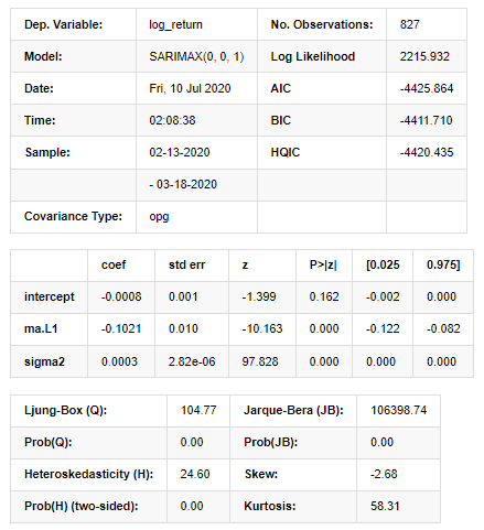
警告: [1] グラデーションの外積 (複合ステップ) を使用して計算された共変数行列. [27]:
model_results.plot_diagnostics(figsize=(18, 10));
アウト[27]:
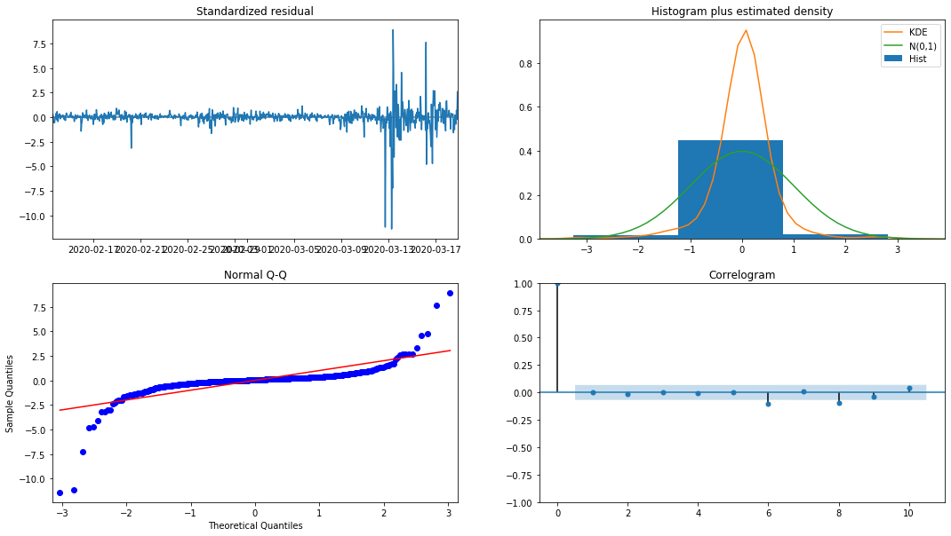
ヒストグラムの確率密度 KDE は,正常分布 N (0,1) から遠く離れていて,残りは正常分布ではないことを示している.QQ量子線グラフでは,標準正常分布から採取されたサンプル残りは線形傾向を完全に追及していないため,残りは正常分布ではなく,ホワイトノイズに近いことが再び確認される.
このモデルが使えるかどうかは まだ試さなければなりません
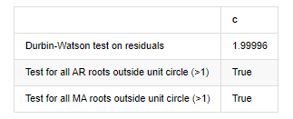
4-3 モデル試験
余分のマッチング効果は理想的ではないので,ダービン・ワトソンテストを実行した. テストの元の仮説は,配列に自相関関係がないことであり,代替仮説配列は静止していることである. さらに,LB,JB,HテストのP値が0.05%の信頼レベルの臨界値未満である場合,元の仮説は拒絶される.
[12] で:
het_method='breakvar'
norm_method='jarquebera'
sercor_method='ljungbox'

(het_stat, het_p) = model_results.test_heteroskedasticity(het_method)[0]
norm_stat, norm_p, skew, kurtosis = model_results.test_normality(norm_method)[0]

sercor_stat, sercor_p = model_results.test_serial_correlation(method=sercor_method)[0]
sercor_stat = sercor_stat[-1] # The last value of the maximum period
sercor_p = sercor_p[-1]

dw = sm.stats.stattools.durbin_watson(model_results.filter_results.standardized_forecasts_error[0, model_results.loglikelihood_burn:])

arroots_outside_unit_circle = np.all(np.abs(model_results.arroots) > 1)
maroots_outside_unit_circle = np.all(np.abs(model_results.maroots) > 1)

print('Test heteroskedasticity of residuals ({}): stat={:.3f}, p={:.3f}'.format(het_method, het_stat, het_p));
print('\nTest normality of residuals ({}): stat={:.3f}, p={:.3f}'.format(norm_method, norm_stat, norm_p));
print('\nTest serial correlation of residuals ({}): stat={:.3f}, p={:.3f}'.format(sercor_method, sercor_stat, sercor_p));
print('\nDurbin-Watson test on residuals: d={:.2f}\n\t(NB: 2 means no serial correlation, 0=pos, 4=neg)'.format(dw))
print('\nTest for all AR roots outside unit circle (>1): {}'.format(arroots_outside_unit_circle))
print('\nTest for all MA roots outside unit circle (>1): {}'.format(maroots_outside_unit_circle))

root_test=pd.DataFrame(index=['Durbin-Watson test on residuals','Test for all AR roots outside unit circle (>1)','Test for all MA roots outside unit circle (>1)'],columns=['c'])
root_test['c']['Durbin-Watson test on residuals']=dw
root_test['c']['Test for all AR roots outside unit circle (>1)']=arroots_outside_unit_circle
root_test['c']['Test for all MA roots outside unit circle (>1)']=maroots_outside_unit_circle
root_test
アウト[12]: 残留物のテストヘテロスケダスティシティ (ブレイクバル):stat=24.598,p=0.000
残留物 (ジャルケベラ) の試験正常性:stat=106398.739,p=0.000
残留物 (ljungbox) のテストシリアル相関:stat=104.767,p=0.000
残留物に関するダービン=ワトソン試験: d=2.00 (注: 2 は連続的相関がないことを意味し,0=pos,4=neg)
単位円 (>1) 外にあるすべてのAR根のテスト: True
単位円 (>1) の外にあるすべてのMA根のテスト: True
[13]では:
kline_all['log_price_dif1'] = kline_all['log_price'].diff(1)
kline_all = kline_all[1:]
kline_train = kline_all

training_label = 'log_return'
training_ts = pd.DataFrame(kline_train[training_label], dtype=np.float)

delta = model_results.fittedvalues - training_ts[training_label]
adjR = 1 - delta.var()/training_ts[training_label].var()
adjR_test=pd.DataFrame(index=['adjR2'],columns=['Value'])
adjR_test['Value']['adjR2']=adjR**2
adjR_test
アウト[13]:
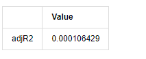
ダービン・ワトソン試験統計値が2である場合,配列に関連性がないことを確認し,その統計値が (0,4) 間で分布される. 0に近いということは,正の関連性が高いことを意味し,4に近いということは,負の関連性が高いことを意味します.ここでは,約2に等しいです.他の試験のP値は十分に小さいので,単位特性の根は単位円の外にあり,修正されたadjR2の値が大きいほど,よりよいものになります.測定の全体的な結果は満足のいくようには見えません.
[14] では:
model_results.params
アウト[14]: 傍受する -0.000817 ma.L1 -0.102102 シグマ2 0.000275 d型:浮遊機64
要約すると,この順序設定パラメータは,基本的には時間列モデリングおよびそれ以降の変動モデリングの要件を満たすことができるが,マッチング効果はこうこうである.モデルの表現は以下のとおりである: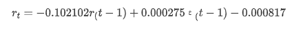
4-4 モデル予測
次に,訓練されたモデルが向上にマッチされる. statsmodelsはマッチングと予測のための静的および動的オプションを提供します.違いは,観測値が予測の次のステップで使用されるか,または前のステップで生成された予測値が繰り返して使用されるかである. log_return (ロガリズム回帰率) の予測効果は以下のとおりです.
[37]:
start_date = '2020-02-28 12:00:00+08:00'
end_date = start_date

pred_dy = model_results.get_prediction(start=start_date, dynamic=False)
pred_dy_ci = pred_dy.conf_int()

fig, ax = plt.subplots(nrows=1, ncols=1, figsize=(18, 6))
ax.plot(kline_all['log_return'].loc[start_date:], label='Log Return', linestyle='-')
ax.plot(pred_dy.predicted_mean.loc[start_date:], label='Forecast Log Return', linestyle='--')
ax.fill_between(pred_dy_ci.index,pred_dy_ci.iloc[:, 0],pred_dy_ci.iloc[:, 1], color='g', alpha=.25)

plt.ylabel("BTC Log Return")
plt.legend(loc='best')
plt.tight_layout()
sns.despine()
アウト[37]:
静的モードのサンプルへのフィットメント効果が優れていることがわかります. サンプルデータはほぼ95%の信頼区間でカバーされ,動的モードは少し制御不能です.
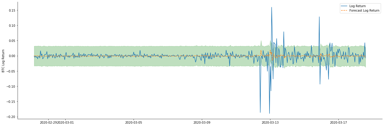
ダイナミックモードでのデータマッチング効果を見てみましょう
[38]:
start_date = '2020-02-28 12:00:00+08:00'
end_date = start_date

pred_dy = model_results.get_prediction(start=start_date, dynamic=True)
pred_dy_ci = pred_dy.conf_int()

fig, ax = plt.subplots(nrows=1, ncols=1, figsize=(18, 6))
ax.plot(kline_all['log_return'].loc[start_date:], label='Log Return', linestyle='-')
ax.plot(pred_dy.predicted_mean.loc[start_date:], label='Forecast Log Return', linestyle='--')
ax.fill_between(pred_dy_ci.index,pred_dy_ci.iloc[:, 0],pred_dy_ci.iloc[:, 1], color='g', alpha=.25)

plt.ylabel("BTC Log Return")
plt.legend(loc='best')
plt.tight_layout()
sns.despine()
アウト[38]:
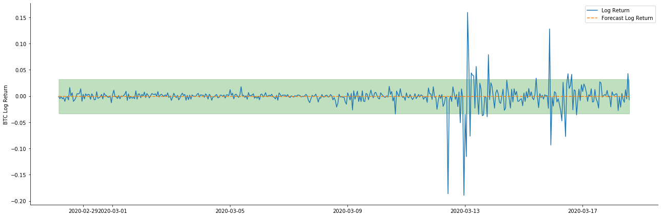
この2つのモデルのサンプルへのフィットメント効果は優れたものであり,平均値はほぼ95%の信頼区間によってカバーされることが見られますが,静的モデルは明らかにより適しています.次に,サンプル外50ステップ,すなわち最初の50時間の予測効果を見てみましょう.
[41]:
# Out-of-sample predicted data predict()
start_date = '2020-03-01 12:00:00+08:00'
end_date = '2020-03-20 23:00:00+08:00'
model = False

predict_step = 50
predicts_ARIMA_normal = model_results.get_prediction(start=start_date, dynamic=model, full_reports=True)
ci_normal = predicts_ARIMA_normal.conf_int().loc[start_date:]

predicts_ARIMA_normal_out = model_results.get_forecast(steps=predict_step, dynamic=model)
ci_normal_out = predicts_ARIMA_normal_out.conf_int().loc[start_date:end_date]

fig, ax = plt.subplots(figsize=(18,8))
kline_test.loc[start_date:end_date, 'log_return'].plot(ax=ax, label='Benchmark Log Return')

predicts_ARIMA_normal.predicted_mean.plot(ax=ax, style='g', label='In Sample Forecast')
ax.fill_between(ci_normal.index, ci_normal.iloc[:,0], ci_normal.iloc[:,1], color='g', alpha=0.1)

predicts_ARIMA_normal_out.predicted_mean.loc[:end_date].plot(ax=ax, style='r--', label='Out of Sample Forecast')
ax.fill_between(ci_normal_out.index, ci_normal_out.iloc[:,0], ci_normal_out.iloc[:,1], color='r', alpha=0.1)

plt.tight_layout()
plt.legend(loc='best')
sns.despine()
アウト[41]:
サンプル内のデータのマッチングは前向きな予測であるため,サンプルの情報量が十分である場合,静的モデルはマッチング過剰に傾向があり,動的モデルは信頼できる依存変数がないため,反復後効果は悪化する.サンプルの外部のデータを予測する際に,モデルはサンプルの内の動的モデルと同等であるため,長期予測の誤差項の精度は低いことが必然である.
ログ_プライス (ロガリズム値) に返金率予測を逆転させると,マッチは以下の図に示されています.
[42] で:
params = (0, 1, 1)
mod = smt.SARIMAX(endog=kline_all['log_price'], trend='c', order=params, seasonal_order=(0, 0, 0, 0))
res = mod.fit(disp=False)

start_date = '2020-03-01 12:00:00+08:00'
end_date = '2020-03-15 23:00:00+08:00'

predicts_ARIMA_normal = res.get_prediction(start=start_date, dynamic=False, full_results=False)
predicts_ARIMA_dynamic = res.get_prediction(start=start_date, dynamic=True, full_results=False)

fig, ax = plt.subplots(figsize=(18,6))
kline_test.loc[start_date:end_date, 'log_price'].plot(ax=ax, label='Log Price')

predicts_ARIMA_normal.predicted_mean.loc[start_date:end_date].plot(ax=ax, style='r--', label='Normal Prediction')
ci_normal = predicts_ARIMA_normal.conf_int().loc[start_date:end_date]
ax.fill_between(ci_normal.index, ci_normal.iloc[:,0], ci_normal.iloc[:,1], color='r', alpha=0.1)

predicts_ARIMA_dynamic.predicted_mean.loc[start_date:end_date].plot(ax=ax, style='g', label='Dynamic Prediction')
ci_dynamic = predicts_ARIMA_dynamic.conf_int().loc[start_date:end_date]
ax.fill_between(ci_dynamic.index, ci_dynamic.iloc[:,0], ci_dynamic.iloc[:,1], color='g', alpha=0.1)

plt.tight_layout()
plt.legend(loc='best')
sns.despine()
アウト[42]:
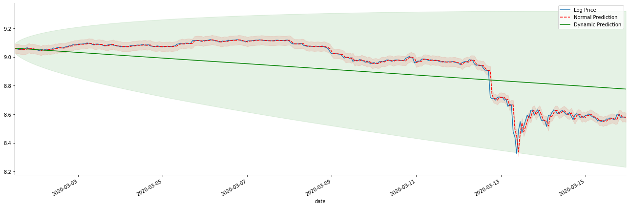
静的モデルのマッチングの利点と,長期予測における動的モデルと静的モデルの極端な違いは簡単に見えます.赤い点線とピンクの範囲は... このモデルの予測が間違っているとは言えません. 結局のところ,移動平均の傾向を完全にカバーしていますが...それは意味がありますか?
ARMAモデル自体は間違っていない.問題はモデルそのものではなく,物事そのものの客観的論理である.時間系列モデルは,以前の観察と後の観測間の相関に基づいてのみ確立することができる.したがって,ホワイトノイズシリーズをモデル化することは不可能である.したがって,以前のすべての研究は,BTCのリターンレートシリーズが独立して同一に分布できないという大胆な仮定に基づいている.
一般的に,リターンレートシリーズはマルティンゲール差数列である.これはリターンレートは予測不能であり,対応する市場の低効率仮定が成立することを意味する.個々のサンプルにおけるリターンレートは一定の程度に自相関性を持っていると仮定し,同じ分布仮定は,トレーニングセットに適用可能なマッチングモデルを作ることにもなる.
しかし,マッチした残留配列はマルチンゲール差異配列でもある.マルチンゲール差異配列は独立して同一分布ではないかもしれないが,条件差異は過去値に依存する可能性があるため,第一順位の自動相関はなくなりましたが,依然としてより高い順位の自動相関があります.これは,変動をモデル化し観察するための重要な前提条件でもあります.
このような論理が成立すれば,様々な変動モデルを構築する前提も成立する.したがって,収益率シリーズでは,低効率の市場が満足している場合,平均値は予測が困難で,差は予測可能である.そしてマッチされたARMAは公正な品質のタイムシリーズベンチマークを提供し,品質は変動予測の品質も決定する.
最後に,予測の効果を単純に評価しましょう.エラーを評価基準として,サンプル内外の指標は以下のとおりです.
[15] について
start = '2020-02-14 00:00:00+08:00'
predicts_ARIMA_normal = model_results.get_prediction(dynamic=False)
predicts_ARIMA_dynamic = model_results.get_prediction(dynamic=True)
training_label = 'log_return'

compare_ARCH_X = pd.DataFrame()
compare_ARCH_X['Model'] = ['NORMAL','DYNAMIC']
compare_ARCH_X['RMSE'] = [rmse(predicts_ARIMA_normal.predicted_mean[1:], kline_test[training_label][:826]),
                          rmse(predicts_ARIMA_dynamic.predicted_mean[1:], kline_test[training_label][:826])]
compare_ARCH_X['MAPE'] = [mape(predicts_ARIMA_normal.predicted_mean[:50], kline_test[training_label][:50]),
                          mape(predicts_ARIMA_dynamic.predicted_mean[:50], kline_test[training_label][:50])]
compare_ARCH_X
アウト[15]: 根平均正方形誤差 (RMSE): 0.0184 根平均正方形誤差 (RMSE): 0.0167 平均絶対%誤差 (MAPE): 2.25e+03 平均絶対%誤差 (MAPE): 395
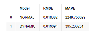
静的モデルは予測値と実際の値の誤差一致性において動的モデルよりもわずかに優れていることが見られる.Bitcoinの対数回帰率によく一致し,基本的には期待に沿っている.動的予測にはより正確な変数情報がないし,誤差も繰り返しに増幅されるため,予測効果は低下している.MAPEは100%を超えるため,両方のモデルの実際のマッチング品質は理想的ではない.
[18]:
predict_step = 50
predicts_ARIMA_normal_out = model_results.get_forecast(steps=predict_step, dynamic=False)
predicts_ARIMA_dynamic_out = model_results.get_forecast(steps=predict_step, dynamic=True)
testing_ts = kline_test
training_label = 'log_return'

compare_ARCH_X = pd.DataFrame()
compare_ARCH_X['Model'] = ['NORMAL','DYNAMIC']
compare_ARCH_X['RMSE'] = [get_rmse(predicts_ARIMA_normal_out.predicted_mean, testing_ts[training_label]),
                          get_rmse(predicts_ARIMA_dynamic_out.predicted_mean, testing_ts[training_label])]
compare_ARCH_X['MAPE'] = [get_mape(predicts_ARIMA_normal_out.predicted_mean, testing_ts[training_label]),
                          get_mape(predicts_ARIMA_dynamic_out.predicted_mean, testing_ts[training_label])]
compare_ARCH_X
アウト[18]:
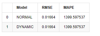
サンプル外の次の予測は,前のステップの結果に依存しているため,動的モデルのみが有効である.しかし,動的モデルの長期的エラー欠陥は,全体のモデルの予測能力が不十分になるため,次のステップは最多で予測される.
ARMAモデル静的モデルは,ビットコインのサンプル内の収益率をマッチするのに適している.収益率の短期予測は信頼区間を効果的にカバーできるが,長期的な予測は非常に困難で,市場の弱い有効性を満たしている.テスト後,サンプル区間の収益率は,後の変動観察の前提を満たす.
5. ARCH 効果
ARCHモデル効果は,条件的異性多動性配列の連続相関である.ミックステストLjung Boxは,余剰平方配列の相関をテストするために使用され,ARCH効果があるかどうかを決定する.ARCH効果テストが通過した場合,すなわち,配列が異性多動性を持っている場合,GARCHモデリングの次のステップは,平均方程式と揮発性方程式を共同で推定するために実行することができる.そうでなければ,モデルは微分処理または相互シリーズなどの最適化および再調整が必要である.
ここにはいくつかのデータセットと グローバル変数があります
[33]:
count_num = 100000
start_date = '2020-03-01'

df = get_bars('huobi.btc_usdt', '1m', count=count_num, start=start_date)  # Take the minute data
kline_1m = pd.DataFrame(df['close'], dtype=np.float)
kline_1m.index.name = 'date'
kline_1m['log_price'] = np.log(kline_1m['close'])
kline_1m['return'] = kline_1m['close'].pct_change().dropna()
kline_1m['log_return'] = kline_1m['log_price'] - kline_1m['log_price'].shift(1)

kline_1m['squared_log_return'] = np.power(kline_1m['log_return'], 2)

kline_1m['return_100x'] = np.multiply(kline_1m['return'], 100)
kline_1m['log_return_100x'] = np.multiply(kline_1m['log_return'], 100)  # Enlarge 100 times

df = get_bars('huobi.btc_usdt', '1h', count=count_num, start=start_date)  # Take the hour data
kline_test = pd.DataFrame(df['close'], dtype=np.float)
kline_test.index.name = 'date'
kline_test['log_price'] = np.log(kline_test['close'])  # Calculate the daily logarithmic rate of return
kline_test['return'] = kline_test['log_price'].pct_change().dropna()
kline_test['log_return'] = kline_test['log_price'] - kline_test['log_price'].shift(1)  # Calculate the logarithmic rate of return
kline_test['squared_log_return'] = np.power(kline_test['log_return'], 2)  # Exponential square of log daily return rate

kline_test['return_100x'] = np.multiply(kline_test['return'], 100)
kline_test['log_return_100x'] = np.multiply(kline_test['log_return'], 100)  # Enlarge 100 times

kline_test['realized_variance_1_hour'] = kline_1m.loc[:, 'squared_log_return'].resample('h', closed='left', label='left').sum().copy() # Resampling to days
kline_test['realized_volatility_1_hour'] = np.sqrt(kline_test['realized_variance_1_hour'])  # Volatility of variance derivation

kline_test = kline_test[4:-2500]
kline_test.head(3)
アウト[33]:
[22]:
cc = 3
model_p = 1
predict_lag = 30
label = 'log_return'

training_label = label
training_ts = pd.DataFrame(kline_test[training_label], dtype=np.float)

training_arch_label = label
training_arch = pd.DataFrame(kline_test[training_arch_label], dtype=np.float)

training_garch_label = label
training_garch = pd.DataFrame(kline_test[training_garch_label], dtype=np.float)

training_egarch_label = label
training_egarch = pd.DataFrame(kline_test[training_egarch_label], dtype=np.float)

training_arch.plot(figsize = (18,4))
アウト[22]:
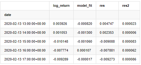
ロガリズム回帰率は上記のように示されています.次に,サンプルのARCH効果をテストする必要があります.ARMAに基づいてサンプルの内の残留列を確立します.いくつかの列と残留と残留の平方列を最初に計算します:
[20]:
training_arma_model = smt.SARIMAX(endog=training_ts, trend='c', order=(0, 0, 1), seasonal_order=(0, 0, 0, 0))
arma_model_results = training_arma_model.fit(disp=False)
arma_model_results.summary()
training_arma_fitvalue = pd.DataFrame(arma_model_results.fittedvalues,dtype=np.float)
at = pd.merge(training_ts, training_arma_fitvalue, on='date')
at.columns = ['log_return', 'model_fit']
at['res'] = at['log_return'] - at['model_fit']
at['res2'] = np.square(at['res'])
at.head()
アウト[20]:
その後,サンプルの残数列をグラフ化します.
[69 ]:
fig, ax = plt.subplots(figsize=(18, 6))
ax1 = fig.add_subplot(2,1,1)
at['res'][1:].plot(ax=ax1,label='resid')
plt.legend(loc='best')

ax2 = fig.add_subplot(2,1,2)
at['res2'][1:].plot(ax=ax2,label='resid2')

plt.legend(loc='best')
plt.tight_layout()
sns.despine()
アウト[69]:
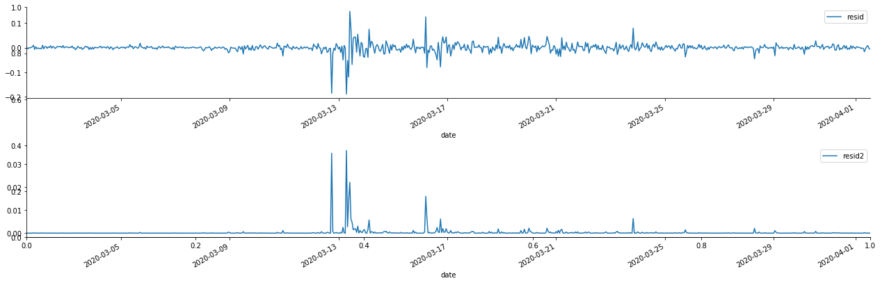
余剰数列は明らかな集積特性を有し,その数列にARCH効果があると最初判断することができる.ACFも二乗残数の自動相関性試験に用いられ,結果は以下のとおりである.
[70]では:
figure = plt.figure(figsize=(18,4))
ax1 = figure.add_subplot(111)
fig = sm.graphics.tsa.plot_acf(at['res2'],lags = 40, ax=ax1)
アウト[70]:
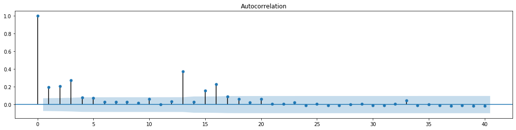
シリーズブレンドテストの元の仮定は,シリーズは関連性がないというものである.最初の20つのデータ順位の対応P値は0.05%の信頼レベルの臨界値未満であることが見られる.したがって,元の仮定は拒絶される.すなわち,シリーズの残留値はARCH効果を有する.分散モデルは,残留シリーズの異性相性性に対応し,さらに変動を予測するためにARCH型モデルを通じて確立することができる.
6. GARCH モデリング
GARCHモデリングを行う前に,数列の脂肪尾部分に対処する必要があります. 仮説における数列の誤差項は,正常分布またはt分布に適合する必要があります. そして,前述で,出力数列が脂肪尾分布を持っていることを確認したので,この部分を記述し補完する必要があります.
GARCHモデリングでは,エラー項目は,正規分布,t分布,GED (汎用エラー分布) 配分,Skewed Students t分布のオプションを提供します.AIC基準に従って,すべてのオプションの結果を比較するために,数値関節回帰推定を使用し,Gの最高のマッチング度を得ます.
- 暗号通貨市場の基本分析を定量化する: データが自分で話せ!
- 通貨圏の基礎的な定量化研究 - 数字を客観的に話すために,あらゆる
教師を信頼しなくていい! - 量化取引の必須ツール - 発明者による量化データ探索モジュール
- すべてをマスターする - FMZの新バージョンの取引ターミナルへの紹介 (TRB仲裁ソースコード)
- FMZの新バージョンの取引端末のご紹介 (TRBの利息ソースコード追加)
- FMZ Quant: 仮想通貨市場における共通要件設計例の分析 (II)
- 80行のコードで高周波戦略で 脳のない販売ボットを利用する方法
- FMZ定量化:仮想通貨市場の常用需要設計事例解析 (II)
- 80行コードの高周波戦略で脳のないロボットを搾取して売る方法
- FMZ Quant: 仮想通貨市場における共通要件設計例の分析 (I)
- FMZ定量化:仮想通貨市場の常用需要設計事例解析 (1)