Interactive Controls
Strategies in JavaScript, Python, Rust and MyLanguage can have interactive controls, which send interaction commands to the strategy while it is running live. In JavaScript, Python and Rust strategies, the messages produced by interactive controls are read with the GetCommand function. The "Component Configuration" of interactive controls is the same as for strategy parameters (see Strategy Parameters → Component Configuration).
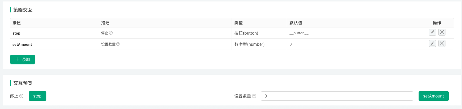
With code in the strategy that handles interactive control messages, interactive controls in live trading can be used for (among other things):
- Manually closing the strategy's positions.
- Changing strategy parameters dynamically without restarting the live trading.
- Switching strategy logic.
- Printing debugging information or data to test a feature.
Types of Interactive Controls
| Variable (naming example) | Description | Type | Default Value (description) | Component Configuration (description) | Notes |
|---|---|---|---|---|---|
| cmdNum | Description of interactive control cmdNum | Number type (number) | Default value is optional, can be left empty | Used to set the component type, minimum value, maximum value, grouping, etc. of the interface control bound to the current interactive item | Notes for interactive control cmdNum |
| cmdBool | Description of interactive control cmdBool | Boolean type (true/false) | Default value is required, on or off | Same as above | Notes for interactive control cmdBool |
| cmdStr | Description of interactive control cmdStr | String type (string) | Default value is optional, can be left empty | Same as above | Notes for interactive control cmdStr |
| cmdCombox | Description of interactive control cmdCombox | Dropdown (selected) | Default value is optional, can be left empty | Same as above | Notes for interactive control cmdCombox |
| cmdBtn | Description of interactive control cmdBtn | Button (button) | Button control does not bind input items | Same as above | Notes for interactive control cmdBtn |
Messages (strings) sent to the strategy after interactive control is triggered:
- Number type
After entering interactive data123in the input box of interactive controlcmdNum, click the button of interactive control cmdNum. TheGetCommand()function in the strategy program will receive the message:cmdNum:123. - Boolean type
After setting the switch control of interactive controlcmdBoolto on, click the button of interactive control cmdBool. TheGetCommand()function in the strategy program will receive the message:cmdBool:true. - String type
After entering interactive dataabcin the input box of interactive controlcmdStr, click the button of interactive control cmdStr. TheGetCommand()function in the strategy program will receive the message:cmdStr:abc. - Dropdown
After selecting the second option in the dropdown of interactive controlcmdCombox, click the button of interactive control cmdCombox. TheGetCommand()function in the strategy program will receive the message:cmdCombox:1, where 1 represents the index of the selected option, the first option has index 0, the second option has index 1. - Button
Click the button of interactive controlcmdBtn. TheGetCommand()function in the strategy program will receive the message:cmdBtn.
The "Component Configuration" of interactive controls is the same as for strategy parameters (see Strategy Parameters → Component Configuration).
Example: changing a strategy parameter with an interactive control
On the strategy editing page, add a string interactive control named changeSymbol under "Strategy Interaction". The settings of the interactive control:
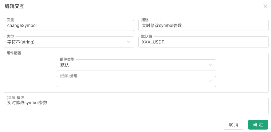
While the strategy runs live, enter ETH_USDT in the control's input box and click its button; GetCommand() receives the message changeSymbol:ETH_USDT. The strategy detects the message and updates the corresponding variable (parameters set in the strategy interface are global variables too; a global variable in the code is used here for demonstration):
javascript
// strategy parameter
var symbol = "BTC_USDT"
function main() {
while (true) {
var cmd = GetCommand()
if (cmd) {
var arr = cmd.split(":")
if (arr.length == 2 && arr[0] == "changeSymbol") {
// the changeSymbol control was triggered: update the parameter
Log("Changed symbol parameter to:", arr[1])
symbol = arr[1]
}
}
LogStatus(_D(), ", Current symbol parameter value:", symbol)
Sleep(3000)
}
}
Interactive Controls in Status Bar
In addition to designing interactive controls in the "Strategy Interaction" section, you can also design interactive controls in the strategy status bar. Currently, the only supported interactive control type is the button type. See LogStatus.
Button controls in the status bar can be divided into:
-
Regular button controls
Data structure example:json{"type": "button", "name": "Button 1", "cmd": "button1", "description": "This is the first button"} -
Button controls with a single input data
Use theinputattribute to set input control options. Data structure example:json{"type": "button", "name": "Button 2", "cmd": "button2", "description": "This is the second button", "input": {"name": "Open Quantity", "type": "number", "defValue": 1}}json{ "type": "button", "cmd": "test1", "name": "test1", "input": { "type": "selected", "name": "selected", "label": "Dropdown", "description": "description", "default": 100, "settings": { "multiple": true, "customizable": true, "options":[{"name": "A", "value": 100}, {"name": "B", "value": 200}] } } } -
Button controls with a group of input data
Use thegroupattribute to set options for a group of input controls. Data structure example:json{ "type": "button", "cmd": "open", "name": "Open", "group": [ {"name": "orderType", "description": "Order Method|order type", "type": "selected", "defValue": "Market Order|Limit Order"}, {"name": "tradePrice@orderType==1", "description": "Trade Price|trade price", "type": "number", "defValue": 100}, {"name": "orderAmount", "description": "Order Quantity|order amount", "type": "string", "defValue": 100}, {"name": "boolean", "description": "Yes/No|boolean", "type": "boolean", "defValue": true} ] }json{ "type": "button", "cmd": "test2", "name": "test2", "group": [{ "type": "selected", "name": "selected", "label": "Dropdown", "description": "description", "default": 200, "group": "group1", "settings": { "multiple": true, "options":[{"name": "A", "value": 100}, {"name": "B", "value": 200}] } }, { "type": "string", "name": "string", "label": "Input Box", "description": "description", "default": "ABC", "group": "group1" }] }
Encode the JSON data of these button controls as a JSON string, then wrap it with ` characters and output it in the status bar. Using JavaScript as an example:
            javascript

            function main() {
    var btn = {"type": "button", "name": "Button 1", "cmd": "button1", "description": "This is the first button"}
    LogStatus("`" + JSON.stringify(btn) + "`")
}
These button controls can also be written into status bar tables. For detailed examples see LogStatus.
The input field structure is consistent with the single control structure in the group field. The following is a detailed explanation (an annotated JavaScript object):
            javascript

            {
    "type": "selected",     // Control type (required field), supports: number, string, selected, boolean
    "name": "test",         // Name (required field when used in group)
    "label": "topic",       // Title (required field)
    "description": "desc",  // Tooltip information for the component
    "default": 1,           // Default value; if the settings field is not set in the current JSON structure, it is compatible with defValue, and defValue can be used instead of default
    "filter": "a>1",        // Selector, not setting this field means no filtering (display control); when this field is set, the control is not filtered (displayed) when the expression is true, and filtered (not displayed) when the expression is false
                            // For the selector, using the expression a>1 in this example, 'a' refers to the control value with name 'a' under the group field in the type=button structure, and this value is used to determine whether to filter
    "group": "group1",      // Grouping
    "settings": {}          // Component configuration, fields described below
}
Detailed explanation of each field in the component configuration settings:
settings.required: Whether it is required.settings.disabled: Whether it is disabled.settings.min: Valid whentype=number, represents the minimum value.settings.max: Valid whentype=number, represents the maximum value.settings.step: Valid whentype=numberandrender=slider, represents the step size.settings.multiple: Valid whentype=selected, indicates support for multiple selection.settings.customizable: Valid whentype=selected, indicates support for customization; users can directly edit and add new options in the dropdown control. If a newly edited option is selected, the option's name will be used instead of the option's value when triggering the interaction.settings.options: Valid whentype=selected, represents the selector's option data format:["Option 1", "Option 2"],[{'name':'xxx','value':0}, {'name':'xxx','value':1}].settings.render: Render component type.
Whentype=number,settings.renderis not set (defaults to number input box), options:slider(slider),date(date picker, returns timestamp).
Whentype=string,settings.renderis not set (defaults to single-line input box), options:textarea(multi-line input),date(date picker, returns yyyy-MM-dd hh:mm:ss),color(color picker, returns #FF00FF).
Whentype=selected,settings.renderis not set (defaults to dropdown), options:segment(segmented selector).
Whentype=boolean, currently only the default checkbox is available.
Bilingual settings are supported. For example, the text '选项|options' adapts to the current language. Using a single control in the group field as an example, a complete example (a JavaScript object):
            javascript

            {
    type:'selected',
    name:'test',
    label:'选项|options',
    description:'描述|description',
    default:0,                            // Here the default value is set to 0, representing the value in {name:'xxx|yyy',value:0} option
    filter:'a>1&&a<10',
    group:'Group|group',
    settings:{
        multiple:true,
        customizable:true,
        options:[{name:'xxx|yyy',value:0}]
    }
}